Data Processing

Includes hypothesis testingIncludes sampling

Edexcel

AQA

OCR A

OCR MEI

June 2025 Paper 3 Q4

EdexcelCurrent spec9 marksIncludes hypothesis testingIncludes samplingCorrelation & RegressionData ProcessingLarge Data Set

4. Kay is studying the variables Daily Total Sunshine (\(x\)) and Daily Total Rainfall (\(y\)) from the large data set for Leeming in 2015

Kay starts with 5th May and then selects every 10th day thereafter.

(a) State the name of the sampling technique Kay uses. (1)

Kay wants to find the regression line of \(y\) on \(x\) for these data.

(b) Using your knowledge of the large data set, explain how Kay might need to clean these data before finding the equation of the regression line. (1)

The equation of the regression line Kay finds is \(y = 0.741 + 0.199x\)

(c) Using your knowledge of the large data set,
(i) state the units of the gradient of the regression line,
(ii) give an interpretation of the \(y\)-intercept of the regression line. (2)

Kay’s teacher claimed that the greater the amount of sunshine in a day the lower the amount of rain there should be.

(d) State, giving a reason, whether the teacher’s claim is true for Kay’s data. (1)

The teacher used all the data for these variables from the large data set for Leeming in 2015, as a sample.
The teacher calculated the product moment correlation coefficient for \(x\) and \(y\) to be \(-0.160\)

In a suitable test to determine whether there is evidence to support the teacher’s claim, the \(p\)-value was 0.015

(e) Using a 5% level of significance, state the hypotheses and conclusion for this test. (2)
(f) For the test in part (e) describe
(i) the sample,
(ii) a possible population. (2)

June 2025 Paper 3 Q2

EdexcelCurrent spec5 marksData Processing

2. Runners in an athletics club can train with either coach \(A\) or coach \(B\) for the 400 m race.

Coach \(A\) trains 120 runners for the 400 m and records the best time, \(x\) seconds, for each runner.

The results are summarised by the following statistics

\[\sum x = 6612 \qquad \sum x^2 = 364\,902\]
(a) Calculate the mean of the best times for the runners trained by coach \(A\) (1)
(b) Calculate the standard deviation of the best times for the runners trained by coach \(A\) (2)

The mean and standard deviation for the best times of the 100 runners trained for the 400 m by coach \(B\) are 55.1 seconds and 3.6 seconds respectively.

A 400 m race consists of equal numbers of the fastest runners trained by coach \(A\) and by coach \(B\)

(c) State, giving a reason, which coach is more likely to have trained the winner. (2)

June 2024 Paper 3 Q3

EdexcelCurrent spec6 marksData ProcessingLarge Data Set

3. Ming is studying the large data set for Perth in 2015

He intended to use all the data available to find summary statistics for the Daily Mean Air Temperature, \(x\) °C.
Unfortunately, Ming selected an incorrect variable on the spreadsheet.
This incorrect variable gave a mean of 5.3 and a standard deviation of 12.4

(a) Using your knowledge of the large data set, suggest which variable Ming selected. (1)

The correct values for the Daily Mean Air Temperature are summarised as

\[n = 184 \qquad \sum x = 2801.2 \qquad \sum x^2 = 44\,695.4\]
(b) Calculate the mean and standard deviation for these data. (3)

One of the months from the large data set for Perth in 2015 has

  • mean \(\bar{x} = 19.4\)
  • standard deviation \(\sigma_x = 2.83\)

for Daily Mean Air Temperature.

(c) Suggest, giving a reason, a month these data may have come from. (2)

June 2025 Paper 3 Q17

AQACurrent spec7 marksIncludes samplingBinomial DistributionData Processing

17 A maths teacher holds a revision session every Wednesday.

In a random sample of eight Wednesdays, the number of students who attended is listed below.

24314523
(a) Find the mean of these eight values. [1 mark]
(b) Find the variance of these eight values. [1 mark]
(c) The teacher believes that the number of students who attended a revision session each Wednesday can be modelled by the binomial distribution \(\mathrm{B}(30, 0.1)\).

Comment on whether the mean and variance found in parts (a) and (b) support the teacher’s belief.

Fully justify your answer.

[3 marks]
(d) The teacher wanted to decide if a Saturday morning revision session was worth doing.

The teacher asked the first 10 students who entered the classroom if they would attend a Saturday session.

(i) Name this method of sampling. [1 mark]
(ii) Describe one advantage of this method of sampling. [1 mark]

June 2025 Paper 3 Q16

AQACurrent spec7 marksData Processing

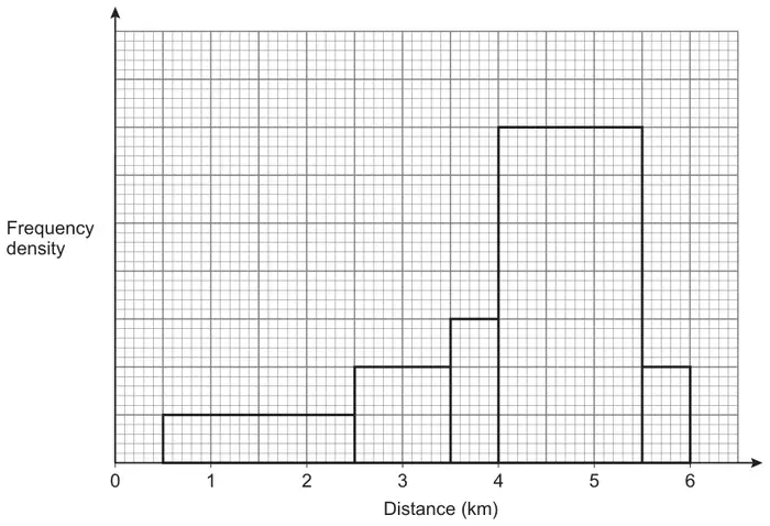
16 The distance, in kilometres, travelled from home to work by 340 individuals is shown in the histogram.

Histogram on a grid of frequency density against distance (km) from 0 to 6, with bars for 0.5 to 2.5, 2.5 to 3.5, 3.5 to 4, 4 to 5.5 and 5.5 to 6; the vertical axis has no scale
(a)
(i) Estimate the number of individuals who travel between 3 km and 5 km from home to work.

Fully justify your answer.

[4 marks]
(ii) Give one reason why your answer to part (a)(i) is only an estimate. [1 mark]
(b) The histogram shows that the data is skewed.

State the type of skewness.

[1 mark]
(c) Explain why frequency density is used in this histogram. [1 mark]

June 2024 Paper 3 Q14

AQACurrent spec5 marksData Processing

14 The annual cost of energy in 2021 for each of the 350 households in Village A can be modelled by a random variable £\(X\)

It is given that

\[\sum x = 945\,000 \qquad \sum x^2 = 2\,607\,500\,000\]
(a) Calculate the mean of \(X\). [1 mark]
(b) Calculate the standard deviation of \(X\). [2 marks]
(c) For households in Village B the annual cost of energy in 2021 has mean £3100 and standard deviation £325

Compare the annual cost of energy in 2021 for households in Village A and Village B. [2 marks]

June 2024 Paper 3 Q12

AQACurrent spec1 markData Processing

12 A random sample of 84 students was asked how many revision websites they had visited in the past month.

The data is summarised in the table below.

Number of websitesFrequency
01
14
218
316
45
537
62
71

Find the interquartile range of the number of websites visited by these 84 students.

Circle your answer. [1 mark]

  • 3
  • 4
  • 19
  • 42

June 2023 Paper 3 Q15

AQACurrent spec11 marksIncludes samplingData ProcessingDRVsLarge Data Set

15

(a) A random sample of eight cars was selected from the Large Data Set.

The masses of these cars, in kilograms, were as follows.

950989124714151506168018332040

It is given that, for the population of cars in the Large Data Set:

\[\begin{aligned}\text{lower quartile} &= 1167 \\ \text{median} &= 1393 \\ \text{upper quartile} &= 1570\end{aligned}\]
(i) It was decided to remove any of the masses which fall outside the following interval.\[\text{median} - 1.5 \times \text{interquartile range} \leqslant \text{mass} \leqslant \text{median} + 1.5 \times \text{interquartile range}\]

Show that only one of the eight masses in the sample should be removed. [3 marks]

(ii) Write down the statistical name for the mass that should be removed in part (a)(i). [1 mark]
(b) The table shows the probability distribution of the number of previous owners, \(N\), for a sample of cars taken from the Large Data Set.
\(n\)0123456 or more
\(\mathrm{P}(N = n)\)0.140.37\(0.9k\)0.25\(0.4k\)\(1.7k\)0

Find the value of \(\mathrm{P}(1 \leqslant N \lt 5)\) [4 marks]

(c) An expert team is investigating whether there have been any changes in CO2 emissions from all cars taken from the Large Data Set.

The team decided to collect a quota sample of 200 cars to reflect the different years and the different makes of cars in the Large Data Set.

(i) Using your knowledge of the Large Data Set, explain how the team can collect this sample. [2 marks]
(ii) Describe one disadvantage of quota sampling. [1 mark]

June 2022 Paper 3 Q18

AQACurrent spec11 marksData ProcessingNormal Distribution

18 In a particular year, the height of a male athlete at the Summer Olympics has a mean 1.78 metres and standard deviation 0.23 metres.

The heights of 95% of male athletes are between 1.33 metres and 2.22 metres.

(a) Comment on whether a normal distribution may be suitable to model the height of a male athlete at the Summer Olympics in this particular year. [3 marks]
(b) You may assume that the height of a male athlete at the Summer Olympics may be modelled by a normal distribution with mean 1.78 metres and standard deviation 0.23 metres.
(i) Find the probability that the height of a randomly selected male athlete is 1.82 metres. [1 mark]
(ii) Find the probability that the height of a randomly selected male athlete is between 1.70 metres and 1.90 metres. [1 mark]
(iii) Two male athletes are chosen at random.

Calculate the probability that both of their heights are between 1.70 metres and 1.90 metres. [1 mark]

(c) The summarised data for the heights, \(h\) metres, of a random sample of 40 male athletes at the Winter Olympics is given below.\[\sum h = 69.2 \qquad \sum (h - \bar{h})^2 = 2.81\]

Use this data to calculate estimates of the mean and standard deviation of the heights of male athletes at the Winter Olympics. [3 marks]

(d) Using your answers from part (c), compare the heights of male athletes at the Summer Olympics and male athletes at the Winter Olympics. [2 marks]

June 2022 Paper 3 Q15

AQACurrent spec3 marksIncludes samplingData Processing

15 Researchers are investigating the average time spent on social media by adults on the electoral register of a town.

They select every 100th adult from the electoral register for their investigation.

(a) Identify the population in their investigation. [1 mark]
(b)
(i) State the name of this method of sampling. [1 mark]
(ii) Describe one advantage of this sampling method. [1 mark]

June 2022 Paper 3 Q13

AQACurrent spec2 marksData ProcessingLarge Data Set

13 A reporter is writing an article on the CO2 emissions from vehicles using the Large Data Set.

The reporter claims that the Large Data Set shows that the CO2 emissions from all vehicles in the UK have declined every year from 2002 to 2016.

Using your knowledge of the Large Data Set, give two reasons why this claim is invalid. [2 marks]

June 2022 Paper 3 Q12

AQACurrent spec1 markData Processing

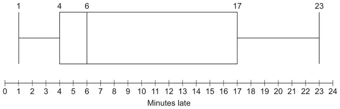
12 The box plot below shows summary data for the number of minutes late that buses arrived at a rural bus stop.

Box plot on a scale of minutes late from 0 to 24: minimum 1, lower quartile 4, median 6, upper quartile 17, maximum 23

Identify which term best describes the distribution of this data.

Circle your answer. [1 mark]

  • negatively skewed
  • normal
  • positively skewed
  • symmetrical

June 2025 Paper 2 Q13

OCR ACurrent spec6 marksData ProcessingLarge Data Set

13 The table shows excerpts from the census data for Age Structure in 2001 and 2011 for four Local Authorities (LAs) in South West England.

Age
LAYear0 to 45 to 78 to 910 to 141516 to 1718 to 1920 to 2425 to 29
Bournemouth2001
2011
8 171
10 275
5 103
4 862
3 579
2 999
8 752
8 399
1 681
1 732
3 255
3 517
4 289
6 141
12 901
17 130
11 785
14 935
City of Bristol2001
2011
23 453
29 633
12 887
14 371
8 794
8 466
22 871
21 703
4 791
4 408
8 690
8 922
11 812
13 711
34 798
44 371
32 001
40 752
Plymouth2001
2011
13 213
15 336
8 535
7 956
6 091
4 991
16 078
13 645
3 106
2 954
6 103
6 011
7 454
8 839
17 245
24 343
14 885
18 888
Swindon2001
2011
11 392
14 083
7 194
7 551
4 862
4 722
12 121
12 433
2 178
2 593
4 337
5 141
3 798
4 690
10 212
12 859
13 816
15 075

Researchers want to investigate whether there is evidence that those people who were residents in these LAs in 2001 were still resident in the same LAs in 2011.

(a) One researcher suggests that, for each of the LAs, they should compare the sum of the data for 2001 for Age 15 to 19 with the data for 2011 for Age 25 to 29.

Explain why this comparison is relevant. [1]
(b) The census data also includes data for the following age ranges:
Age
30 to 4445 to 5960 to 6465 to 7475 to 8485 to 8990 +
Explain why none of these data ranges are helpful in this context. [1]
(c) The data for one of these four LAs show that some of the 0 to 4 year olds living in that LA in 2001 are definitely no longer living there in 2011.

Explain which LA this is. [1]
(d) One of the researchers says that there has been little movement in or out of Bournemouth between 2001 and 2011 for those who were aged 5 to 7 in 2001.
(i) Use values from the table to show that this statement is not contradicted by the data. [2]
(ii) Explain why the statement is not necessarily correct. [1]

June 2025 Paper 2 Q9

OCR ACurrent spec11 marksData Processing

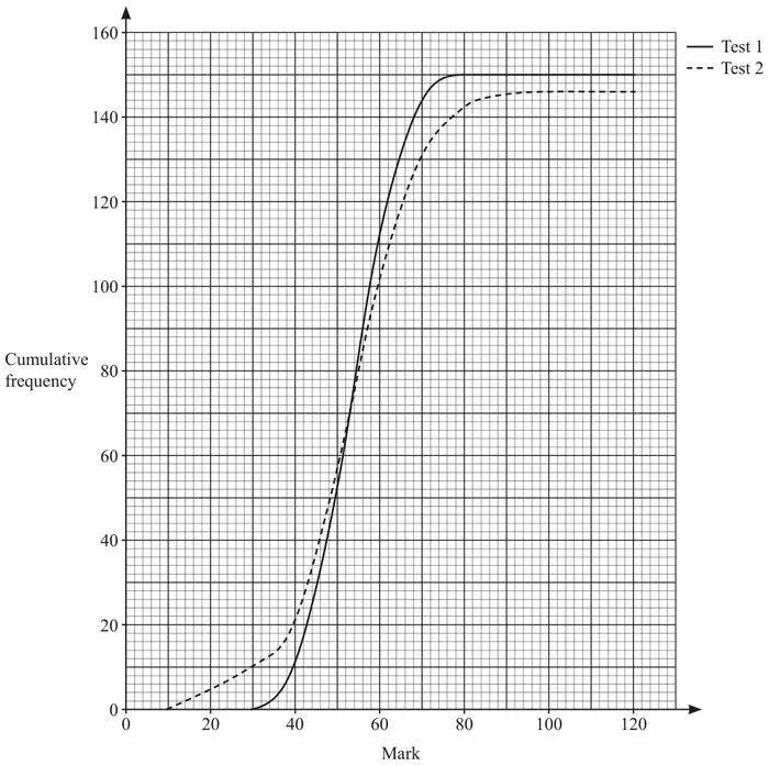
9 Some students in a year-group took two tests, Test 1 and Test 2. The maximum mark in each test was 120.
The students’ marks are illustrated in the cumulative frequency diagram. The diagram is reproduced in the Printed Answer Booklet.

Cumulative frequency diagram on graph paper: Mark from 0 to 120 on the horizontal axis, cumulative frequency from 0 to 160 on the vertical axis. A solid curve for Test 1 rises from 0 at mark 30 to level off at 150 by about mark 78. A dashed curve for Test 2 rises from 0 at mark 10 to level off at about 146. The curves cross near cumulative frequency 70, mark 53.
(a) All the students in the year-group took Test 1, but some students missed Test 2.

State the number of students who missed Test 2. [1]
(b) Find an estimate of the number of students whose marks for Test 1 were in the range 45 to 65 inclusive. [2]
(c) The final parts of the graphs are horizontal.

For Test 1, explain what this means about the results. [1]
(d) It is required that the number of students obtaining grade A* should be the same on both tests. The minimum mark for grade A* on Test 2 was 76.

Find the minimum mark for grade A* on Test 1. [1]

A teacher commented that the median marks on both tests were very similar. This suggests that, on average, the levels of difficulty on both tests were about the same.

(e) Use the cumulative frequency diagram to make another comparison between Test 1 and Test 2 about the easier questions on both papers. [1]

The marks for Test 1 are summarised in the table.

Test 1 mark\(\leqslant 29\)30–3940–4950–5960–6970–79\(\geqslant 80\)
Frequency01040603370
(f)
(i) Find estimates of the mean and standard deviation of the Test 1 marks. [3]
(ii) Use your answers to part (f)(i) to comment on whether there may be any outliers amongst the Test 1 marks. [2]

June 2024 Paper 2 Q12

OCR ACurrent spec4 marksIncludes samplingData ProcessingProbability

12 Ryan has to choose one student at random from a group of 11 students. Ryan makes the choice using a single throw of two fair, six-sided dice, together with the following table.

Total score on the two dice23456789101112
Student chosenABCDEFGHIJK
(a) Show that this sampling method is not random. [2]

Sasha suggests making the choice using a single throw of two fair, six-sided dice, together with the following table.

Scores on the two dice1, 11, 22, 11, 33, 11, 44, 11, 55, 11, 66, 1
Student chosenABCDEFGHIJK

Ryan says that a further instruction is needed to complete the method.

(b)
(i) Write a suitable further instruction. [1]
(ii) Using Sasha’s method, state the probability of choosing student E. [1]

June 2024 Paper 2 Q11

OCR ACurrent spec8 marksData Processing

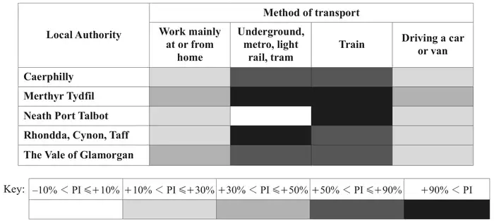
11 The chart below represents the percentage increases (PI) in the numbers of employees using four different methods of travel to work from 2001 and 2011, in five different Local Authorities (LAs) in Wales.

Shaded chart. Rows: Caerphilly, Merthyr Tydfil, Neath Port Talbot, Rhondda Cynon Taff, The Vale of Glamorgan. Columns (method of transport): Work mainly at or from home; Underground, metro, light rail, tram; Train; Driving a car or van. Each cell is shaded by a key of five PI bands: -10% to +10% (white), +10% to +30% (light grey), +30% to +50% (mid grey), +50% to +90% (dark grey), above +90% (black). Work from home: light, mid, light, light, mid. Underground etc: dark, black, white, black, dark. Train: dark, black, black, dark, dark. Driving: light, mid, light, light, light
(a)
(i) State, with a reason, which of the four methods of transport probably had the greatest overall percentage growth in these LAs between 2001 and 2011. [1]
(ii) Explain why your answer to part (a)(i) is not definite. [1]
(b) A student suggests that the chart can be used to estimate the total percentage change for these methods of transport in each individual LA.
Give two reasons why the student is likely to be wrong. [2]
(c) A student wants to investigate the trend from 2001 to 2011 in numbers using underground, metro, light rail or tram. The actual numbers of people using these methods in these LAs in 2001 were all less than 50 (and in one case was 4).
Explain why this means that the chart does not provide very helpful information for the student. [1]
(d) Let \(D\) denote the number of people in the Vale of Glamorgan whose usual method of travel to work is “Driving a car or van”, and let \(H\) denote the number of people in the Vale of Glamorgan who “Work mainly at or from home”.
Between 2001 and 2011 the increase in \(D\) was approximately 3.5 times the increase in \(H\).
Use this fact and the information in the chart to estimate the ratio \(D : H\) in 2001. [3]

June 2023 Paper 2 Q13

OCR ACurrent spec10 marksData ProcessingLarge Data Set

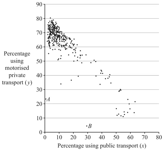
13 The scatter diagram uses information about all the Local Authorities (LAs) in the UK, taken from the 2011 census.

For each LA it shows the percentage (\(x\)) of employees who used public transport to travel to work and the percentage (\(y\)) who used motorised private transport.

“Public transport” includes train, bus, minibus, coach, underground, metro and light rail.
“Motorised private transport” includes car, van, motorcycle, scooter, moped, taxi and passenger in a car or van.

Scatter diagram of percentage using motorised private transport (y, 0 to 90) against percentage using public transport (x, 0 to 80): a dense cluster at x about 2 to 15, y about 55 to 80, with points trailing down to x about 50 to 63, y about 11 to 23; outlier A at about (1, 23) and outlier B at about (29, 4)
(a) Most of the points in the diagram lie on or near the line with equation \(x + y = k\), where \(k\) is a constant.
(i) Give a possible value for \(k\). [1]
(ii) Hence give an approximate value for the percentage of employees who either worked from home or walked or cycled to work. [1]
(b) The average amount of fuel used per person per day for travelling to work in any LA is denoted by F.
Consider the two groups of LAs where the percentages using motorised private transport are highest and lowest.
(i) Using only the information in the diagram, suggest, with a reason, which of these two groups will have greater values of F than the other group. [1]

A student says that it is not possible to give a reliable answer to part (b)(i) without some further information.

(ii) Suggest two kinds of further information which would enable a more reliable answer to be given. [2]
(c) Points \(A\) and \(B\) in the diagram are the most extreme outliers. Use their positions on the diagram to answer the following questions about the two LAs represented by these two points.
(i) The two LAs share a certain characteristic.
Describe, with a justification, this characteristic. [2]
(ii) The environments in these two LAs are very different.
Describe, with a justification, this difference. [2]
(d) A student says that it is difficult to extract detailed information from the scatter diagram.
Explain whether you agree with this criticism. [1]

June 2023 Paper 2 Q9

OCR ACurrent spec6 marksIncludes samplingBinomial DistributionData Processing

9 A school contains 500 students in years 7 to 11 and 250 students in years 12 and 13. A random sample of 20 students is selected to represent the school at a parents’ evening. The number of students in the sample who are from years 12 and 13 is denoted by \(X\).

(a) State a suitable binomial model for \(X\). [1]

Use your model to answer the following.

(b)
(i) Write down an expression for \(\mathrm{P}(X = x)\). [1]
(ii) State, in set notation, the values of \(x\) for which your expression is valid. [1]
(c) Find \(\mathrm{P}(5 \leqslant X \leqslant 9)\). [2]
(d) State one disadvantage of using a random sample in this context. [1]

June 2023 Paper 2 Q8

OCR ACurrent spec7 marksData Processing

8 The stem-and-leaf diagram shows the heights, in centimetres, of 15 plants.

02
10
24
30  2  4  9
41  2  4  7  9
53  7
62

Key: 2 | 5 means 25 cm.

(a) Draw a box-and-whisker plot to illustrate the data. [4]

A statistician intends to analyse the data, but wants to ignore any outliers before doing so.

(b) Discuss briefly whether there are any heights in the diagram which the statistician should ignore. [3]

June 2022 Paper 2 Q10

OCR ACurrent spec10 marksData ProcessingLarge Data Set

10 The table shows the age structure of usual residents of 18 Local Authorities (LAs) in the North West region of the UK in 2011.

Local AuthorityAge 0 to 17Age 18 to 24Age 25 to 64Age 65 and over
A26.20%9.06%51.81%12.92%
B23.32%8.99%52.32%15.37%
C22.24%8.96%52.56%16.23%
D22.67%8.10%53.27%15.96%
E20.70%7.77%54.77%16.76%
F18.14%6.51%51.13%24.21%
G18.96%14.20%48.51%18.33%
H19.06%14.79%52.12%14.04%
I25.15%9.04%51.16%14.65%
J22.93%8.81%52.22%16.04%
K21.48%13.98%50.82%13.73%
L23.98%9.20%52.26%14.56%
M21.67%11.19%52.94%14.19%
N17.82%6.01%51.93%24.23%
O22.83%7.30%53.86%16.01%
P21.76%8.28%54.03%15.93%
Q21.42%8.43%53.90%16.25%
R18.61%7.33%49.35%24.71%

Percentage of residents

(a) Without reference to any other columns, explain how you would use only the columns for the age ranges 0 to 17 and 18 to 24 to decide whether an LA might be one of the following.
(i) An LA that includes a university [1]
(ii) An LA that attracts young couples to live [1]
(iii) An LA that attracts retired people to live [1]
(b) Using your answers to part (a), identify the following.
(i) Four LAs that might include a university [1]
(ii) Three LAs that might be attractive to retired people [1]
(c) Explain why your answer to part (b)(ii), based only on the columns for the age ranges 0 to 17 and 18 to 24, may not be reliable. [1]
(d) The lower quartile, median and upper quartile of the percentages in the column “Age 65 and over” are 14.56%, 15.99% and 16.76% respectively.
Use this information to comment on your answers to part (b)(ii) and part (c). [2]

In a magazine article, a councillor plans to describe a typical LA in the North West region. He wants to quote the average percentage of residents aged 65 or over.

(e) The mean of the percentages in the column “Age 65 and over” is 16.90%.
Use this information, and the information given in part (d), to explain whether the median or the mean better represents the data in the column “Age 65 and over”. [2]

June 2022 Paper 2 Q9

OCR ACurrent spec14 marksData ProcessingNormal Distribution

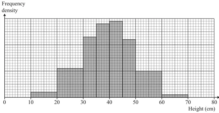
9 The heights, in centimetres, of a random sample of 150 plants of a certain variety were measured. The results are summarised in the histogram.

Histogram of frequency density against height in cm from 0 to 80, with bars for 10 to 20, 20 to 30, 30 to 35, 35 to 40, 40 to 45, 45 to 50, 50 to 60 and 60 to 70; the tallest bars are 35 to 40 and 40 to 45

One of the 150 plants is chosen at random, and its height, \(X\) cm, is noted.

(a) Show that \(\mathrm{P}(20 \lt X \lt 30) = 0.147\), correct to 3 significant figures. [2]

Sam suggests that the distribution of \(X\) can be well modelled by the distribution \(\mathrm{N}(40, 100)\).

(b)
(i) Give a brief justification for the use of the normal distribution in this context. [1]
(ii) Give a brief justification for the choice of the parameter values 40 and 100. [2]
(c) Use Sam’s model to find \(\mathrm{P}(20 \lt X \lt 30)\). [1]

Nina suggests a different model. She uses the midpoints of the classes to calculate estimates, \(m\) and \(s\), for the mean and standard deviation respectively, in centimetres, of the 150 heights. She then uses the distribution \(\mathrm{N}(m, s^2)\) as her model.

(d) Use Nina’s model to find \(\mathrm{P}(20 \lt X \lt 30)\). [4]
(e)
(i) Complete the table in the Printed Answer Booklet to show the probabilities obtained from Sam’s model and Nina’s model. [2]
\(x\)< 2020 to 3030 to 3535 to 4040 to 4545 to 5050 to 60> 60
Histogram0.0270.1470.1530.1870.1930.1470.1330.013
\(\mathrm{N}(40, 100)\)0.0230.1500.1910.1360.023
\(\mathrm{N}(m, s^2)\)0.0300.1530.1890.1300.023
(ii) By considering the different ranges of values of \(X\) given in the table, discuss how well the two models fit the original distribution. [2]

October 2021 Paper 2 Q13

OCR ACurrent spec7 marksData ProcessingLarge Data Set

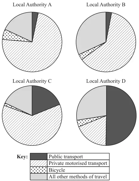
13 The four pie charts illustrate the numbers of employees using different methods of travel in four Local Authorities in 2011.

Four pie charts for Local Authorities A, B, C and D with key: public transport (dark), private motorised transport (hatched), bicycle (dotted), all other methods of travel (light grey). A: mostly private, small bicycle and very small public. B: mostly private, large other, very small bicycle and public. C: mostly private, about a fifth public, tiny bicycle. D: half public, rest other, private and a small bicycle
(a) State, with reasons, which of the four Local Authorities is most likely to be a rural area with many hills. [2]
(b) Explain why pie charts are more suitable for answering part (a) than bar charts showing the same data. [1]
(c) Two of the Local Authorities represent urban areas.
(i) State with a reason which two Local Authorities are likely to be urban. [2]
(ii) One urban Local Authority introduced a Park-and-Ride service in 2006. Users of this service drive to the edge of the urban area and then use buses to take them into the centre of the area. A student claims that a comparison of the corresponding pie charts for 2001 (not shown) and 2011 would enable them to identify which Local Authority this was.
State with a reason whether you agree with the student. [2]

October 2021 Paper 2 Q11

OCR ACurrent spec12 marksIncludes hypothesis testingIncludes samplingData ProcessingNormal Distribution

11 Zac is planning to write a report on the music preferences of the students at his college. There is a large number of students at the college.

(a) State one reason why Zac might wish to obtain information from a sample of students, rather than from all the students. [1]
(b) Amaya suggests that Zac should use a sample that is stratified by school year.
Give one advantage of this method as compared with random sampling, in this context. [1]

Zac decides to take a random sample of 60 students from his college. He asks each student how many hours per week, on average, they spend listening to music during term. From his results he calculates the following statistics.

MeanStandard deviationMedianLower quartileUpper quartile
21.04.2020.518.022.9
(c) Sundip tells Zac that, during term, she spends on average 30 hours per week listening to music.
Discuss briefly whether this value should be considered an outlier. [3]
(d) Layla claims that, during term, each student spends on average 20 hours per week listening to music. Zac believes that the true figure is higher than 20 hours. He uses his results to carry out a hypothesis test at the 5% significance level.
Assume that the time spent listening to music is normally distributed with standard deviation 4.20 hours.
Carry out the test. [7]

June 2025 Paper 2 Q15

OCR MEICurrent spec10 marksIncludes samplingCorrelation & RegressionData Processing

15 A personal trainer is investigating whether, in the general population, there is any association between resting pulse rate in beats per minute and mean hours per week spent running.

One week he collects a sample by asking 25 of his clients for the relevant data.

(a)
(i) State the name of the sampling technique used by the personal trainer. [1]
(ii) Explain why this sampling technique might introduce bias. [1]

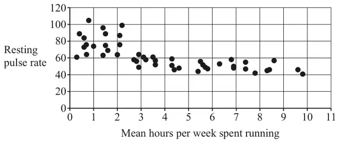
A biologist researching the same topic collects a random sample of size 47. She represents the data using the scatter diagram shown below.

Scatter diagram of resting pulse rate against mean hours per week spent running, 0 to 11 hours: higher, more spread pulse rates below about 2.5 hours and lower pulse rates (about 40 to 60) above
(b) Describe the association between resting pulse rate and mean hours per week spent running. [1]
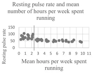
(c) The biologist identifies two distinct regions on the scatter diagram. Identify these regions on the copy of the scatter diagram in the Printed Answer Booklet by drawing an appropriate vertical line between them. [1]

According to medical research, the normal resting pulse rate for an adult is between 60 and 110 beats per minute.

The biologist separates the data into a group to the left of the vertical line on the scatter diagram and a group to the right of the vertical line on the scatter diagram. She calculates Spearman’s rank correlation coefficient, \(r_s\), and the associated \(p\)-value for each group.

The results are shown in the table.

Group\(r_s\)\(p\)-value
To the left of the vertical line0.209 360.419 98
To the right of the vertical line–0.613 490.000 31
(d) With reference to the two groups identified by the biologist and to the values in the table, explain what may be inferred about the association between resting pulse rate and mean number of hours per week spent running. [6]

June 2025 Paper 2 Q11

OCR MEICurrent spec7 marksBinomial DistributionData Processing

11 Apples are sold in packets of 4. Ling and Sam are investigating the frequency, \(f\), of the number of bruised apples in a packet, \(x\). They each collect a random sample of packets, note the number of bruised apples in each packet and draw a diagram to represent their data.

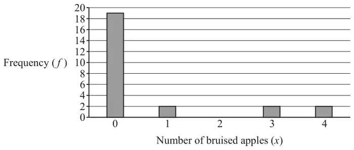
Ling’s results are shown in Table 11.1 and Fig. 11.1.

Table 11.1

\(x\)01234
\(f\)192022
Fig. 11.1: bar chart of frequency against number of bruised apples for Ling: 19, 2, 0, 2, 2 for x = 0 to 4
Fig. 11.1

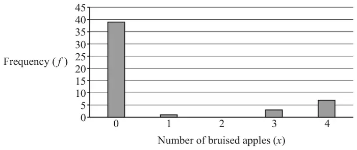
Sam’s results are shown in Table 11.2 and Fig. 11.2.

Table 11.2

\(x\)01234
\(f\)391037
Fig. 11.2: bar chart of frequency against number of bruised apples for Sam: 39, 1, 0, 3, 7 for x = 0 to 4
Fig. 11.2
(a) Explain why Sam’s diagram is likely to be a better representation of the true distribution of the number of bruised apples in a packet than Ling’s diagram. [1]
(b) Calculate the mean number of bruised apples per packet for Sam’s data. [1]

Sam thinks that the distribution of bruised apples may be modelled by a binomial distribution.

(c) Use your answer to part (b) to calculate the value of \(p\), the probability that an apple selected at random is bruised, for Sam’s model. [1]
(d) Calculate the theoretical frequency distribution of the number of bruised apples per packet for Sam’s model, giving your answers correct to 2 decimal places. [3]
(e) Comment on whether Sam’s model appears to be a good fit for the data. [1]

June 2025 Paper 2 Q10

OCR MEICurrent spec5 marksData ProcessingLarge Data Set

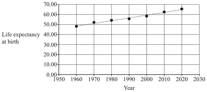
10 The pre-release material contains information about life expectancy at birth for countries of the world at 10-year intervals from 1960 until 2020.

The life expectancy at birth of the population of Sudan for this period, together with a line of best fit, is shown in Fig. 10.1.

Fig. 10.1: life expectancy at birth in Sudan plotted against year from 1960 to 2020, rising from about 48 to about 65, with a dotted line of best fit
Fig. 10.1

The equation of the line of best fit is \(L = 0.275X - 490\), where \(X\) is the year and \(L\) is the life expectancy at birth, measured in years.

(a) Use the equation of the line of best fit to estimate the life expectancy at birth in Sudan in 1975. [1]
(b) Explain whether this estimate is likely to be close to the true value of life expectancy at birth in Sudan in 1975. [1]
(c) Use your knowledge of the pre-release material to explain whether your answer to part (a) is likely to be a close approximation to the life expectancy at birth in the United Kingdom in 1975. [1]

The pre-release material also gives the median age of the population in countries of the world.

The table shows the median age of the population and the life expectancy at birth in 2020 for some countries in Africa.

CountryMedian ageLife expectancy at birth 2020
Nigeria18.655.02
Rwanda19.769.33
Saint Helena, Ascension and Tristan da Cunha43.2#N/A
Sao Tome and Principe19.370.58
Senegal19.468.21
(d) Explain how the data in the table should be cleaned before these data can be included in a scatter diagram for life expectancy at birth against median age for the countries in Africa. [1]

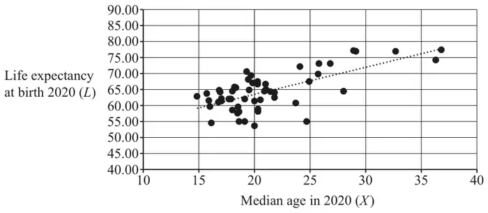
Fig. 10.2 shows a scatter diagram for the cleaned data of life expectancy at birth against median age in 2020 for the countries in Africa. It also shows a line of best fit.

The product moment correlation coefficient for these data is 0.680.

Fig. 10.2: scatter diagram of life expectancy at birth 2020 (L) against median age in 2020 (X) for African countries, median ages about 15 to 37, with a dotted line of best fit
Fig. 10.2
(e) A student decides to use the line of best fit to estimate the life expectancy at birth in 2020 for Saint Helena, Ascension and Tristan da Cunha.

Explain whether this estimate is likely to be reliable. [1]

June 2025 Paper 2 Q8

OCR MEICurrent spec4 marksData Processing

8 At the end of the summer term all 120 Year 8 pupils at Oakmount College sit the same mathematics examination.

The marks obtained by the pupils in the 2024 examination are summarised in the table.

Mark11–2021–3031–4041–5051–6061–7071–8081–9091–100
Frequency812241723161073

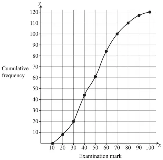
Software is used to produce the cumulative frequency curve shown below.

Cumulative frequency curve of examination mark, from (10, 0) through (20, 8), (30, 20), (40, 44), (50, 61), (60, 84), (70, 100), (80, 110), (90, 117) to (100, 120)
(a) It is proposed that the 30 pupils with the best marks in the examination are placed in the top set in Year 9.

Use the copy of the cumulative frequency curve in the Printed Answer Booklet to determine an estimate of the lowest mark needed for a pupil to be placed in the top set. [2]
(b) The person who will teach the top set states that pupils will not manage in this class unless they obtain at least 75 marks in the examination.

Use the copy of the cumulative frequency curve in the Printed Answer Booklet to determine an estimate of how many pupils will be in the top set if the lowest mark is set at 75. [2]

June 2024 Paper 2 Q15

OCR MEICurrent spec17 marksIncludes hypothesis testingData ProcessingNormal Distribution

15 Bottles of Fizzipop nominally contain 330 ml of drink. A consumer affairs researcher collects a random sample of 55 bottles of Fizzipop and records the volume of drink in each bottle.

Summary statistics for the researcher’s sample are shown in the table.

\(n\)55
\(\sum x\)18 535
\(\sum x^2\)6 247 066.6
(a)
(i) Calculate the mean volume of drink in a bottle of Fizzipop. [1]
(ii) Show that the standard deviation of the volume of drink in a bottle of Fizzipop is 3.78 ml. [1]

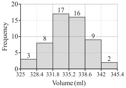
The researcher uses software to produce a histogram with equal class intervals, which is shown below.

Histogram of volume in ml with equal class widths of 3.4 from 325 to 345.4; frequencies 3, 8, 17, 16, 9, 2
(b) Explain why the researcher decides that the Normal distribution is a suitable model for the volume of drink in a bottle of Fizzipop. [2]
(c) Use your answers to parts (a) and (b) to determine the expected number of bottles which contain less than 330 ml in a random sample of 100 bottles. [3]

In order to comply with new regulations, no more than 1% of bottles of Fizzipop should contain less than 330 ml.

The manufacturer decides to meet the new regulations by adjusting the manufacturing process so that the mean volume of drink in a bottle of Fizzipop is increased.

The standard deviation is unaltered.

(d) Determine the minimum mean volume of drink in a bottle of Fizzipop which should ensure that the new regulations are met. Give your answer to 3 significant figures. [3]

The mean volume of drink in a bottle of Fizzipop is set to 340 ml. After several weeks the quality control manager suspects the mean volume may have reduced. She collects a random sample of 100 bottles of Fizzipop.

The mean volume of drink in a bottle in the sample is found to be 339.37 ml.

(e) Assuming the standard deviation is unaltered, conduct a hypothesis test at the 5% level to determine whether there is any evidence to suggest that the mean volume of drink in a bottle of Fizzipop is less than 340 ml. [7]

June 2024 Paper 2 Q14

OCR MEICurrent spec8 marksData ProcessingLarge Data Set

14 The pre-release material contains medical data for 103 women and 97 men.

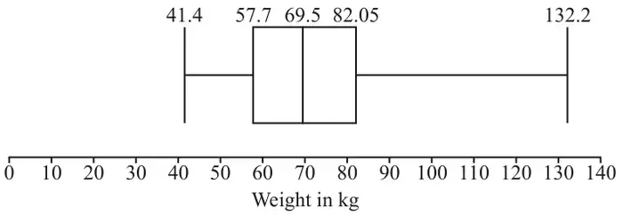
The boxplot represents the weights in kg of 101 of the women from the pre-release material.

Boxplot of weight in kg on a scale from 0 to 140: minimum 41.4, lower quartile 57.7, median 69.5, upper quartile 82.05, maximum 132.2
(a) Use your knowledge of the pre-release material to give a reason why the weights of all 103 women were not included in the diagram. [1]
(b) Determine the range of values in which any outliers lie. [3]
(c) Use your knowledge of the pre-release material to explain whether these outliers should be removed from any further analysis of the data. [1]
(d) The median weight of men in the sample was found to be 79.9 kg.
Explain what may be inferred by comparing the median weight of men with the median weight of women. [1]

Further analysis of the weights of both men and women is carried out. The table shows some of the results.

meanstandard deviation
men82.69 kg19.98 kg
women72.5 kg19.95 kg
(e) Use the information in the table to make two inferences about the distribution of the weights of men compared with the distribution of the weights of women. [2]

June 2024 Paper 2 Q9

OCR MEICurrent spec4 marksIncludes samplingData Processing

9 A teacher is investigating how pupils travel to and from school each day. Pupils can either travel by bus, train, car, bicycle or walk.

The teacher decides to collect a sample of size 60 for the investigation.

(a) The teacher lives in a village 10 miles away from the school.
Explain how collecting a sample which just consists of pupils who live in the same village as the teacher might introduce bias. [1]

The table below shows how many students there are in each year.

Year 7Year 8Year 9Year 10Year 11
86105107101101
(b) The teacher decides to use the method of proportional stratified sampling.
Calculate the number of pupils in the sample who are in Year 9. [2]

The teacher generates a sample of 10 pupils from the 86 in Year 7 by listing them in alphabetical order and selecting the first name on the list and every ninth name thereafter.

(c) Explain whether this method will generate a simple random sample of the pupils who travel in Year 7. [1]

June 2024 Paper 2 Q3

OCR MEICurrent spec3 marksData Processing

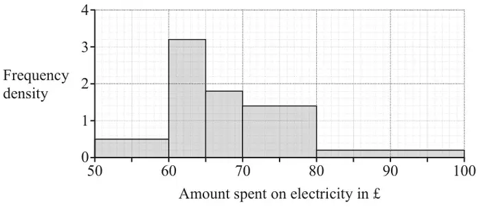
3 The histogram shows the amount spent on electricity in pounds in a sample of households in March 2023.

Histogram of amount spent on electricity in £ with frequency density: 50 to 60 at 0.5, 60 to 65 at 3.2, 65 to 70 at 1.8, 70 to 80 at 1.4, 80 to 100 at 0.2
(a) Describe the shape of the distribution. [1]

A total of 16 households each spent between £60 and £65 on electricity.

(b) Determine how many households were in the sample altogether. [2]

June 2023 Paper 2 Q18

OCR MEICurrent spec11 marksData ProcessingNormal Distribution

18 Riley is investigating the daily water consumption, in litres, of his household.
He records the amount used for a random sample of 120 days from the previous twelve-month period.

The daily water consumption, in litres, is denoted by \(x\).

Summary statistics for Riley’s sample are given below.

\(\sum x = 31164.7 \quad \sum x^2 = 8\,101\,050.91 \quad n = 120\)

(a) Calculate the sample mean giving your answer correct to 3 significant figures. [1]

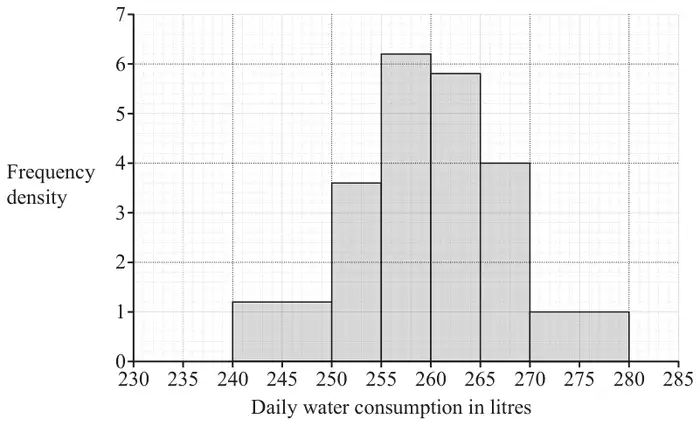
Riley displays the data in a histogram.

Histogram of daily water consumption in litres (230 to 285) with frequency density: 240–250 at 1.2, 250–255 at 3.6, 255–260 at 6.2, 260–265 at 5.8, 265–270 at 4, 270–280 at 1
(b) Find the number of days on which between 255 and 260 litres were used. [1]
(c) Give two reasons why a Normal distribution may be an appropriate model for the daily consumption of water. [2]

Riley uses the sample mean and the sample variance, both correct to 3 significant figures, as parameters of a Normal distribution to model the daily consumption of water.

(d) Use Riley’s model to calculate the probability that on a randomly chosen day the household uses less than 255 litres of water. [2]
(e) Calculate the probability that the household uses less than 255 litres of water on at least 5 days out of a random sample of 28 days. [2]

The company which supplies the water makes charges relating to water consumption which are shown in the table below.

Standing charge per day in pence7.8
Charge per litre in pence0.18
(f) Adapt Riley’s model for daily water consumption to model the daily charges for water consumption. [3]

June 2023 Paper 2 Q9

OCR MEICurrent spec5 marksIncludes samplingData ProcessingLarge Data Set

9 The pre-release material contains information concerning the median income of taxpayers in different areas of London. Some of the data for Camden is shown in the table below. The years quoted in this question refer to the end of the financial years used in the pre-release material. For example, the year 2004 in the table refers to the year 2003/04 in the pre-release material.

Year20042005200620072008200920102011
Median Income in £21 30023 20024 20025 90026 900#N/A28 40029 400
(a) Explain whether these data are a sample or a population of Camden taxpayers. [1]

A time series for the data is shown below.

Time series titled Median income of taxpayers in Camden 2004–2011: median income in pounds (0 to 35 000) against year (2003 to 2012), points for 2004 to 2008, 2010 and 2011 rising from about 21 300 to 29 400, with no point for 2009

The LINEST function on a spreadsheet is used to formulate the following model for the data:

\(I = 1115Y - 2\,212\,950\), where \(I =\) median income of taxpayers in £ and \(Y =\) year.

(b) Use this model to find an estimate of the median income of taxpayers in Camden in 2009. [1]
(c) Give two reasons why this estimate is likely to be close to the true value. [2]

The median income of taxpayers in Croydon in 2009 is also not available.

(d) Use your knowledge of the pre-release material to explain whether the model used in part (b) would give a reasonable estimate of the missing value for Croydon. [1]

June 2023 Paper 2 Q8

OCR MEICurrent spec6 marksIncludes samplingData Processing

8 A garden centre stocks coniferous hedging plants. These are displayed in 10 rows, each of 120 plants. An employee collects a sample of the heights of these plants by recording the height of each plant on the front row of the display.

(a) Explain whether the data collected by the employee is a simple random sample. [1]

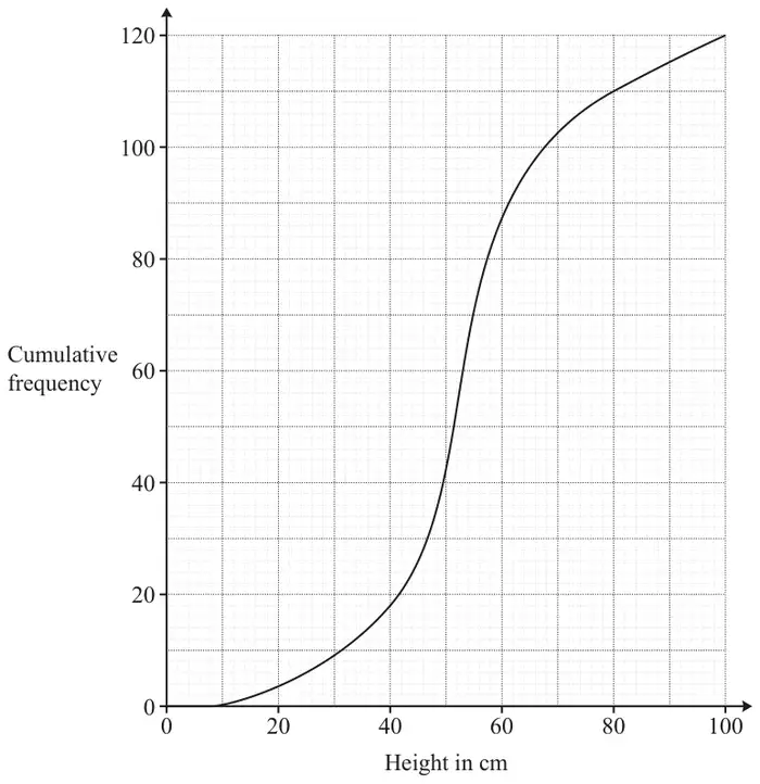
The data are shown in the cumulative frequency curve below.

Cumulative frequency curve: cumulative frequency (0 to 120) against height in cm (0 to 100), rising slowly from about 8 cm, steeply between 40 and 60 cm, and reaching 120 at 100 cm

The owner states that at least 75% of the plants are between 40 cm and 80 cm tall.

(b) Show that the data collected by the employee supports this statement. [4]
(c) Explain whether all samples of 120 plants would necessarily support the owner’s statement. [1]

June 2022 Paper 2 Q9

OCR MEICurrent spec9 marksData ProcessingNormal Distribution

9 At the beginning of the academic year, all the pupils in year 12 at a college take part in an assessment. Summary statistics for the marks obtained by the 2021 cohort are given below.

\(n = 205\quad \sum x = 23\,042\quad \sum x^2 = 2\,591\,716\)

Marks may only be whole numbers, but the Head of Mathematics believes that the distribution of marks may be modelled by a Normal distribution.

(a) Calculate
  • The mean mark
  • The variance of the marks
[2]
(b) Use your answers to part (a) to write down a possible Normal model for the distribution of marks. [2]

One candidate in the cohort scored less than 105.

(c) Determine whether the model found in part (b) is consistent with this information. [3]
(d) Use the model to calculate an estimate of the number of candidates who scored 115 marks. [2]

June 2022 Paper 2 Q8

OCR MEICurrent spec3 marksIncludes samplingData Processing

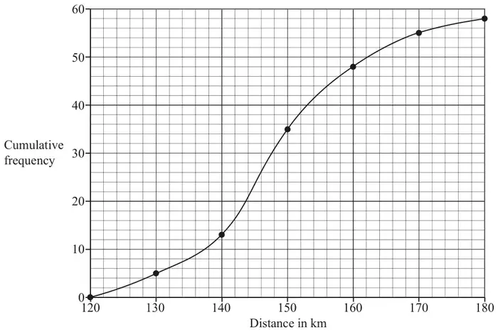
8 Ali conducted an investigation into the distances ridden by those members of a cycling club who rode at least 120 km in a training week. She grouped all the distances into intervals of length 10 km and then constructed a cumulative frequency diagram, which is shown below.

Cumulative frequency diagram, distance in km from 120 to 180: points (120, 0), (130, 5), (140, 13), (150, 35), (160, 48), (170, 55), (180, 58) joined by a smooth curve
(a) Explain whether the data Ali used is a sample or a population. [1]

The club is taking part in a competition. Eight team members and one reserve are to be selected. The club captain decides that the team members should be those cyclists who rode the furthest during the training week, and that the reserve should be the cyclist who rode the next furthest.

(b) Use the graph to estimate the shortest distance cycled by a team member. [1]

The captain’s best friend rode 156 km in the training week and was selected as reserve. Ali complained that this was unjustifiable.

(c) Explain whether there is sufficient evidence in the diagram to support Ali’s complaint. [1]

June 2022 Paper 2 Q7

OCR MEICurrent spec2 marksData Processing

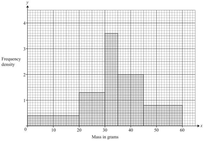
7 Kareem bought some tomatoes. He recorded the mass of each tomato and displayed the results in a histogram, which is shown below.

Histogram of mass in grams (x) against frequency density (y): 0–20 height 0.4, 20–30 height 1.3, 30–35 height 3.6, 35–45 height 2, 45–60 height 0.8

Determine how many tomatoes Kareem bought. [2]

October 2021 Paper 2 Q13

OCR MEICurrent spec7 marksBinomial DistributionData Processing

13 At a certain factory Christmas tree decorations are packed in boxes of 10.

The quality control manager collects a random sample of 100 boxes of decorations and records the number of decorations in each box which are damaged.

His results are displayed in Fig. 13.1.

Number of damaged decorations012345 or more
Number of boxes1935281350

Fig. 13.1

(a) Calculate
  • the mean number of damaged decorations per box,
  • the standard deviation of the number of damaged decorations per box.
[2]

It is believed that the number of damaged decorations in a box of 10, \(X\), may be modelled by a binomial distribution such that \(X \sim \mathrm{B}(n, p)\).

(b) State suitable values for \(n\) and \(p\). [1]
(c) Use the binomial model to complete the copy of Fig. 13.2 in the Printed Answer Booklet, giving your answers correct to 1 decimal place. [3]
Number of damaged decorations012345 or more
Observed number of boxes1935281350
Expected number of boxes

Fig. 13.2

(d) Explain whether the model is a good fit for these data. [1]

October 2021 Paper 2 Q12

OCR MEICurrent spec7 marksData ProcessingLarge Data Set

12 Fig. 12.1 shows an excerpt from the pre-release material.

ABCDEFGH
1SexAgeMaritalWeightHeightBMIWaistPulse
2Female34Married60.3173.420.0582.574
3Female85Widowed64.7161.224.9#N/A#N/A
4Female48Divorced100.6171.434.24105.692
5Male61Married70.9169.524.6892.270
6Male68Divorced96.8181.629.35112.968

Fig. 12.1

There was no data available for cell H3.

(a) Explain why #N/A is used when no data is available. [1]

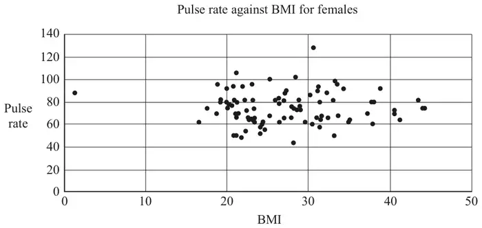
Fig. 12.2 shows a scatter diagram of pulse rate against BMI (Body Mass Index) for females.
All the available data was used.

Fig. 12.2: scatter diagram titled Pulse rate against BMI for females; BMI 0 to 50, pulse rate 0 to 140; most points have BMI 17 to 45 and pulse 44 to 106, with one point at about (1.3, 88) and one at about (30.6, 128)
Fig. 12.2

There are two outliers on the diagram.

(b) On the copy of Fig. 12.2 in the Printed Answer Booklet, ring these outliers. [1]
(c) Use your knowledge of the pre-release material to explain whether either of these outliers should be removed. [2]
(d) State whether the diagram suggests there is any correlation between pulse rate and BMI. [1]

The product moment correlation coefficient between waist measurement, \(w\), in cm and BMI, \(b\), for females was found to be 0.912. All the available data was used.

(e) Explain why a model of the form \(w = mb + c\) for the relationship between waist measurement and BMI is likely to be appropriate. [1]

The LINEST function on a spreadsheet gives \(m = 2.16\) and \(c = 33.0\).

(f) Calculate an estimate of the value for cell G3 in Fig. 12.1. [1]

October 2021 Paper 2 Q10

OCR MEICurrent spec9 marksIncludes samplingData Processing

10 Ben has an interest in birdwatching.

For many years he has identified, at the start of the year, 32 days on which he will spend an hour counting the number of birds he sees in his garden.

He divides the year into four using the Meteorological Office definition of seasons. Each year he uses stratified sampling to identify the 32 days on which he will count the birds in his garden, drawn equally from the four seasons.

Ben’s data for 2019 are shown in the stem and leaf diagram in Fig. 10.1.

03 5 9 9 9
10 0 1 1 2 4 5 6 7 8 9
20 1 4 6 7 8 9
30 0 2 3
40 3 6
51
60

Fig. 10.1

(a) Suggest a reason why Ben chose to use stratified sampling instead of simple random sampling. [1]
(b) Describe the shape of the distribution. [1]
(c) Explain why the mode is not a useful measure of central tendency in this case. [1]
(d) For Ben’s sample, determine
  • the median,
  • the interquartile range.
[3]

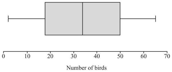
Ben found a boxplot for the sample of size 32 he collected using stratified sampling in 2015.

The boxplot is shown in Fig. 10.2.

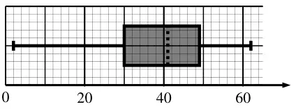
Fig. 10.2: boxplot of number of birds on a scale 0 to 70: minimum about 2, lower quartile about 18, median about 34, upper quartile 50, maximum about 65
Fig. 10.2

In 2016 Ben replaced his hedge with a garden fence.
Ben now believes that

  • he sees fewer birds in his garden,
  • the number of birds he sees in his garden is more variable.
(e) With reference to Fig. 10.2 and your answer to part (d), comment on whether there is any evidence to support Ben’s belief. [2]

Jane says she can tell that the data for 2015 is definitely uniformly distributed by looking at the boxplot.

(f) Explain why Jane is wrong. [1]

October 2020 Paper 2 Q9

OCR MEICurrent spec9 marksIncludes hypothesis testingIncludes samplingData ProcessingNormal Distribution

9 A company supplies computers to businesses. In the past the company has found that computers are kept by businesses for a mean time of 5 years before being replaced. Claud, the manager of the company, thinks that the mean time before replacing computers is now different.

(a) Describe how Claud could obtain a cluster sample of 120 computers used by businesses the company supplies. [1]

Claud decides to conduct a hypothesis test at the 5% level to test whether there is evidence to suggest that the mean time that businesses keep computers is not 5 years. He takes a random sample of 120 computers. Summary statistics for the length of time computers in this sample are kept are shown in Fig. 9.

Statistics
n120
Mean4.8855
σ2.6941
s2.7054
Σx586.2566
Σx23735.1475
Min0.1213
Q12.5472
Median4.8692
Q37.0349
Max9.9856

Fig. 9

(b) In this question you must show detailed reasoning.
  • State the hypotheses for this test, explaining why the alternative hypothesis takes the form it does.
  • Use a suitable distribution to carry out the test.
[8]

October 2020 Paper 2 Q8

OCR MEICurrent spec12 marksIncludes samplingData ProcessingNormal Distribution

8 Rosella is carrying out an investigation into the age at which adults retire from work in the city where she lives. She collects a sample of size 50, ensuring this comprises of 25 randomly selected retired men and 25 randomly selected retired women.

(a) State the name of the sampling method she uses. [1]

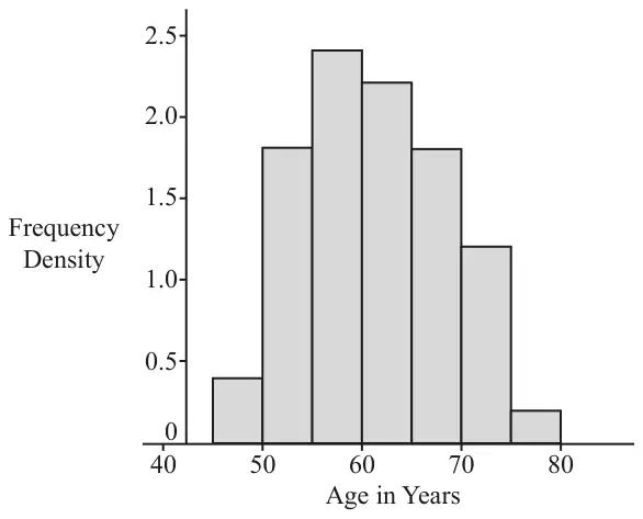
Fig. 8.1 shows the data she obtains in a frequency table and Fig. 8.2 shows these data displayed in a histogram.

Age in years at retirement45 –50 –55 –60 –65 –70 –75 – 80
Frequency density0.41.82.42.21.81.20.2

Fig. 8.1

Fig. 8.2: histogram of frequency density against age in years, bars from 45 to 80 with heights 0.4, 1.8, 2.4, 2.2, 1.8, 1.2, 0.2
Fig. 8.2
(b) How many people in the sample are aged between 50 and 55? [1]

Rosella obtains a list of the names of all 4960 people who have retired in the city during the previous month.

(c) Describe how Rosella could collect a sample of size 200 from her list using
  • systematic sampling such that every item on the list could be selected,
  • simple random sampling.
[4]

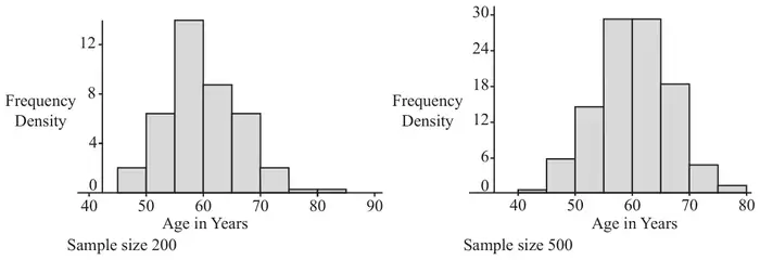
Rosella collects two simple random samples, one of size 200 and one of size 500, from her list. The histograms in Fig. 8.3 show the data from the sample of size 200 on the left and the data from the sample of 500 on the right.

Fig. 8.3: two histograms of frequency density against age in years, for the sample of size 200 (ages 45 to 85) and the sample of size 500 (ages 40 to 80); both are roughly symmetrical and bell-shaped, peaking between 55 and 65
Fig. 8.3
(d) With reference to the histograms shown in Fig. 8.2 and Fig. 8.3, explain why it appears reasonable to model the age of retirement in this city using the Normal distribution. [1]

Summary statistics for the sample of 500 are shown in Fig. 8.4.

Statistics
n500
Mean60.0515
σ6.5717
s6.5783
Σx30025.7601
Σx21824686.322
Min36.0793
Q155.2573
Median59.9202
Q364.4239
Max81.742

Fig. 8.4

(e) Use an appropriate Normal model based on the information in Fig. 8.4 to estimate the number of people aged over 65 who retired in the city in the previous month. [4]
(f) Identify a limitation in using this model to predict the number of people aged over 65 retiring in the following month. [1]

October 2020 Paper 2 Q4

OCR MEICurrent spec2 marksData Processing

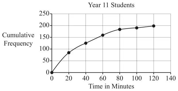
4 Fig. 4 shows a cumulative frequency diagram for the time spent revising mathematics by year 11 students at a certain school during a week in the summer term.

Fig. 4: cumulative frequency curve for Year 11 students through (0, 0), (20, 85), (40, 125), (60, 158), (80, 183), (100, 189), (120, 197); time in minutes from 0 to 140
Fig. 4
(a) Use the diagram to estimate the median time spent revising mathematics by these students. [1]

A teacher comments that 90% of the students spent less than an hour revising mathematics during this week.

(b) Determine whether the information in the diagram supports this comment. [1]