4. Kay is studying the variables Daily Total Sunshine (\(x\)) and Daily Total Rainfall (\(y\)) from the large data set for Leeming in 2015
Kay starts with 5th May and then selects every 10th day thereafter.
(a) State the name of the sampling technique Kay uses. (1)
Kay wants to find the regression line of \(y\) on \(x\) for these data.
(b) Using your knowledge of the large data set, explain how Kay might need to clean these data before finding the equation of the regression line. (1)
The equation of the regression line Kay finds is \(y = 0.741 + 0.199x\)
(c) Using your knowledge of the large data set,
(i) state the units of the gradient of the regression line,
(ii) give an interpretation of the \(y\)-intercept of the regression line. (2)
Kay’s teacher claimed that the greater the amount of sunshine in a day the lower the amount of rain there should be.
(d) State, giving a reason, whether the teacher’s claim is true for Kay’s data. (1)
The teacher used all the data for these variables from the large data set for Leeming in 2015, as a sample. The teacher calculated the product moment correlation coefficient for \(x\) and \(y\) to be \(-0.160\)
In a suitable test to determine whether there is evidence to support the teacher’s claim, the \(p\)-value was 0.015
(e) Using a 5% level of significance, state the hypotheses and conclusion for this test. (2)
(f) For the test in part (e) describe
(i) the sample,
(ii) a possible population. (2)
Mark scheme (a)
Scheme
Marks
AO
Systematic (sampling)
B1
1.2
(1)
Notes
B1: for systematic (ignore other non-contradictory descriptions). Condone misspelling. If a clear choice is given e.g. stratified or systematic we take the final answer.
Mark scheme (b)
Scheme
Marks
AO
The (Daily Total) Rainfall data may contain “tr” entries (these will need a suitable value substituted before calculations can take place.)
B1
2.4
(1)
Notes
B1: for mention of “tr” or “trace” entries in rain(fall) [ or \(y\)] data. Ignore “n/a”. Ignore any comment about what to do with trace.
Mark scheme (c)
Scheme
Marks
AO
(i) mm/h (o.e.) e.g. \(\mathrm{mm\,h^{-1}}\) or \(\mathrm{mm\,hrs^{-1}}\) or \(\dfrac{\text{mm}}{\text{hours}}\)
B1
1.1b
(ii) When there is no sun(shine) there is (on average) 0.7(41) (mm) of rain or the amount of rain when there is no sun(shine) (o.e.)
B1
2.4
(2)
Notes
(i) B1: for mm/h or equivalent in words.
(ii) B1: for the idea of amount of rain when no sun. “Minimum rain” is B0 Don’t need value or units but if given must be correct or consistent with (i)
Mark scheme (d)
Scheme
Marks
AO
e.g. Not consistent (since); Kay’s line says positive correlation or gradient or regression coefficient or regression line or 0.199 is positive
B1
2.4
(1)
Notes
B1: for a suitable reason and saying not consistent (o.e.) e.g. “false” or “untrue” or “no” Reason only needs to be about the line and may be a description e.g. as \(x\) increases \(y\) increases or at least 2 values of \(x\) substituted and \(y\) values evaluated
[\(p\)-value < 5% so significant result] there is evidence to support the teacher’s claim
B1
2.2b
(2)
Notes
B1: for both hypotheses correct in terms of \(\rho\) (condone attempt at \(\rho\) that looks like \(p\))
B1: for a correct conclusion in context with no contradiction. Using words “support” and “teacher’s claim” or “negative correlation” and “sun or \(x\)” and “rain or \(y\)” [If a comparison is given it must be \(0.015 < 0.05\)]
Mark scheme (f)
Scheme
Marks
AO
(i) The sample is rainfall (\(y\)) and sunshine (\(x\)) for May~Oct in (Leeming) in 2015
B1
1.1b
(ii) e.g. (rainfall and sunshine) for: (Leeming) for all of 2015, or Leeming anytime (not just May~Oct) or Leeming for May~October for other years too or May~Oct in UK etc
B1
3.3
(2)
(9 marks)
Notes
(i) B1: for recognising that all the data/days for these variables in LDS for 2015 is the sample. Condone omitting “Leeming” B0 for “sunshine and rainfall for Leeming in 2015” It could be the population.
(ii) B1: for a suitable attempt to describe a population. The teacher’s sample must be a subset.
3. Ming is studying the large data set for Perth in 2015
He intended to use all the data available to find summary statistics for the Daily Mean Air Temperature, \(x\) °C. Unfortunately, Ming selected an incorrect variable on the spreadsheet. This incorrect variable gave a mean of 5.3 and a standard deviation of 12.4
(a) Using your knowledge of the large data set, suggest which variable Ming selected. (1)
The correct values for the Daily Mean Air Temperature are summarised as
(b) Calculate the mean and standard deviation for these data. (3)
One of the months from the large data set for Perth in 2015 has
mean \(\bar{x} = 19.4\)
standard deviation \(\sigma_x = 2.83\)
for Daily Mean Air Temperature.
(c) Suggest, giving a reason, a month these data may have come from. (2)
Mark scheme (a)
Scheme
Marks
AO
Rain[fall] (allow [Mean] Windspeed)
B1
1.2
(1)
Notes
Answers may appear next to the question.
B1 for Rain[fall] or precipitation (e.g. allow Daily Total [or Mean or max] Rainfall etc) (or allow Mean Windspeed or just “windspeed” BUT not max windspeed or “gust”) If they give more than one answer we take the last one. (NB Actual windspeed mean is 8.2, sd 2.38. No other quantitative variables available)
Mark scheme (b)
Scheme
Marks
AO
[\(\bar{x} =\)] \(15.2239\ldots =\) awrt 15.2
B1
1.1b
\(\sigma_x = \sqrt{\dfrac{44\,695.4}{184} - \text{``}15.22..\text{''}^2}\) or \(\sqrt{11.1(422\ldots)}\)
M1
1.1b
\(= 3.33800\ldots\) awrt 3.34
A1
1.1b
(3)
Notes
B1 for awrt 15.2 (Do not accept fractions or mixed numbers)
M1 for a correct expression including square root (ft their mean) May be implied by an answer of 3.3 or better.
A1 for awrt 3.34 [Allow \(s = 3.3471\ldots\) i.e. awrt 3.35 if correct formula/expression is seen]
Mark scheme (c)
Scheme
Marks
AO
Mean is higher than average OR a summer/spring month If they say winter/autumn they must explain that these are hotter months for Perth.
M1
2.4
[Perth is southern hemisphere or Australia so latest available] month is Oct
A1cso
2.2b
(2)
(6 marks)
Notes
If answer in (b)(i) \(\gt 19.4\) and an attempt is made in (c) please send to review.
M1 for a reason mentioning that mean or temperature is higher (o.e.) e.g. it is a warmer/hotter month is OK or sight of \(19.4 \gt\) (their) 15.2 Only ft their 15.2 if it is less than 19.4 OR suggesting a summer/spring month. Ignore incorrect statements that are irrelevant or don’t contradict For incorrect statements that contradict score M0
A1cso dep on M1 scored for inferring October Must choose just October not a range like August~October (NB actual mean for Sep is 15.6 and sd 3.19 and this scores A0) Can accept for example “high mean so December” for M1A0
SC M1A1 for “October since Perth is in the southern hemisphere/Australia” M1A0 for “Sep or Nov or Dec or Jan or Feb and “Perth is in the southern hemisphere/Australia” M0A0 just “Perth is in the southern hemisphere/Australia” without a month M0A0
20 The oxides of nitrogen emissions, \(F\) g/km, of a car registered in 2000 can be modelled by a normal distribution with mean 0.41 and standard deviation 0.07
(a) Find \(\mathrm{P}(F \lt 0.39)\) [1 mark]
(b) Find \(\mathrm{P}(0.3 \lt F \lt 0.5)\) [1 mark]
(c)
(i) Find \(\mathrm{P}(F \gt 0.6)\) [1 mark]
(ii) Explain why \(\mathrm{P}(F \geqslant 0.6) = \mathrm{P}(F \gt 0.6)\) in this model. [2 marks]
(d) The oxides of nitrogen emissions, \(F\) g/km, of a car in 2010 can be modelled by a normal distribution with mean 0.36 and standard deviation 0.09
Compare the oxides of nitrogen emissions in 2000 with those in 2010.
[2 marks]
(e) A researcher collected data on the oxides of nitrogen emissions from the Large Data Set for cars registered in 2002 and 2016.
The researcher cleaned the data by removing the details for some cars.
Using your knowledge of the Large Data Set, give one reason why the researcher cleaned the data.
[1 mark]
(f) The researcher wished to make a comparison between the oxides of nitrogen emissions for a sample of Nissan cars in their local town from 2016 with the data from all cars registered in the same year in the Large Data Set.
Using your knowledge of the Large Data Set, give one reason why a meaningful comparison could not be made.
[1 mark]
Mark scheme (a)
Scheme
Marks
AO
Obtains AWFW [0.387, 0.39]
B1
1.1b
(1)
Typical solution
0.3875
Mark scheme (b)
Scheme
Marks
AO
Obtains AWFW [0.84, 0.843]
B1
1.1b
(1)
Typical solution
0.8427
Mark scheme (c)
Scheme
Marks
AO
(i) Obtains AWFW [0.003, 0.0034]
B1
1.1b
(1)
(ii) Deduces that \(\mathrm{P}(F = 0.6) = 0\)
E1
2.2a
Explains the continuous nature of the normal distribution
E1
2.4
(2)
Typical solution
(c)(i)
0.0033
(c)(ii)
\(\mathrm{P}(F = 0.6) = 0\) since \(F\) is continuous.
Mark scheme (d)
Scheme
Marks
AO
Concludes correctly in context for the means Comparison must include the word such as ‘on average’ or ‘typically’ or ‘in general’ etc Must use ‘oxides’ or ‘emissions’ and ‘2000’ or ‘2010’ at least once throughout Ignore values
E1
2.2b
Concludes correctly in context for the standard deviations Comparison must include the word such as ‘varies’, ‘spread’ ‘disperse’ ‘variation’ or ‘consistent’ etc Do not allow comparison that only includes ‘range’ or ‘variety’
E1
2.2b
(2)
Typical solution
The oxides of nitrogen emissions by cars in 2000 are greater on average and less varied than those in 2010.
Mark scheme (e)
Scheme
Marks
AO
States that there are some blanks in the LDS or states that there are some missing data in the LDS or states that the emissions are not known for every car in LDS
E1
2.4
(1)
Typical solution
There are some blanks on the oxides of nitrogen emissions in the LDS.
Mark scheme (f)
Scheme
Marks
AO
States that there are no Nissan cars in the LDS or states that the LDS only has BMW, Ford, Toyota, Vauxhall and Volkswagen cars
19 It is known that 80% of all diesel cars registered in 2017 had carbon monoxide (CO) emissions less than 0.3 g/km.
Talat decides to investigate whether the proportion of diesel cars registered in 2022 with CO emissions less than 0.3 g/km has changed.
Talat will carry out a hypothesis test at the 10% significance level on a random sample of 25 diesel cars registered in 2022.
(a)
(i) State suitable null and alternative hypotheses for Talat’s test. [1 mark]
(ii) Using a 10% level of significance, find the critical region for Talat’s test. [5 marks]
(iii) In his random sample, Talat finds 18 cars with CO emissions less than 0.3 g/km.
State Talat’s conclusion in context. [1 mark]
(b) Talat now wants to use his random sample of 25 diesel cars, registered in 2022, to investigate whether the proportion of diesel cars in England with CO emissions more than 0.5 g/km has changed from the proportion given by the Large Data Set.
Using your knowledge of the Large Data Set, give two reasons why it is not possible for Talat to do this. [2 marks]
Mark scheme (a)
Scheme
Marks
AO
(i) States \(\mathrm{H_0} : p = 0.8\) \(\mathrm{H_1} : p \neq 0.8\)
B1
2.5
(1)
(ii) States or uses correct model PI by calculation of one of \(\mathrm{P}(X \leqslant x)\) where \(x\) = [1, 24] or \(\mathrm{P}(X \geqslant x)\) where \(x\) = [1, 25] or \(\mathrm{P}(X = x)\) where \(x\) = 0 or 25 or by critical region of \(x \leqslant 16\) or \(x \geqslant 24\)
B1
3.3
Obtains one of (List 1) [0.017, 0.0174] or [0.046, 0.047] or [0.109, 0.11] or [0.098, 0.0983] or [0.027, 0.0274] or [0.0037, 0.0038] or obtains one of (List 2) [0.982, 0.983] or [0.953, 0.954] or [0.890, 0.891] or [0.901, 0.902] or [0.97, 0.973] or [0.996, 0.9963] PI by critical region of \(x \leqslant 16\) or \(x \geqslant 24\) Ignore labels
M1
1.1a
Compares one probability from List 1 with 0.05 or compares one probability from List 2 with 0.95 PI by critical region of \(x \leqslant 16\) or \(x \geqslant 24\)
M1
1.1a
Obtains one of the critical regions of \(x \leqslant 16\) or \(x \geqslant 24\)
A1
1.1b
Obtains both critical regions \(x \leqslant 16\), \(x \geqslant 24\) Accept critical region of \(x \lt 17\) or \(0 \leqslant x \lt 17\), \(x \gt 23\) Condone use of any letter for \(x\) or stating \(\leqslant 16\) or \(\geqslant 24\) throughout
A1
3.2a
(5)
(iii) Concludes correctly in context from a fully correct comparison Conclusion must not be definite, eg use of ‘suggest’, ‘support’ etc Follow through the correct comparison of 18 with their critical region from part 19(a)(ii) The comparison does not need to be seen
E1F
2.2b
(1)
Typical solution
(i)
\[\mathrm{H_0} : p = 0.8\]\[\mathrm{H_1} : p \neq 0.8\]
(i) It was decided to remove any of the masses which fall outside the following interval.\[\text{median} - 1.5 \times \text{interquartile range} \leqslant \text{mass} \leqslant \text{median} + 1.5 \times \text{interquartile range}\]
Show that only one of the eight masses in the sample should be removed. [3 marks]
(ii) Write down the statistical name for the mass that should be removed in part (a)(i). [1 mark]
(b) The table shows the probability distribution of the number of previous owners, \(N\), for a sample of cars taken from the Large Data Set.
\(n\)
0
1
2
3
4
5
6 or more
\(\mathrm{P}(N = n)\)
0.14
0.37
\(0.9k\)
0.25
\(0.4k\)
\(1.7k\)
0
Find the value of \(\mathrm{P}(1 \leqslant N \lt 5)\) [4 marks]
(c) An expert team is investigating whether there have been any changes in CO2 emissions from all cars taken from the Large Data Set.
The team decided to collect a quota sample of 200 cars to reflect the different years and the different makes of cars in the Large Data Set.
(i) Using your knowledge of the Large Data Set, explain how the team can collect this sample. [2 marks]
(ii) Describe one disadvantage of quota sampling. [1 mark]
Mark scheme (a)
Scheme
Marks
AO
(i) Finds IQR PI by correct expression or value for the lower or upper limit
B1
1.1b
Substitutes their IQR and obtains a value for the lower or upper limit PI by correct value for the lower or upper limit
M1
1.1a
Obtains correct lower and upper limits and selects mass 2040
Forms the equation for total probability PI by \(k = 0.08\) OE
M1
3.1b
Obtains the correct value of \(k\) OE
A1
1.1b
Forms a correct expression for \(\mathrm{P}(1 \leqslant N \lt 5)\) with or without \(k\) substituted e.g \(0.37 + 0.9k + 0.25 + 0.4k\) or \(0.62 + 1.3k\) or \(1 - 0.14 - 1.7k\) OE
(i) Identifies the LDS contains cars from 2 years or chooses 100 cars from each year or identifies the LDS contains 5 makes of car or chooses 40 from each make
Condone statement 20 of each car or 10 groups
M1
2.4
Concludes that 20 cars selected from each of the 5 makes of car for both years
R1
2.4
(2)
(ii) States that the disadvantage of quota sampling in LDS is that it is biased or not random or not proportionate.
E1
3.5b
(1)
(11 marks)
Typical solution
(i)
Select 20 of each of the five makes of car in each of the two years.
13 The table shows excerpts from the census data for Age Structure in 2001 and 2011 for four Local Authorities (LAs) in South West England.
Age
LA
Year
0 to 4
5 to 7
8 to 9
10 to 14
15
16 to 17
18 to 19
20 to 24
25 to 29
Bournemouth
2001 2011
8 171 10 275
5 103 4 862
3 579 2 999
8 752 8 399
1 681 1 732
3 255 3 517
4 289 6 141
12 901 17 130
11 785 14 935
City of Bristol
2001 2011
23 453 29 633
12 887 14 371
8 794 8 466
22 871 21 703
4 791 4 408
8 690 8 922
11 812 13 711
34 798 44 371
32 001 40 752
Plymouth
2001 2011
13 213 15 336
8 535 7 956
6 091 4 991
16 078 13 645
3 106 2 954
6 103 6 011
7 454 8 839
17 245 24 343
14 885 18 888
Swindon
2001 2011
11 392 14 083
7 194 7 551
4 862 4 722
12 121 12 433
2 178 2 593
4 337 5 141
3 798 4 690
10 212 12 859
13 816 15 075
Researchers want to investigate whether there is evidence that those people who were residents in these LAs in 2001 were still resident in the same LAs in 2011.
(a) One researcher suggests that, for each of the LAs, they should compare the sum of the data for 2001 for Age 15 to 19 with the data for 2011 for Age 25 to 29.
Explain why this comparison is relevant. [1]
(b) The census data also includes data for the following age ranges:
Age
30 to 44
45 to 59
60 to 64
65 to 74
75 to 84
85 to 89
90 +
Explain why none of these data ranges are helpful in this context. [1]
(c) The data for one of these four LAs show that some of the 0 to 4 year olds living in that LA in 2001 are definitely no longer living there in 2011.
Explain which LA this is. [1]
(d) One of the researchers says that there has been little movement in or out of Bournemouth between 2001 and 2011 for those who were aged 5 to 7 in 2001.
(i) Use values from the table to show that this statement is not contradicted by the data. [2]
(ii) Explain why the statement is not necessarily correct. [1]
Mark scheme (a)
Scheme
Marks
AO
Those who were in the ranges 15 to 19 in 2001 were in the range 25 to 29 in 2011
B1
2.4
[1]
Notes
B1: Accept e.g.:
“these ranges are the same width and 10 years apart”
“will include the same cohort for comparison”
Mark scheme (b)
Scheme
Marks
AO
None of the given ranges provide an appropriate pair of groups for comparison because the only pair that are two corresponding ranges 10 years apart are 65-74 and 75-84, where numbers will be decreasing.
B1
2.4
[1]
Notes
B1: Accept e.g.:
“too old”
“not a stable group for comparison”
“there are not two [appropriate] ranges that are 10 years apart [and non-overlapping etc.]”
“ageing population means that the number of residents will be decreasing”
“ranges of 14[or 15] years are not useful for comparison” [as not everyone will have moved to the next class after 10]
But not “age gaps too large” or “classes too wide” B0
Mark scheme (c)
Scheme
Marks
AO
Bristol because \((2011, 10\text{ to }14) \lt (2001, 0\text{ to }4)\) or \(21703 \lt 23453\) or “the population of 10-14 in 2011 is less than the population of 0-4 in 2001”
B1
2.4
[1]
Notes
B1: Bristol stated and explanation in words or values given (must refer to ‘decrease’ or ‘less’ or provide an inequality oe). If values are quoted then they may be rounded (to 2sf or better) but must be correct. Accept e.g.
Decrease in population of 1750
Mark scheme (d)
Scheme
Marks
AO
(i) Little change in overall numbers
B1
2.3
\(5103 \to 5249\)
B1
1.1
[2]
(ii) Individuals may have moved out and been replaced by others
B1
2.3
[1]
Notes
(d)(i)
B1: For a correct statement in words or symbols. Accept e.g.
“the population is approximately the same”
“the population has only gone up slightly”
(NB candidates who obtain incorrect values could score B1B0)
B1: For correctly using correct values from the table e.g.
Scale factor 1.03.
Accept 5103 and 5249 seen anywhere
Accept \(1732 + 3517\) for 5249 (ISW incorrect addition)
The statement \(5103 \approx 5249\) scores B1B1.
(d)(ii)
B1: Or equivalent, e.g. may not be the same people Accept e.g.
“could have been large movement in and [equally] large movement out”
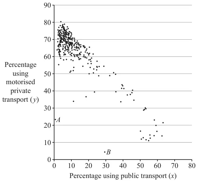
13 The scatter diagram uses information about all the Local Authorities (LAs) in the UK, taken from the 2011 census.
For each LA it shows the percentage (\(x\)) of employees who used public transport to travel to work and the percentage (\(y\)) who used motorised private transport.
“Public transport” includes train, bus, minibus, coach, underground, metro and light rail. “Motorised private transport” includes car, van, motorcycle, scooter, moped, taxi and passenger in a car or van.
(a) Most of the points in the diagram lie on or near the line with equation \(x + y = k\), where \(k\) is a constant.
(i) Give a possible value for \(k\). [1]
(ii) Hence give an approximate value for the percentage of employees who either worked from home or walked or cycled to work. [1]
(b) The average amount of fuel used per person per day for travelling to work in any LA is denoted by F. Consider the two groups of LAs where the percentages using motorised private transport are highest and lowest.
(i) Using only the information in the diagram, suggest, with a reason, which of these two groups will have greater values of F than the other group. [1]
A student says that it is not possible to give a reliable answer to part (b)(i) without some further information.
(ii) Suggest two kinds of further information which would enable a more reliable answer to be given. [2]
(c) Points \(A\) and \(B\) in the diagram are the most extreme outliers. Use their positions on the diagram to answer the following questions about the two LAs represented by these two points.
(i) The two LAs share a certain characteristic. Describe, with a justification, this characteristic. [2]
(ii) The environments in these two LAs are very different. Describe, with a justification, this difference. [2]
(d) A student says that it is difficult to extract detailed information from the scatter diagram. Explain whether you agree with this criticism. [1]
Mark scheme (a)
Scheme
Marks
AO
(i) \(k = 70\) to 80 inclusive
B1
1.2
[1]
(ii) \(100 -\) their \(k\)
B1FT
2.2a
[1]
Notes
(a)(ii)
B1FT: Strictly FT their \(k\) (i.e. this must be \(100 -\) their \(k\) only)
Mark scheme (b)
Scheme
Marks
AO
(i) The group with highest usage of private (motorised) transport (top left), because private transport uses more fuel than public transport (for the same travel distance, per person).
B1
2.2b
[1]
(ii) e.g. Lengths of journeys (or distance travelled) and
B1
2.4
e.g. how many people travel in each vehicle used (or ‘occupancy’ of each mode)
B1
2.4
[2]
Notes
(b)(i)
B1: For a clear explanation that must both identify the group unambiguously (e.g. ‘top left’, ‘least public transport use’) and give a reason. Accept equivalent justifications e.g. ‘each individual uses more fuel’
(b)(ii)
B1 B1: For two sensible distinct suggestions. Acceptable answers include:
The type or amount of fuel used (by different modes of transport)
Proportion or usage of Electric Vehicles
Types of vehicle used (or available)
Proportion of the different modes of transport within each category
The occupancy of each mode (or e.g. car sharing)
Proportion of full-time vs part-time working patterns
Do not accept:
Population size (because \(F\) is per person)
Number of those not in work (because \(F\) is for employees)
References to emissions e.g. ‘given off’ (because \(F\) is the amount of fuel used)
Mark scheme (c)
Scheme
Marks
AO
(i) Large percentage walk/cycle/work from home
B1
2.2b
Small area
B1
2.4
[2]
(ii) \(A\) is rural, \(B\) is urban
B1
2.2b
Public transport is absent in \(A\) but used in \(B\) or, eg, Those in \(B\) who don’t walk, don’t use cars, so there is probably a lot of traffic, so \(B\) is urban. No public transport in \(A\) so \(A\) is rural
B1
2.4
[2]
Notes
(c)(i)
B1: For the shared characteristic (any of walk/cycle/work from home). Condone ‘these have the lowest total proportion using public or motorised private transport combined’ but do not accept only ‘lower percentage using motorised private transport’ or ‘lower percentage using public transport’ – need both
B1: For a justification (must be related to the LA). Acceptable answers include:
‘less need to travel to work’
‘shorter journeys’
‘better walking/cycling infrastructure’
But not just ‘more work from home’ (this is the characteristic)
(\(A\) is Scilly Isles, \(B\) is City of London)
(c)(ii)
B1: B1 for identifying the difference in environment (must make a comparison e.g. ‘\(A\) is more rural than \(B\)’). Accept clearly equivalent statements e.g. ‘city’ or ‘countryside’
B1: B1 for justification. Cannot just restate the data so do not accept e.g. ‘\(A\) has low public transport use’ – must give a justification as to why this might be. Accept e.g. ‘less availability of public transport’ Other sensible answers may be seen e.g. ‘motorised private transport is almost absent in \(B\) but more widely used in \(A\)’
Mark scheme (d)
Scheme
Marks
AO
Some points are too close together to read
B1
2.3
[1]
Notes
B1: Must make a specific criticism of the graph related to reading values. Acceptable answers include:
‘the scale is not precise enough to read detailed values’
‘closely clustered points mean it is hard to read’
‘there are no gridlines so cannot read exact values’
Do not accept generic statements such as ‘the data may not be accurate’ or references to information not included on the graph.
10 The table shows the age structure of usual residents of 18 Local Authorities (LAs) in the North West region of the UK in 2011.
Local Authority
Age 0 to 17
Age 18 to 24
Age 25 to 64
Age 65 and over
A
26.20%
9.06%
51.81%
12.92%
B
23.32%
8.99%
52.32%
15.37%
C
22.24%
8.96%
52.56%
16.23%
D
22.67%
8.10%
53.27%
15.96%
E
20.70%
7.77%
54.77%
16.76%
F
18.14%
6.51%
51.13%
24.21%
G
18.96%
14.20%
48.51%
18.33%
H
19.06%
14.79%
52.12%
14.04%
I
25.15%
9.04%
51.16%
14.65%
J
22.93%
8.81%
52.22%
16.04%
K
21.48%
13.98%
50.82%
13.73%
L
23.98%
9.20%
52.26%
14.56%
M
21.67%
11.19%
52.94%
14.19%
N
17.82%
6.01%
51.93%
24.23%
O
22.83%
7.30%
53.86%
16.01%
P
21.76%
8.28%
54.03%
15.93%
Q
21.42%
8.43%
53.90%
16.25%
R
18.61%
7.33%
49.35%
24.71%
Percentage of residents
(a) Without reference to any other columns, explain how you would use only the columns for the age ranges 0 to 17 and 18 to 24 to decide whether an LA might be one of the following.
(i) An LA that includes a university [1]
(ii) An LA that attracts young couples to live [1]
(iii) An LA that attracts retired people to live [1]
(b) Using your answers to part (a), identify the following.
(i) Four LAs that might include a university [1]
(ii) Three LAs that might be attractive to retired people [1]
(c) Explain why your answer to part (b)(ii), based only on the columns for the age ranges 0 to 17 and 18 to 24, may not be reliable. [1]
(d) The lower quartile, median and upper quartile of the percentages in the column “Age 65 and over” are 14.56%, 15.99% and 16.76% respectively. Use this information to comment on your answers to part (b)(ii) and part (c). [2]
In a magazine article, a councillor plans to describe a typical LA in the North West region. He wants to quote the average percentage of residents aged 65 or over.
(e) The mean of the percentages in the column “Age 65 and over” is 16.90%. Use this information, and the information given in part (d), to explain whether the median or the mean better represents the data in the column “Age 65 and over”. [2]
Mark scheme (a)
Scheme
Marks
AO
(i) High(er) or increased proportion 18–24
B1
2.2b
[1]
(ii) High(er) or increased proportion either/both
B1
2.2b
[1]
(iii) Low(er) or decreased proportion either/both
B1
2.2b
[1]
Notes
All parts of Q10: Allow “percentage” or “value” or “number” or “rate” etc for proportion in all parts of qu 10
(a)(i) B1: eg “many 18-24” Ignore any LA mentioned Ignore extras only if they don’t contradict High 18-24 only
(a)(ii) B1: or high proportion of younger. Ignore any LA mentioned Ignore extras
(a)(iii) B1: or low proportion of younger. Ignore any LA mentioned eg “LA F because low % in younger ages” B1 Ignore extras
Mark scheme (b)
Scheme
Marks
AO
(i) G, H, K, M
B1
2.2b
[1]
(ii) F, N, R
B1
2.2b
[1]
Notes
All parts of Q10: Allow “percentage” or “value” or “number” or “rate” etc for proportion in all parts of qu 10
(b)(i) B1: No extras or omissions
(b)(ii) B1: No extras or omissions
Mark scheme (c)
Scheme
Marks
AO
Imply need to consider other age range(s) Examples: May be a large % of 25-64 (or 65+) Some LAs have low 0-17 and 18-24 and 65+ Low 0-17 & 18-24 does not mean high 65+
Need to consider other factors or anomalies
B1
2.3
[1]
Notes
All parts of Q10: Allow “percentage” or “value” or “number” or “rate” etc for proportion in all parts of qu 10
B1: Low 0-17 & 18-24 not \(\Rightarrow\) attractive to older High % of young people does not necessarily imply low % of older people Older people may want live near young relatives
Eg May be reasons for low % younger people eg no schools
Mark scheme (d)
Scheme
Marks
AO
State all 3 LAs are > 1.5×IQR above UQ
B1
1.2
Confirms F, N, R (implied) despite (c)
B1
2.2a
[2]
Notes
All parts of Q10: Allow “percentage” or “value” or “number” or “rate” etc for proportion in all parts of qu 10
NB. No ft for either mark
B1: Or \(16.76 + 1.5 \times (16.76 - 14.56)\) \((= 20.06)\) Ignore attempt at lower limit
B1: Independent mark. But must mention (c)
Mark scheme (e)
Scheme
Marks
AO
Mean > UQ
B1*
1.1
Median better
B1dep
2.2b
[2]
Notes
All parts of Q10: Allow “percentage” or “value” or “number” or “rate” etc for proportion in all parts of qu 10
or mean is in 4th quartile Ignore all else Not Mean skewed by F, N, R so median better Not Median not skewed by F, N, R so better Not Mean because need take account of outliers (or F,N,R)
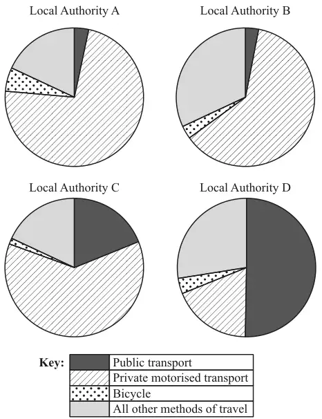
13 The four pie charts illustrate the numbers of employees using different methods of travel in four Local Authorities in 2011.
(a) State, with reasons, which of the four Local Authorities is most likely to be a rural area with many hills. [2]
(b) Explain why pie charts are more suitable for answering part (a) than bar charts showing the same data. [1]
(c) Two of the Local Authorities represent urban areas.
(i) State with a reason which two Local Authorities are likely to be urban. [2]
(ii) One urban Local Authority introduced a Park-and-Ride service in 2006. Users of this service drive to the edge of the urban area and then use buses to take them into the centre of the area. A student claims that a comparison of the corresponding pie charts for 2001 (not shown) and 2011 would enable them to identify which Local Authority this was. State with a reason whether you agree with the student. [2]
Mark scheme (a)
Scheme
Marks
A: High private and low public OR B: Low bicycle and low public OR B: Low bicycle and high private OR C: Low bicycle and high private
B2
[2]
Notes
Allow B1 for A or B or C with one correct factor only. Ignore else
All answers can be implied Ignore all else
Mark scheme (b)
Scheme
Marks
Pie charts allow comparison of proportions Pie charts show proportions oe Ignore all else
B1
[1]
Notes
NOT: Bar charts don’t show proportions unless also state pies do. Assume “They” means pie charts. NOT: It’s easier to compare data Pie charts don’t easily show which is greatest Allow percentages instead of proportions
Mark scheme (c)
Scheme
Marks
(i) C and D
B1
Larger (or high or most) proportion public transport Can be implied. Ignore all else
B1
[2]
(ii) LDS says “The method of travel used is for the longest part, by distance, of the usual journey to work” Correct answers therefore should assume users of P&R will report only private, not public
Method of travel is the type used for the longest part of the journey
B1
Most people using Park-and-Ride would still say they were using private transport.
B1
[2]
Notes
(c)(i)
B1: Both, no others
B1: Dep applied to at least one of C and D, even if other LA mentioned
B-marks are independent
(c)(ii)
B1: "Disagree" may be implied
B1: independent Ignore all else
Scheme
Marks
People will still have to travel by car, so the results won’t be very different
B2
Alternatives, assuming (incorrectly) users of P&R will report both methods or just public:
Scheme
Marks
Public transport increase or private decrease “Agree” may be implied. Ignore all else
B1 B0
P&R will result in more people using private transport, so this will show an increase Not just “Increase in private” without justification
B1 B0
Users of P&R will use both public and private, so not clear
B1 B0
No, because other changes might have been made that affect the proportions.
B2
If P&R users report both, or just public, then yes, public will show increase
B2
Recognition of issue as to whether P&R users should report private or public Hence unclear whether change will show
B1 B1
Other sensible answers may be seen not covered in this MS
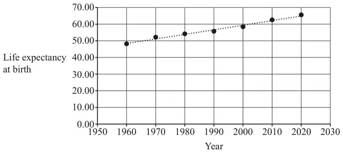
10 The pre-release material contains information about life expectancy at birth for countries of the world at 10-year intervals from 1960 until 2020.
The life expectancy at birth of the population of Sudan for this period, together with a line of best fit, is shown in Fig. 10.1.
Fig. 10.1
The equation of the line of best fit is \(L = 0.275X - 490\), where \(X\) is the year and \(L\) is the life expectancy at birth, measured in years.
(a) Use the equation of the line of best fit to estimate the life expectancy at birth in Sudan in 1975. [1]
(b) Explain whether this estimate is likely to be close to the true value of life expectancy at birth in Sudan in 1975. [1]
(c) Use your knowledge of the pre-release material to explain whether your answer to part (a) is likely to be a close approximation to the life expectancy at birth in the United Kingdom in 1975. [1]
The pre-release material also gives the median age of the population in countries of the world.
The table shows the median age of the population and the life expectancy at birth in 2020 for some countries in Africa.
Country
Median age
Life expectancy at birth 2020
Nigeria
18.6
55.02
Rwanda
19.7
69.33
Saint Helena, Ascension and Tristan da Cunha
43.2
#N/A
Sao Tome and Principe
19.3
70.58
Senegal
19.4
68.21
(d) Explain how the data in the table should be cleaned before these data can be included in a scatter diagram for life expectancy at birth against median age for the countries in Africa. [1]
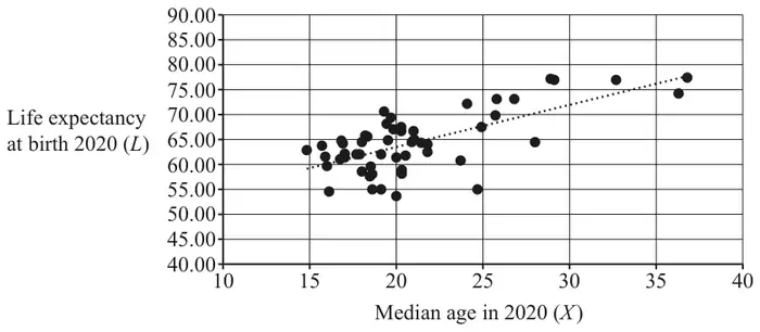
Fig. 10.2 shows a scatter diagram for the cleaned data of life expectancy at birth against median age in 2020 for the countries in Africa. It also shows a line of best fit.
The product moment correlation coefficient for these data is 0.680.
Fig. 10.2
(e) A student decides to use the line of best fit to estimate the life expectancy at birth in 2020 for Saint Helena, Ascension and Tristan da Cunha.
Explain whether this estimate is likely to be reliable. [1]
Mark scheme (a)
Scheme
Marks
AO
53.125 rounded to 2 or more sf isw
B1
1.1
[1]
Mark scheme (b)
Scheme
Marks
AO
likely to be close because oe allow eg linear model seems appropriate eg interpolation eg 1975 is within range eg points are approximately in a straight line
B1
2.2b
[1]
Notes
B1: allow eg yes do not allow eg 53.125 is within range eg positive correlation eg follows the same trend eg the value for 1975 is between the values for 1970 and 1980
Mark scheme (c)
Scheme
Marks
AO
not likely to be close approximation because oe eg life expectancy generally higher in UK (or Europe) oe eg life expectancy generally lower in Sudan (or Africa) oe eg change of life expectancy over time different in UK oe
B1
2.4
[1]
Notes
B1: must refer to life expectancy; must refer to UK or Europe or Sudan or Africa; ignore superfluous speculation do not allow eg not likely to be close because data is different eg life expectancy varies between countries
Mark scheme (d)
Scheme
Marks
AO
remove / delete the row with #N/A or remove (the data for) Saint Helena, (Ascension and Tristan da Cunha) isw
B1
1.2
[1]
Notes
B1: do not allow “cell” or “entry” do not allow ignore instead of remove ignore superfluous comments
Mark scheme (e)
Scheme
Marks
AO
not reliable because oe eg it’s extrapolation eg 43.2 is outside the range of median ages eg \(r\) is not close to 1 eg scatter does not appear to be linear eg linear model is not a good fit for the data eg scatter not elliptical
14 The pre-release material contains medical data for 103 women and 97 men.
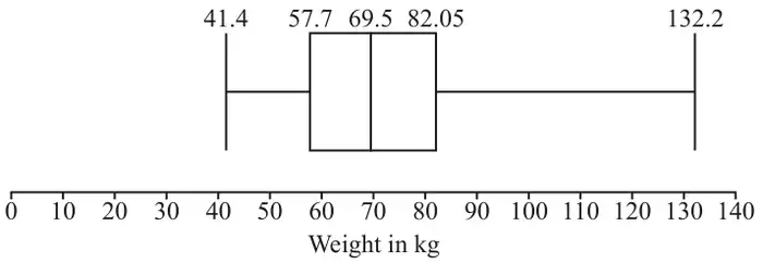
The boxplot represents the weights in kg of 101 of the women from the pre-release material.
(a) Use your knowledge of the pre-release material to give a reason why the weights of all 103 women were not included in the diagram. [1]
(b) Determine the range of values in which any outliers lie. [3]
(c) Use your knowledge of the pre-release material to explain whether these outliers should be removed from any further analysis of the data. [1]
(d) The median weight of men in the sample was found to be 79.9 kg. Explain what may be inferred by comparing the median weight of men with the median weight of women. [1]
Further analysis of the weights of both men and women is carried out. The table shows some of the results.
mean
standard deviation
men
82.69 kg
19.98 kg
women
72.5 kg
19.95 kg
(e) Use the information in the table to make two inferences about the distribution of the weights of men compared with the distribution of the weights of women. [2]
Mark scheme (a)
Scheme
Marks
AO
not all the data were available
B1
2.4
[1]
Notes
B1: LDS advantage must refer to data not being available or reference to #N/A
Mark scheme (b)
Scheme
Marks
AO
\(57.7 - 1.5 \times (82.05 - 57.7)\) or \(82.05 + 1.5 \times (82.05 - 57.7)\) seen
M1
1.1
outliers \(\lt 21.175\) or outliers \(\gt 118.575\)
A1
2.2a
(hence all outliers in interval) (118.575,132.2] (since no outliers in lower tail)
A1
2.2a
[3]
Notes
A1: given correct to 1 dp or better; both regions needed; allow non-strict inequalities
A1: allow eg between 118.6 and 132.2 allow strict or non-strict inequalities
if M0 allow SCB1 for both regions outliers \(\lt 21.175\) or outliers \(\gt 118.575\) unsupported; allow SCB2 for all outliers in (118.575,132.2] unsupported
Mark scheme (c)
Scheme
Marks
AO
should not be removed since no reason to eg doubt that it’s genuine data eg suspect it’s been misrecorded eg doubt since from (US) government
B1
2.4
[1]
Notes
B1: LDS advantage
Mark scheme (d)
Scheme
Marks
AO
a typical man is heavier than a typical woman, [since \(79.9 \gt 69.5\)]
B1
2.2b
[1]
Notes
B1: allow eg an average man is heavier than an average woman
do not allow eg men are heavier than women on average
Mark scheme (e)
Scheme
Marks
AO
mean weight for men is greater than mean weight for women, so distribution for men is located further along the number line than the distribution for women (by about 10 kg) oe
B1
2.4
standard deviations (or variances) are approximately equal, so similar dispersion about the mean / variation in weights for men and women oe
B1
2.2a
[2]
Notes
B1: allow mean weight for men greater than mean weight for women, so men are heavier than women (by about 10 kg) oe must refer to mean or average
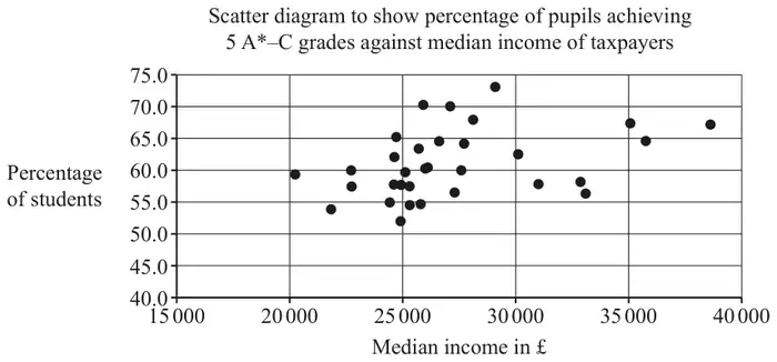
14 The pre-release material contains information concerning the median income of taxpayers in £ and the percentage of all pupils at the end of KS4 achieving 5 or more GCSEs at grade A*–C, including English and Maths, for different areas of London.
Some of the data for 2014/15 is shown in Fig. 14.1.
Fig. 14.1
Median Income of Taxpayers in £
Percentage of Pupils Achieving 5 or more A*–C, including English and Maths
City of London
61 100
#N/A
Barking and Dagenham
21 800
54.0
Barnet
27 100
70.1
Bexley
24 400
55.0
Brent
22 700
60.0
Bromley
28 100
68.0
A student investigated whether there is any relationship between median income of taxpayers and percentage of pupils achieving 5 or more GCSEs at grade A*–C, including English and Maths.
(a) With reference to Fig. 14.1, explain how the data should be cleaned before any analysis can take place. [1]
After the data was cleaned, the student used software to draw the scatter diagram shown in Fig. 14.2.
Fig. 14.2
The student calculated that the product moment correlation coefficient for these data is 0.3743.
(b) Give two reasons why it may not be appropriate to use a linear model for the relationship between median income of taxpayers in £ and the percentage of all pupils at the end of KS4 achieving 5 or more GCSEs at grade A*–C. [2]
The student carried out some further analysis. The results are shown in Fig. 14.3.
Fig. 14.3
median income of taxpayers in £
percentage of pupils achieving 5+ A*–C
mean
27 216
61.0
standard deviation
4177.5
5.32
The student identified three outliers in total.
(c)
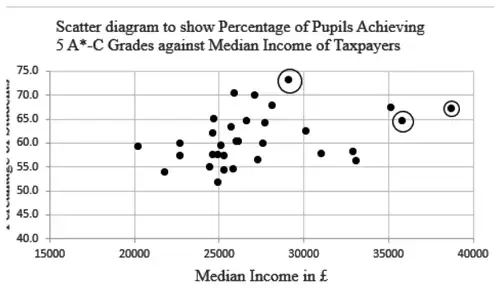
Use the information in Fig. 14.3 to determine the range of values of the median income of taxpayers in £ which are outliers.
Use the information in Fig. 14.3 to determine the range of values of the percentage of all pupils at the end of KS4 achieving 5 or more GCSEs at grade A*–C which are outliers.
On the copy of Fig. 14.2 in the Printed Answer Booklet, circle the three outliers identified by the student.
[4]
The student decided to remove these outliers and recalculate the product moment correlation coefficient.
(d) Explain whether the new value of the product moment correlation coefficient would be between 0.3743 and 1 or between 0 and 0.3743. [1]
Mark scheme (a)
Scheme
Marks
AO
discard City of London (as part of the data not available) or discard any regions where one or more pieces of data are missing oe
B1
2.4
[1]
Notes
B1: LDS advantage do not allow if answer spoiled eg because it’s an anomaly, eg because it’s an outlier,
Mark scheme (b)
Scheme
Marks
AO
scatter does not look linear oe
B1
3.4
pmcc not close to 1 oe
B1
3.4
[2]
Notes
B1: ignore extra comments unless they contradict an otherwise correct answer
B1: ignore extra comments unless they contradict an otherwise correct answer
9 The pre-release material contains information concerning the median income of taxpayers in different areas of London. Some of the data for Camden is shown in the table below. The years quoted in this question refer to the end of the financial years used in the pre-release material. For example, the year 2004 in the table refers to the year 2003/04 in the pre-release material.
Year
2004
2005
2006
2007
2008
2009
2010
2011
Median Income in £
21 300
23 200
24 200
25 900
26 900
#N/A
28 400
29 400
(a) Explain whether these data are a sample or a population of Camden taxpayers. [1]
A time series for the data is shown below.
The LINEST function on a spreadsheet is used to formulate the following model for the data:
\(I = 1115Y - 2\,212\,950\), where \(I =\) median income of taxpayers in £ and \(Y =\) year.
(b) Use this model to find an estimate of the median income of taxpayers in Camden in 2009. [1]
(c) Give two reasons why this estimate is likely to be close to the true value. [2]
The median income of taxpayers in Croydon in 2009 is also not available.
(d) Use your knowledge of the pre-release material to explain whether the model used in part (b) would give a reasonable estimate of the missing value for Croydon. [1]
Mark scheme (a)
Scheme
Marks
AO
eg sample, since only some data used oe eg sample, since data for 2009 not used oe
B1
2.2a
[1]
Notes
B1: sample, since not all data used; ignore further reasoning unless contradictory
Mark scheme (b)
Scheme
Marks
AO
£27 085 or £27 100 or £27 000
B1
3.4
[1]
Mark scheme (c)
Scheme
Marks
AO
it’s interpolation oe eg because we use 2009 oe which is between 2008 and 2010
B1
2.2a
eg a straight line model appears to be justified eg relationship seems to be linear eg median income seems to be directly proportional to time eg positive correlation [between median income and year]
B1
2.2b
[2]
Notes
B1: do not allow eg 27085 lies between 2008 and 2010 eg 27085 lies between the values for 2008 and 2010
B1: do not allow eg positive association eg positive relationship
Mark scheme (d)
Scheme
Marks
AO
not reasonable oe since eg (median taxable) income varies considerably across different regions of London eg (median) income different in Croydon and Camden eg (median) income lower in Croydon (than Camden) eg pattern of change in income over time different in Camden to Croydon
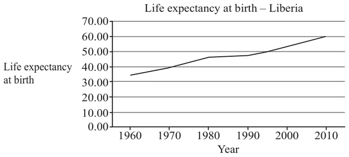
15 The pre-release material includes information on life expectancy at birth in countries of the world. Fig. 15.1 shows the data for Liberia, which is in Africa, together with a time series graph.
1960
1970
1980
1990
2000
2010
34.67
39.25
46.00
47.18
52.42
59.63
Fig. 15.1
Sundip uses the LINEST function on a spreadsheet to model life expectancy as a function of calendar year by a straight line.
The equation of this line is \(L = 0.473y - 892\), where \(L\) is life expectancy at birth and \(y\) is calendar year.
(a) Use this model to find an estimate of the life expectancy at birth in Liberia in 1995. [1]
According to the model, the life expectancy at birth in Liberia in 2025 is estimated to be 65.83 years.
(b) Explain whether each of these two estimates is likely to be reliable. [2]
(c) Use your knowledge of the pre-release material to explain whether this model could be used to obtain a reliable estimate of the life expectancy at birth in other countries in 1995. [1]
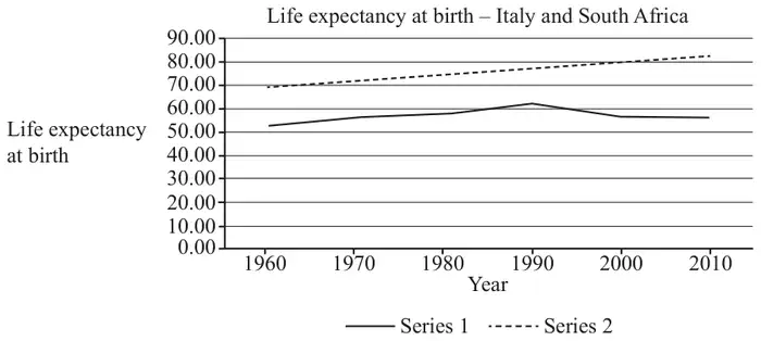
Fig. 15.2 shows the life expectancy at birth between 1960 and 2010 for Italy and South Africa.
Fig. 15.2
(d) Use your knowledge of the pre-release material to
Explain whether series 1 or series 2 represents the data for Italy.
Explain how the data for South Africa differs from the data for most developed countries.
[2]
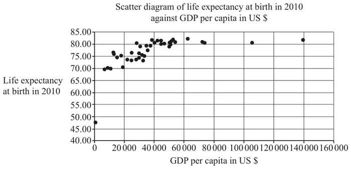
Sundip is investigating whether there is an association between the wealth of a country and life expectancy at birth in that country. As part of her analysis she draws a scatter diagram of GDP per capita in US$ and life expectancy at birth in 2010 for all the countries in Europe for which data is available. She accidentally includes the data for the Central African Republic. The diagram is shown in Fig. 15.3.
Fig. 15.3
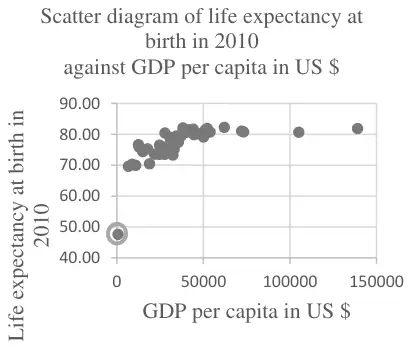
(e) On the copy of Fig. 15.3 in the Printed Answer Booklet, use your knowledge of the pre-release material to circle the point representing the data for the Central African Republic. [1]
Sundip states that as GDP per capita increases, life expectancy at birth increases.
(f) Explain to what extent the information in Fig. 15.3 supports Sundip’s statement. [2]
Mark scheme (a)
Scheme
Marks
AO
51.635 or 51.64 or 51.6
B1
3.4
[1]
Mark scheme (b)
Scheme
Marks
AO
1995 estimate (probably) reliable since it is interpolation
B1
2.2b
2025 estimate (probably) not reliable since it is extrapolation
B1
2.2b
[2]
Notes
B1: allow eg the first estimate..
B1: allow eg the second estimate…
Mark scheme (c)
Scheme
Marks
AO
No, because trends in life expectancy at birth may vary considerably between nations
B1
2.4
[1]
Notes
B1: LDS advantage
Mark scheme (d)
Scheme
Marks
AO
series 2 (the top one) is Italy – life expectancy (generally) higher in Europe (than Africa)
B1
2.4
the values are decreasing (from 1990) in South Africa (– unusual since most show an upward trend) or little (or no) overall increase in South Africa (since 1970) or South Africa has lower life expectancy (than most developed countries)
B1
2.4
[2]
Notes
B1: LDS advantage
B1: LDS advantage
Mark scheme (e)
Scheme
Marks
AO
B1
1.1
[1]
Notes
B1: Point at (700, 47.56) ringed LDS advantage
Mark scheme (f)
Scheme
Marks
AO
the diagram supports this statement for values of GDP per capita from \(k\) to \(n\) where \(0 \lt k \leqslant 20\,000\) and \(40\,000 \leqslant n \leqslant 60\,000\) since there appears to be positive correlation oe
B1
2.3
for values of GDP per capita \(\geqslant K\) where \(40\,000 \leqslant K \leqslant 60\,000\) there appears to be no association between GDP per capita and life expectancy at birth so the diagram does not support Sundip’s statement for these values
B1
2.2b
[2]
Notes
B1: must give specific range of values ; must say supports statement oe
B1: the range may be implied by reference to a specific range identified for the first mark; must say does not support statement oe
12Fig. 12.1 shows an excerpt from the pre-release material.
A
B
C
D
E
F
G
H
1
Sex
Age
Marital
Weight
Height
BMI
Waist
Pulse
2
Female
34
Married
60.3
173.4
20.05
82.5
74
3
Female
85
Widowed
64.7
161.2
24.9
#N/A
#N/A
4
Female
48
Divorced
100.6
171.4
34.24
105.6
92
5
Male
61
Married
70.9
169.5
24.68
92.2
70
6
Male
68
Divorced
96.8
181.6
29.35
112.9
68
Fig. 12.1
There was no data available for cell H3.
(a) Explain why #N/A is used when no data is available. [1]
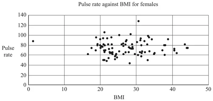
Fig. 12.2 shows a scatter diagram of pulse rate against BMI (Body Mass Index) for females. All the available data was used.
Fig. 12.2
There are two outliers on the diagram.
(b) On the copy of Fig. 12.2 in the Printed Answer Booklet, ring these outliers. [1]
(c) Use your knowledge of the pre-release material to explain whether either of these outliers should be removed. [2]
(d) State whether the diagram suggests there is any correlation between pulse rate and BMI. [1]
The product moment correlation coefficient between waist measurement, \(w\), in cm and BMI, \(b\), for females was found to be 0.912. All the available data was used.
(e) Explain why a model of the form \(w = mb + c\) for the relationship between waist measurement and BMI is likely to be appropriate. [1]
The LINEST function on a spreadsheet gives \(m = 2.16\) and \(c = 33.0\).
(f) Calculate an estimate of the value for cell G3 in Fig. 12.1. [1]
Mark scheme (a)
Scheme
Marks
AO
#N/A is used to stop the software reading the entry as zero
B1
2.4
[1]
Notes
B1: allow so that the cell is ignored oe or the software interprets #N/A as no data oe advantage
Mark scheme (b)
Scheme
Marks
AO
(30.6, 128) and (1.3,88) ringed
B1
1.1
[1]
Mark scheme (c)
Scheme
Marks
AO
outlier on extreme left oe should be removed as nobody could have a BMI this low oe
B1
2.4
outlier with (very) high pulse rate oe should not be removed as it is plausible oe
B1
2.4
[2]
Notes
B1: need to refer to BMI being implausible advantage
B1: advantage
Mark scheme (d)
Scheme
Marks
AO
no correlation
B1
2.2b
[1]
Notes
B1: ignore other comments unless contradictory
Mark scheme (e)
Scheme
Marks
AO
because the value of pmcc is close to 1 or because there is strong correlation oe
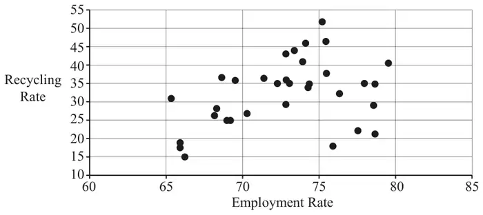
13 The pre-release material contains information concerning median house prices, recycling rates and employment rates. Fig. 13.1 shows a scatter diagram of recycling rate against employment rate for a random sample of 33 regions.
Fig. 13.1
The product moment correlation coefficient for this sample is 0.37154 and the associated \(p\)-value is 0.033.
Lee conducts a hypothesis test at the 5% level to test whether there is any evidence to suggest there is positive correlation between recycling rate and employment rate. He concludes that there is no evidence to suggest positive correlation because \(0.033 \approx 0\) and \(0.37154 > 0.05\).
(a) Explain whether Lee’s reasoning is correct. [2]
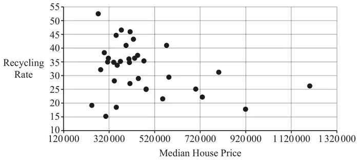
Fig. 13.2 shows a scatter diagram of recycling rate against median house price for a random sample of 33 regions.
Fig. 13.2
The product moment correlation coefficient for this sample is \(-0.33278\) and the associated \(p\)-value is 0.058.
Fig. 13.3 shows summary statistics for the median house prices for the data in this sample.
Statistics
n
33
Mean
465467.9697
σ
201236.1345
s
204356.2606
Σx
15360443
Σx2
8486161617387
Min
243500
Q1
342500
Median
410000
Q3
521000
Max
1200000
Fig. 13.3
(b) Use the information in Fig. 13.3 and Fig. 13.2 to show that there are at least two outliers. [2]
(c) Describe the effect of removing the outliers on
the product moment correlation coefficient between recycling rate and median house price,
the \(p\)-value associated with this correlation coefficient,
in each case explaining your answer. [2]
All 33 items in the sample are areas in London. A student suggests that it is very unlikely that only areas in London would be selected in a random sample.
(d) Use your knowledge of the pre-release material to explain whether you think the student’s suggestion is reasonable. [1]
Mark scheme (a)
Scheme
Marks
AO
Lee is wrong because he should make the comparison of 0.033 with 0.05
B1
2.2a
he should make the comparison of 0.37154 with 0
B1
2.2b
[2]
Notes
B1: allow he should have compared \(r\) with the critical value
if B0B0SC1 for Lee has confused \(r\) with \(p\) or for 0.37154 suggests positive correlation
Mark scheme (b)
Scheme
Marks
AO
\(465467 + 2 \times 204356\)
M1
2.1
awrt 874180 (or 867940 from use of 201236) from scatter diagram the outliers are approximately 920 000, 1 200 000
A1
2.2b
[2]
Notes
M1: condone use of 201236 instead of 204356; ignore work relating to lower tail or \(521000 + 1.5 \times (521000 - 342500)\)
A1: numerical values must be mentioned or 788750 in which case accept two or three outliers identified extra one is approximately 800 000 (corrected from the printed mark scheme: “867940 from use of 210236” is printed; 867940 comes from 201236)
Mark scheme (c)
Scheme
Marks
AO
the pmcc would (probably) be closer to 0 because the scatter is less well modelled by a straight line
B1
2.2b
the \(p\)-value would increase because a value which is closer to 0 is more likely assuming there is no correlation
B1
2.2b
[2]
Notes
if B0B0 allow SC1 for \(r\) closer to 0 and \(p\)-value larger
Mark scheme (d)
Scheme
Marks
AO
the student’s suggestion is reasonable, since there are other regions defined in the LDS
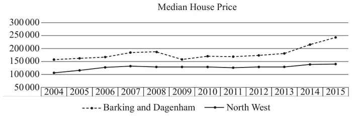
11 The pre-release material contains information concerning median house prices over the period 2004 – 2015. A spreadsheet has been used to generate a time series graph for two areas: the London borough of “Barking and Dagenham” and “North West”. This is shown together with the raw data in Fig. 11.1.
Year
Barking and Dagenham
North West
2004
160 000
107 000
2005
163 000
118 000
2006
168 000
127 000
2007
185 000
134 750
2008
190 000
129 950
2009
160 000
130 000
2010
171 000
130 000
2011
170 000
127 000
2012
174 995
130 000
2013
180 995
131 000
2014
215 000
138 500
2015
243 500
140 000
Fig. 11.1
Dr Procter suggests that it is unusual for median house prices in a London borough to be consistently higher than those in other parts of the country.
(a) Use your knowledge of the large data set to comment on Dr Procter’s suggestion. [1]
Dr Procter wishes to predict the median house price in Barking and Dagenham in 2016. She uses the spreadsheet function LINEST to find the equation of the line of best fit for the given data. She obtains the equation
\(P = 4897Y - 9\,657\,847\), where \(P\) is the median house price in pounds and \(Y\) is the calendar year, for example 2015.
(b) Use Dr Procter’s equation to predict the median house price in Barking and Dagenham in
2016
2017.
[2]
Professor Jackson uses a simpler model by using the data from 2014 and 2015 only to form a straight-line model.
(c) Find the equation Professor Jackson uses in her model. [2]
(d) Use Professor Jackson’s equation to predict the median house price in Barking and Dagenham in
2016
2017.
[2]
Professor Jackson carries out some research online. She finds some information about median house prices in Barking and Dagenham, which is shown in Fig. 11.2.
2016
2017
£290 000
£300 000
Fig. 11.2
(e) Comment on how well
Dr Procter’s model fits the data,
Professor Jackson’s model fits the data.
[2]
(f) Explain which, if any, of the models is likely to be more reliable for predicting median house prices in Barking and Dagenham in 2020. [1]
Mark scheme (a)
Scheme
Marks
AO
house prices are generally higher in London boroughs (than elsewhere in the country), so Dr Procter’s suggestion is probably wrong
B1
2.2a
[1]
Mark scheme (b)
Scheme
Marks
AO
214 505
B1
3.4
219 402
B1
1.1
[2]
Mark scheme (c)
Scheme
Marks
AO
\(P = 28\,500Y - 57\,184\,000\) (where \(Y\) is the calendar year)
B1
3.3
or \(P = 28\,500y + 215\,000\) (where \(y\) is the number of years after 2014)
B1
1.1
[2]
Notes
B1: gradient
B1: intercept
allow both marks for correct equation in any form isw allow eg \(y = 28\,500x - 57\,184\,000\)
Mark scheme (d)
Scheme
Marks
AO
2016 272 000
B1
3.4
2017 300 500
B1
1.1
[2]
Notes
FTtheir straight line model provided this gives values > 250 000
Mark scheme (e)
Scheme
Marks
AO
Dr Procter’s model is a (very) poor fit
B1
2.2a
Prof Jackson’s is a good fit, or works well for 2017, but not 2016
B1
2.2a
[2]
Notes
B1: dependent on correct values in (b)
B1:FT comment for their values > 250 000 this mark is dependent on having calculated values in part (d)