
June 2022 Paper 2 Q15
15 The pre-release material includes information on life expectancy at birth in countries of the world. Fig. 15.1 shows the data for Liberia, which is in Africa, together with a time series graph.
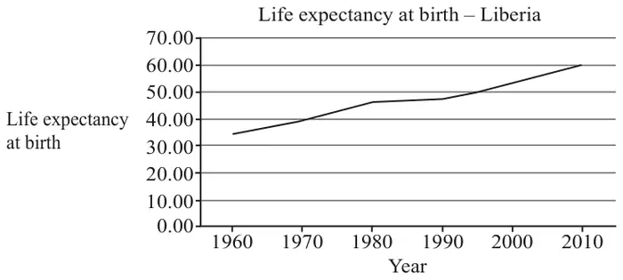
| 1960 | 1970 | 1980 | 1990 | 2000 | 2010 |
| 34.67 | 39.25 | 46.00 | 47.18 | 52.42 | 59.63 |
Fig. 15.1
Sundip uses the LINEST function on a spreadsheet to model life expectancy as a function of calendar year by a straight line.
The equation of this line is \(L = 0.473y - 892\), where \(L\) is life expectancy at birth and \(y\) is calendar year.
According to the model, the life expectancy at birth in Liberia in 2025 is estimated to be 65.83 years.
Fig. 15.2 shows the life expectancy at birth between 1960 and 2010 for Italy and South Africa.
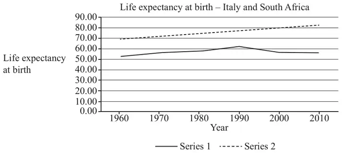
- Explain whether series 1 or series 2 represents the data for Italy.
- Explain how the data for South Africa differs from the data for most developed countries.
Sundip is investigating whether there is an association between the wealth of a country and life expectancy at birth in that country. As part of her analysis she draws a scatter diagram of GDP per capita in US$ and life expectancy at birth in 2010 for all the countries in Europe for which data is available. She accidentally includes the data for the Central African Republic. The diagram is shown in Fig. 15.3.
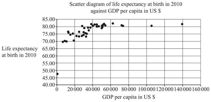
Sundip states that as GDP per capita increases, life expectancy at birth increases.
| Scheme | Marks | AO |
|---|---|---|
| 51.635 or 51.64 or 51.6 | B1 | 3.4 |
| [1] |
| Scheme | Marks | AO |
|---|---|---|
| 1995 estimate (probably) reliable since it is interpolation | B1 | 2.2b |
| 2025 estimate (probably) not reliable since it is extrapolation | B1 | 2.2b |
| [2] |
Notes
B1: allow eg the first estimate..
B1: allow eg the second estimate…
| Scheme | Marks | AO |
|---|---|---|
| No, because trends in life expectancy at birth may vary considerably between nations | B1 | 2.4 |
| [1] |
Notes
B1: LDS advantage
| Scheme | Marks | AO |
|---|---|---|
| series 2 (the top one) is Italy – life expectancy (generally) higher in Europe (than Africa) | B1 | 2.4 |
| the values are decreasing (from 1990) in South Africa (– unusual since most show an upward trend) or little (or no) overall increase in South Africa (since 1970) or South Africa has lower life expectancy (than most developed countries) | B1 | 2.4 |
| [2] |
Notes
B1: LDS advantage
B1: LDS advantage
| Scheme | Marks | AO |
|---|---|---|
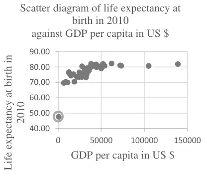 | B1 | 1.1 |
| [1] |
Notes
B1: Point at (700, 47.56) ringed
LDS advantage
| Scheme | Marks | AO |
|---|---|---|
| the diagram supports this statement for values of GDP per capita from \(k\) to \(n\) where \(0 \lt k \leqslant 20\,000\) and \(40\,000 \leqslant n \leqslant 60\,000\) since there appears to be positive correlation oe | B1 | 2.3 |
| for values of GDP per capita \(\geqslant K\) where \(40\,000 \leqslant K \leqslant 60\,000\) there appears to be no association between GDP per capita and life expectancy at birth so the diagram does not support Sundip’s statement for these values | B1 | 2.2b |
| [2] |
Notes
B1: must give specific range of values ; must say supports statement oe
B1: the range may be implied by reference to a specific range identified for the first mark; must say does not support statement oe