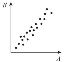
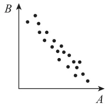
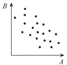
4. Kay is studying the variables Daily Total Sunshine (\(x\)) and Daily Total Rainfall (\(y\)) from the large data set for Leeming in 2015
Kay starts with 5th May and then selects every 10th day thereafter.
(a) State the name of the sampling technique Kay uses. (1)
Kay wants to find the regression line of \(y\) on \(x\) for these data.
(b) Using your knowledge of the large data set, explain how Kay might need to clean these data before finding the equation of the regression line. (1)
The equation of the regression line Kay finds is \(y = 0.741 + 0.199x\)
(c) Using your knowledge of the large data set,
(i) state the units of the gradient of the regression line,
(ii) give an interpretation of the \(y\)-intercept of the regression line. (2)
Kay’s teacher claimed that the greater the amount of sunshine in a day the lower the amount of rain there should be.
(d) State, giving a reason, whether the teacher’s claim is true for Kay’s data. (1)
The teacher used all the data for these variables from the large data set for Leeming in 2015, as a sample. The teacher calculated the product moment correlation coefficient for \(x\) and \(y\) to be \(-0.160\)
In a suitable test to determine whether there is evidence to support the teacher’s claim, the \(p\)-value was 0.015
(e) Using a 5% level of significance, state the hypotheses and conclusion for this test. (2)
(f) For the test in part (e) describe
(i) the sample,
(ii) a possible population. (2)
Mark scheme (a)
Scheme
Marks
AO
Systematic (sampling)
B1
1.2
(1)
Notes
B1: for systematic (ignore other non-contradictory descriptions). Condone misspelling. If a clear choice is given e.g. stratified or systematic we take the final answer.
Mark scheme (b)
Scheme
Marks
AO
The (Daily Total) Rainfall data may contain “tr” entries (these will need a suitable value substituted before calculations can take place.)
B1
2.4
(1)
Notes
B1: for mention of “tr” or “trace” entries in rain(fall) [ or \(y\)] data. Ignore “n/a”. Ignore any comment about what to do with trace.
Mark scheme (c)
Scheme
Marks
AO
(i) mm/h (o.e.) e.g. \(\mathrm{mm\,h^{-1}}\) or \(\mathrm{mm\,hrs^{-1}}\) or \(\dfrac{\text{mm}}{\text{hours}}\)
B1
1.1b
(ii) When there is no sun(shine) there is (on average) 0.7(41) (mm) of rain or the amount of rain when there is no sun(shine) (o.e.)
B1
2.4
(2)
Notes
(i) B1: for mm/h or equivalent in words.
(ii) B1: for the idea of amount of rain when no sun. “Minimum rain” is B0 Don’t need value or units but if given must be correct or consistent with (i)
Mark scheme (d)
Scheme
Marks
AO
e.g. Not consistent (since); Kay’s line says positive correlation or gradient or regression coefficient or regression line or 0.199 is positive
B1
2.4
(1)
Notes
B1: for a suitable reason and saying not consistent (o.e.) e.g. “false” or “untrue” or “no” Reason only needs to be about the line and may be a description e.g. as \(x\) increases \(y\) increases or at least 2 values of \(x\) substituted and \(y\) values evaluated
[\(p\)-value < 5% so significant result] there is evidence to support the teacher’s claim
B1
2.2b
(2)
Notes
B1: for both hypotheses correct in terms of \(\rho\) (condone attempt at \(\rho\) that looks like \(p\))
B1: for a correct conclusion in context with no contradiction. Using words “support” and “teacher’s claim” or “negative correlation” and “sun or \(x\)” and “rain or \(y\)” [If a comparison is given it must be \(0.015 < 0.05\)]
Mark scheme (f)
Scheme
Marks
AO
(i) The sample is rainfall (\(y\)) and sunshine (\(x\)) for May~Oct in (Leeming) in 2015
B1
1.1b
(ii) e.g. (rainfall and sunshine) for: (Leeming) for all of 2015, or Leeming anytime (not just May~Oct) or Leeming for May~October for other years too or May~Oct in UK etc
B1
3.3
(2)
(9 marks)
Notes
(i) B1: for recognising that all the data/days for these variables in LDS for 2015 is the sample. Condone omitting “Leeming” B0 for “sunshine and rainfall for Leeming in 2015” It could be the population.
(ii) B1: for a suitable attempt to describe a population. The teacher’s sample must be a subset.
2. Amar is studying the flight of a bird from its nest.
He measures the bird’s height above the ground, \(h\) metres, at time \(t\) seconds for 10 values of \(t\) Amar finds the equation of the regression line for the data to be \(h = 38.6 - 1.28t\)
(a) Interpret the gradient of this line. (1)
The product moment correlation coefficient between \(h\) and \(t\) is \(-0.510\)
(b) Test whether or not there is evidence of a negative correlation between the height above the ground and the time during the flight. You should
state your hypotheses clearly
use a 5% level of significance
state the critical value used
(3)
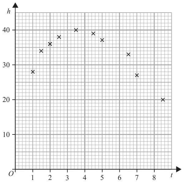
Jane draws the following scatter diagram for Amar’s data.
(c) With reference to the scatter diagram, state, giving a reason, whether or not the regression line \(h = 38.6 - 1.28t\) is an appropriate model for these data. (1)
Jane suggests an improved model using the variable \(u = (t - k)^2\) where \(k\) is a constant.
She obtains the equation \(h = 38.1 - 0.78u\)
(d) Choose a suitable value for \(k\) to write Jane’s improved model for \(h\) in terms of \(t\) only. (1)
Mark scheme (a)
Scheme
Marks
AO
e.g. The height (\(h\))decreases by about 1.28 m for each second of the flight
B1
3.4
(1)
Notes
B1 for a suitable interpretation in context [value can be 1.3 or 1.28 or “just over 1”] per sec Must have underlined words (o.e.) and units “m” or metres and “s” or seconds NB “descends” implies “height decreases” Condone e.g. “decreases by \(-\,1.28\) m”
[\(r = -0.510\) not sig] there is insufficient (o.e.) evidence of a negative correlation between height (or \(\underline{h}\)) and time (or \(\underline{t}\))
A1
2.2b
(3)
Notes
B1 for both hypotheses correct in terms of \(\rho\) [accept a \(p\) or p but not \(r\) or r] Must be attached to \(\mathrm{H_0}\) and \(\mathrm{H_1}\)
M1 for a critical value corresponding to their \(\mathrm{H_1}\): 1-tail: awrt \(\pm\,0.549\) or 2-tail (B0 scored for \(\mathrm{H_1}\)): awrt \(\pm\,0.632\) (tables 0.6319) If hypotheses are in words and can deduce whether one or two-tail then use their words. If no hypotheses or their \(\mathrm{H_1}\) is not clearly one or two-tail assume one-tail
A1 a correct conclusion in context mentioning correlation and height and time A comparison or statement such as “not sig” is not needed but if seen must be correct. Do NOT award this A mark if contradictory comments or working seen e.g. “reject \(\mathrm{H_0}\)” or comparison of 0.510 with significance level of 0.05 or e.g. \(-0.549 \gt -0.510\)
NB Can award B0M1A1
SCB0(for 2-tail) M0(for cv = \(\pm\,0.549\)) scored: Allow 1 mark (score as B0M0A1) for conclusion such as: “insufficient evidence of (negative) correlation between height and time of flight”
Mark scheme (c)
Scheme
Marks
AO
No – since points seem to follow a curve/quadratic (rather than a line) or since points are “non-linear” but regression line/ model is linear or e.g. between (\(t = 5\) and 7) height drops by much more than 2.56 m or e.g. gradient is positive up to \(t = 3.5\) (line gradient \(\lt 0\)) or e.g. gradient is positive initially (line gradient \(\lt 0\)) or e.g. gradient is positive and then negative
B1
2.4
(1)
Notes
B1 for saying no and giving a suitable supporting reason Don’t allow “correlation” on its own instead of “gradient” B0 for simply saying “points don’t lie close to a straight line” Need mention of curve or some other feature of scatter plot that differs from regression line. B0 for just “non-linear” without mention of the model being linear B0 for simply comparing 1 or 2 points – need a comment about general pattern
Mark scheme (d)
Scheme
Marks
AO
[\(h = 38.1 - 0.78(t - k)^2\) with] a suitable \(k\) i.e. in the range 3~4.5
B1
3.3
(1)
(6 marks)
Notes
B1 for a value of \(k\) in the range [3, 4.5] Do not need \(k = \ldots\) Accept a value embedded in Jane’s model. ISW any errors in multiplying out bracket.
16 A medical student believes that, in adults, there is a negative correlation between the amount of nicotine in their blood stream and their energy level.
The student collected data from a random sample of 50 adults.
The correlation coefficient between the amount of nicotine in their blood stream and their energy level was −0.45
Carry out a hypothesis test at the 2.5% significance level to determine if this sample provides evidence to support the student’s belief.
For \(n = 50\), the critical value for a one-tailed test at the 2.5% level for the population correlation coefficient is 0.2787 [4 marks]
Compares ±0.45 or \(\lvert -0.45 \rvert\) and ±0.2787 May be seen on a diagram
M1
3.5a
States \(-0.45 \lt -0.2787\) or \(0.45 \gt 0.2787\) or \(\lvert -0.45 \rvert \gt 0.2787\) or \(\lvert -0.45 \rvert \gt \lvert 0.2787 \rvert\) and Infers \(\mathrm{H_0}\) rejected Condone accept \(\mathrm{H_1}\)
A1
2.2b
Concludes, from a fully correct comparison, in context by referring to negative correlation between the amount of nicotine in the blood stream and the energy level in adults Conclusion must not be definite, eg use of ‘suggest’, ‘support’ etc To be awarded R1, marks M1A1 must be scored as the minimum
There is sufficient evidence to suggest the student’s belief that, in adults, there is a negative correlation between the amount of nicotine in their blood stream and their energy level
10 Each month, the manager of a large store records the number, \(c\), of customers who visit the store, and the amount, £\(h\), spent on heating during that month. The manager wants to test whether there is linear correlation between \(c\) and \(h\).
For a randomly chosen year the value of Pearson’s product-moment correlation coefficient, \(r\), between \(c\) and \(h\) was \(-0.798\), correct to 3 significant figures.
(a) Using the table below, carry out the test at the 1% significance level. [5]
(b) Describe briefly two main features of a scatter diagram that could be drawn to illustrate the values of \(c\) and \(h\) for this year. There is no need to draw a diagram. [2]
(c) The manager makes the following statement. “The value of \(r\) shows that when we spend more on heating, fewer customers visit the store. So we should spend less on heating.” Comment briefly on this statement, making reference to the context. [2]
(d) Give a statement about a probability to explain the meaning of the value 0.7155 in the table below. [2]
Critical values of Pearson’s product-moment correlation coefficient
1-tail test
5%
2.5%
1%
0.5%
2-tail test
10%
5%
2%
1%
\(n\)
10
0.5494
0.6319
0.7155
0.7646
11
0.5214
0.6021
0.6851
0.7348
12
0.4973
0.5760
0.6581
0.7079
13
0.4762
0.5529
0.6339
0.6835
Mark scheme (a)
Scheme
Marks
AO
\(\mathrm{H}_0: \rho = 0\)
B1
1.1
\(\mathrm{H}_1: \rho \neq 0\) where \(\rho\) is the correlation coefficient for the population or where \(\rho\) is the correlation coefficient between amount spent (\(h\)) and no. of customers (\(c\))
B1
2.5
\(0.798 \gt 0.7079\) oe
B1FT
1.1
Reject \(\mathrm{H}_0\)
M1
1.1
Sufficient evidence for a (linear) correlation between amount spent (\(h\)) and no. of customers (\(c\)) oe
A1
2.2b
[5]
Notes
B1 B1: Subtract B1 for each error:
Undefined \(\rho\): B1B0
1-tail: B1B0
Allow other letters (but not \(r\), \(c\) or \(h\): B1B0)
Hypotheses in words (no parameter): B1B0
\(\mathrm{H}_0\): There is no correlation
\(\mathrm{H}_1\): There is correlation
Do not allow “negative” or “positive” correlation for \(\mathrm{H}_1\): B0B0
Accept “pmcc” for correlation coefficient
B1FT: FT their setup/hypotheses
e.g. for \(\mathrm{H}_1: \rho \lt 0\), compare 0.798 with 0.6581
Must use \(n = 12\) and specify a corresponding value from the table
0.6581 or 0.7079 only (NB not 0.6851 from \(n = 11\))
Must compare this with 0.798 with the same sign
Condone \(-0.798 \lt -0.7079\) or \(|-0.798|\)
Do not accept \(-0.798 \lt 0.6581\)
NB this is the only mark that can be scored with no hypotheses
M1: This step must be seen, consistent with their hypotheses and their comparison. Condone Accept \(\mathrm{H}_1\)
A1: Conclusion must be in context, not definite and consistent with their hypotheses and comparison.
Disregard any mention of “negative” or “positive”
“Relationship” A0
“Prove(d)” A0
Condone “there is evidence of a linear correlation between \(h\) and \(c\)”
Condone “significant” for “sufficient”
Must conclude that there is evidence for a correlation.
Mark scheme (b)
Scheme
Marks
AO
Points (fairly) close to a (straight) line
B1
1.2
with negative gradient oe
B1
1.2
[2]
Notes
B1: For a statement about the relative strength of the linear correlation:
Accept “points form a line” or
Accept “points lie (relatively) close to the line”
Not “points are close together” or “close to each other”
B1: For a statement about the appearance of the negative correlation:
Accept “line from 2nd to 4th quadrant”
Accept “two clusters in top left and bottom right”
Accept “line will be downwards sloping”
Not “negatively correlated” (must be a feature of the scatter diagram)
This mark only may be implied by a sketch (showing a scatter diagram with negative correlation, with or without a line of best fit).
Mark scheme (c)
Scheme
Marks
AO
Correlation does not imply causation
B1
2.3
A suggested 3rd factor affecting both \(c\) & \(h\) e.g. time of year, temperature, weather
B1
2.4
[2]
Notes
B1: oe, may be implied (but do not allow “independent”)
B1: Any sensible comment about the statement but must be in context:
Accept “Some people may not visit if the store is too cold”
Accept “the shop being too warm may mean customers don’t want to go inside”
Not “There may be a third factor affecting both \(c\) and \(h\)” (a possible factor must be specified)
Accept “more people in the store may mean there is less need for heating” (so the implication might be the other way around) or equivalent statements about causation
Mark scheme (d)
Scheme
Marks
AO
If no (linear) correlation in the population, then for (a sample of) 10 (pairs)
10 A researcher plans to carry out a statistical investigation to test whether there is linear correlation between the time (\(T\) weeks) from conception to birth, and the birth weight (\(W\) grams) of new-born babies.
(a) Explain why a 1-tail test is appropriate in this context. [1]
The researcher records the values of \(T\) and \(W\) for a random sample of 11 babies. They calculate Pearson’s product-moment correlation coefficient for the sample and find that the value is 0.722.
(b) Use the table below to carry out the test at the 1% significance level. [5]
Critical values of Pearson’s product-moment correlation coefficient.
1-tail test
5%
2.5%
1%
0.5%
2-tail test
10%
5%
2.5%
1%
\(n\)
10
0.5494
0.6319
0.7155
0.7646
11
0.5214
0.6021
0.6851
0.7348
12
0.4973
0.5760
0.6581
0.7079
13
0.4762
0.5529
0.6339
0.6835
Mark scheme (a)
Scheme
Marks
Very likely weight will increase with time oe or He is only looking for positive correlation
B1
[1]
Notes
Or eg "Expect weight to increase with time" oe "Foetuses grow" oe Ignore all else
Mark scheme (b)
Scheme
Marks
\(\mathrm{H}_0: \rho = 0\) Allow other letters
B1
\(\mathrm{H}_1: \rho \gt 0\) where \(\rho\) is the correlation coefficient for the population or where \(\rho\) is the correlation coefficient between time and weight
There is evidence of (positive linear) correlation between time from conception to birth and weight of new-born babies
Or eg It appears that birth weight increases with time (from conception to birth)
A1
[5]
Notes
B1B0 for 1 error, eg undefined \(\rho\) or 2-tail
For hypotheses in words, not using parameter: \(\mathrm{H}_0\): There is no correlation between time and weight \(\mathrm{H}_1\): There is positive correlation between time and weight B1B0 But omission of “positive”: B0B0
M1: May be implied by conclusion
A1: Allow without "positive” and without “linear" In context, not definite
15 A personal trainer is investigating whether, in the general population, there is any association between resting pulse rate in beats per minute and mean hours per week spent running.
One week he collects a sample by asking 25 of his clients for the relevant data.
(a)
(i) State the name of the sampling technique used by the personal trainer. [1]
(ii) Explain why this sampling technique might introduce bias. [1]
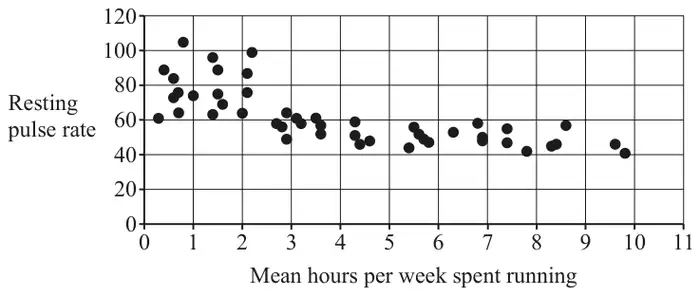
A biologist researching the same topic collects a random sample of size 47. She represents the data using the scatter diagram shown below.
(b) Describe the association between resting pulse rate and mean hours per week spent running. [1]
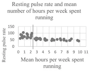
(c) The biologist identifies two distinct regions on the scatter diagram. Identify these regions on the copy of the scatter diagram in the Printed Answer Booklet by drawing an appropriate vertical line between them. [1]
According to medical research, the normal resting pulse rate for an adult is between 60 and 110 beats per minute.
The biologist separates the data into a group to the left of the vertical line on the scatter diagram and a group to the right of the vertical line on the scatter diagram. She calculates Spearman’s rank correlation coefficient, \(r_s\), and the associated \(p\)-value for each group.
The results are shown in the table.
Group
\(r_s\)
\(p\)-value
To the left of the vertical line
0.209 36
0.419 98
To the right of the vertical line
–0.613 49
0.000 31
(d) With reference to the two groups identified by the biologist and to the values in the table, explain what may be inferred about the association between resting pulse rate and mean number of hours per week spent running. [6]
Mark scheme (a)
Scheme
Marks
AO
(i) opportunity (sampling)
B1
2.5
[1]
(ii) only people known to the personal trainer / his clients sampled oe so eg they are fitter than typical members of the population oe eg sample may not be representative oe
B1
2.3
[1]
Notes
(i) B1: allow convenience (sampling) do not allow eg convenient sampling; eg opportunistic sampling
(ii) B1: allow so any eg which alludes to sample possibly giving unrepresentative values
Mark scheme (b)
Scheme
Marks
AO
negative (association)
B1
2.4
[1]
Notes
B1: ignore adjectives such as weak, strong etc allow eg as mean hours spent running increases, resting pulse rate decreases; eg negative relationship; do not allow eg (negative) correlation; eg as pulse rate increases, mean hours per week spent running decreases
Mark scheme (c)
Scheme
Marks
AO
B1
2.2b
[1]
Notes
B1: approximately vertical line at about 2.5; B0 if more than one line
Mark scheme (d)
Scheme
Marks
AO
LH region 0.20936 is (fairly) small oe isw
B1
3.4
0.41998 is not close to 0 oe isw
M1
3.4
insufficient evidence to suggest association (between mean time spent running and resting pulse rate) oe
A1
2.2b
RH region –0.61349 is closer to –1 than 0 oe isw
B1
3.4
0.00031is close to 0 oe
M1
3.4
sufficient evidence to suggest (some) [negative] association (between mean time spent running and resting pulse rate) oe
A1
2.2b
[6]
Notes
B1: allow eg \(r_s\) is closer to 0 than to 1; eg low value of \(r_s\); eg allow \(r_s\) close to 0
M1: allow eg \(p\)-value \(\gt\) 0.05 (or 0.01 or 0.1) eg \(p\)-value not small do not allow eg \(p\)-value (relatively) large eg high \(p\)-value
A1: may infer no association
B1: allow eg \(r_s\) close to \(-1\) eg \(r_s\) is closer to –1 than 0; eg \(r_s\) is not small B0 for eg \(r_s\) is large oe
M1: allow eg \(p\)-value \(\lt\) 0.05 (or 0.01 or 0.10) allow eg \(p\)-value is (very) small/low
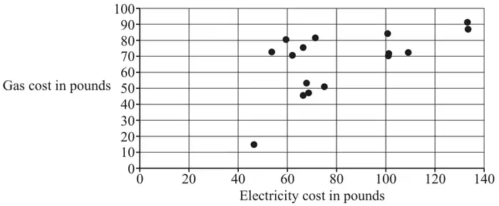
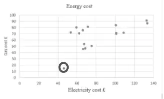
11 A householder is investigating whether there is any relationship between his monthly cost of gas and his monthly cost of electricity, both measured in pounds (£). The householder collects a random sample of monthly costs and presents them in the scatter diagram below.
One of the points on the diagram represents the energy costs in a month when the householder was away on holiday for three weeks. The other points represent the energy costs in months when the householder did not go away on holiday.
(a) On the copy of the diagram in the Printed Answer Booklet, circle the point which represents the month when the householder was most likely to have been away on holiday for three weeks. [1]
(b) With reference to the diagram, describe the relationship between the cost of gas and the cost of electricity. [1]
The householder decides to test whether there is evidence to suggest that there is any association between the monthly cost of gas and the monthly cost of electricity. The value of Spearman’s rank correlation coefficient for this sample is 0.4359 and the associated \(p\)-value is 0.091 95.
(c) Determine whether there is any evidence to suggest, at the 5% level, that there is any association between the monthly cost of gas and the monthly cost of electricity. [3]
Mark scheme (a)
Scheme
Marks
AO
B1
2.2b
[1]
Mark scheme (b)
Scheme
Marks
AO
(weak) positive association or (weak) positive correlation
B1
1.1
[1]
Notes
B1: allow eg as cost of electricity increases, cost of gas increases oe
Mark scheme (c)
Scheme
Marks
AO
0.09195 correctly compared with 0.05 or 0.025 only
M1
3.4
\(0.09195 \gt 0.025\)
A1
1.1
insufficient evidence [at the 5% level] to suggest any association between cost of gas and cost of electricity isw
A1
2.2b
[3]
Notes
M1: allow eg “\(p\)-value \(\gt 0.05\)”
A1: allow \(p\)-value \(\gt 0.025\)
A1:A0 if refers to correlation rather than association; dependent on award of previous A1
14 The pre-release material contains information concerning the median income of taxpayers in £ and the percentage of all pupils at the end of KS4 achieving 5 or more GCSEs at grade A*–C, including English and Maths, for different areas of London.
Some of the data for 2014/15 is shown in Fig. 14.1.
Fig. 14.1
Median Income of Taxpayers in £
Percentage of Pupils Achieving 5 or more A*–C, including English and Maths
City of London
61 100
#N/A
Barking and Dagenham
21 800
54.0
Barnet
27 100
70.1
Bexley
24 400
55.0
Brent
22 700
60.0
Bromley
28 100
68.0
A student investigated whether there is any relationship between median income of taxpayers and percentage of pupils achieving 5 or more GCSEs at grade A*–C, including English and Maths.
(a) With reference to Fig. 14.1, explain how the data should be cleaned before any analysis can take place. [1]
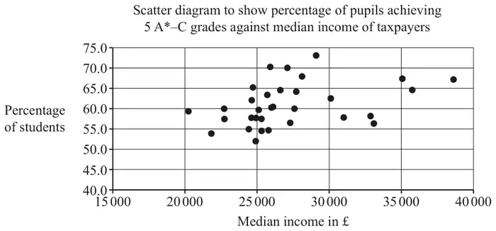
After the data was cleaned, the student used software to draw the scatter diagram shown in Fig. 14.2.
Fig. 14.2
The student calculated that the product moment correlation coefficient for these data is 0.3743.
(b) Give two reasons why it may not be appropriate to use a linear model for the relationship between median income of taxpayers in £ and the percentage of all pupils at the end of KS4 achieving 5 or more GCSEs at grade A*–C. [2]
The student carried out some further analysis. The results are shown in Fig. 14.3.
Fig. 14.3
median income of taxpayers in £
percentage of pupils achieving 5+ A*–C
mean
27 216
61.0
standard deviation
4177.5
5.32
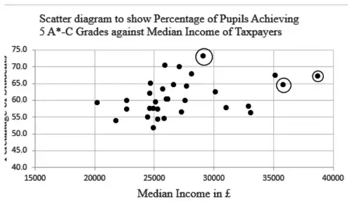
The student identified three outliers in total.
(c)
Use the information in Fig. 14.3 to determine the range of values of the median income of taxpayers in £ which are outliers.
Use the information in Fig. 14.3 to determine the range of values of the percentage of all pupils at the end of KS4 achieving 5 or more GCSEs at grade A*–C which are outliers.
On the copy of Fig. 14.2 in the Printed Answer Booklet, circle the three outliers identified by the student.
[4]
The student decided to remove these outliers and recalculate the product moment correlation coefficient.
(d) Explain whether the new value of the product moment correlation coefficient would be between 0.3743 and 1 or between 0 and 0.3743. [1]
Mark scheme (a)
Scheme
Marks
AO
discard City of London (as part of the data not available) or discard any regions where one or more pieces of data are missing oe
B1
2.4
[1]
Notes
B1: LDS advantage do not allow if answer spoiled eg because it’s an anomaly, eg because it’s an outlier,
Mark scheme (b)
Scheme
Marks
AO
scatter does not look linear oe
B1
3.4
pmcc not close to 1 oe
B1
3.4
[2]
Notes
B1: ignore extra comments unless they contradict an otherwise correct answer
B1: ignore extra comments unless they contradict an otherwise correct answer
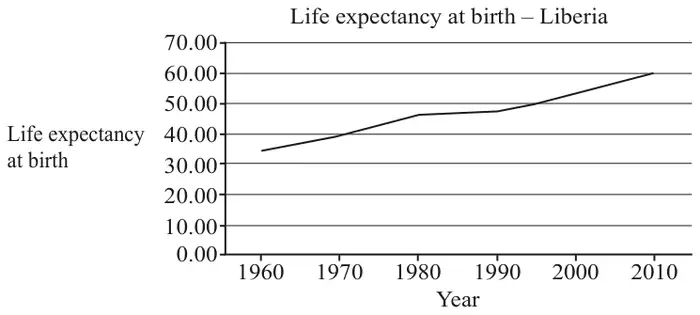
15 The pre-release material includes information on life expectancy at birth in countries of the world. Fig. 15.1 shows the data for Liberia, which is in Africa, together with a time series graph.
1960
1970
1980
1990
2000
2010
34.67
39.25
46.00
47.18
52.42
59.63
Fig. 15.1
Sundip uses the LINEST function on a spreadsheet to model life expectancy as a function of calendar year by a straight line.
The equation of this line is \(L = 0.473y - 892\), where \(L\) is life expectancy at birth and \(y\) is calendar year.
(a) Use this model to find an estimate of the life expectancy at birth in Liberia in 1995. [1]
According to the model, the life expectancy at birth in Liberia in 2025 is estimated to be 65.83 years.
(b) Explain whether each of these two estimates is likely to be reliable. [2]
(c) Use your knowledge of the pre-release material to explain whether this model could be used to obtain a reliable estimate of the life expectancy at birth in other countries in 1995. [1]
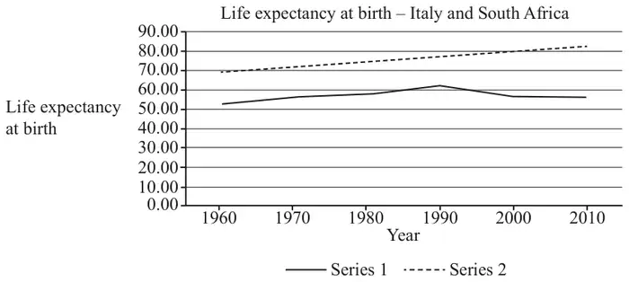
Fig. 15.2 shows the life expectancy at birth between 1960 and 2010 for Italy and South Africa.
Fig. 15.2
(d) Use your knowledge of the pre-release material to
Explain whether series 1 or series 2 represents the data for Italy.
Explain how the data for South Africa differs from the data for most developed countries.
[2]
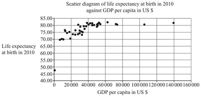
Sundip is investigating whether there is an association between the wealth of a country and life expectancy at birth in that country. As part of her analysis she draws a scatter diagram of GDP per capita in US$ and life expectancy at birth in 2010 for all the countries in Europe for which data is available. She accidentally includes the data for the Central African Republic. The diagram is shown in Fig. 15.3.
Fig. 15.3
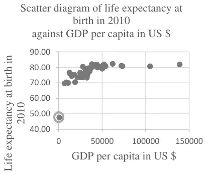
(e) On the copy of Fig. 15.3 in the Printed Answer Booklet, use your knowledge of the pre-release material to circle the point representing the data for the Central African Republic. [1]
Sundip states that as GDP per capita increases, life expectancy at birth increases.
(f) Explain to what extent the information in Fig. 15.3 supports Sundip’s statement. [2]
Mark scheme (a)
Scheme
Marks
AO
51.635 or 51.64 or 51.6
B1
3.4
[1]
Mark scheme (b)
Scheme
Marks
AO
1995 estimate (probably) reliable since it is interpolation
B1
2.2b
2025 estimate (probably) not reliable since it is extrapolation
B1
2.2b
[2]
Notes
B1: allow eg the first estimate..
B1: allow eg the second estimate…
Mark scheme (c)
Scheme
Marks
AO
No, because trends in life expectancy at birth may vary considerably between nations
B1
2.4
[1]
Notes
B1: LDS advantage
Mark scheme (d)
Scheme
Marks
AO
series 2 (the top one) is Italy – life expectancy (generally) higher in Europe (than Africa)
B1
2.4
the values are decreasing (from 1990) in South Africa (– unusual since most show an upward trend) or little (or no) overall increase in South Africa (since 1970) or South Africa has lower life expectancy (than most developed countries)
B1
2.4
[2]
Notes
B1: LDS advantage
B1: LDS advantage
Mark scheme (e)
Scheme
Marks
AO
B1
1.1
[1]
Notes
B1: Point at (700, 47.56) ringed LDS advantage
Mark scheme (f)
Scheme
Marks
AO
the diagram supports this statement for values of GDP per capita from \(k\) to \(n\) where \(0 \lt k \leqslant 20\,000\) and \(40\,000 \leqslant n \leqslant 60\,000\) since there appears to be positive correlation oe
B1
2.3
for values of GDP per capita \(\geqslant K\) where \(40\,000 \leqslant K \leqslant 60\,000\) there appears to be no association between GDP per capita and life expectancy at birth so the diagram does not support Sundip’s statement for these values
B1
2.2b
[2]
Notes
B1: must give specific range of values ; must say supports statement oe
B1: the range may be implied by reference to a specific range identified for the first mark; must say does not support statement oe
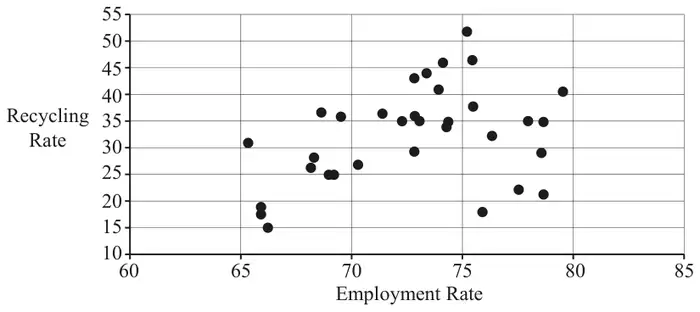
13 The pre-release material contains information concerning median house prices, recycling rates and employment rates. Fig. 13.1 shows a scatter diagram of recycling rate against employment rate for a random sample of 33 regions.
Fig. 13.1
The product moment correlation coefficient for this sample is 0.37154 and the associated \(p\)-value is 0.033.
Lee conducts a hypothesis test at the 5% level to test whether there is any evidence to suggest there is positive correlation between recycling rate and employment rate. He concludes that there is no evidence to suggest positive correlation because \(0.033 \approx 0\) and \(0.37154 > 0.05\).
(a) Explain whether Lee’s reasoning is correct. [2]
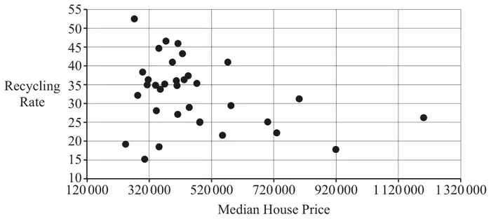
Fig. 13.2 shows a scatter diagram of recycling rate against median house price for a random sample of 33 regions.
Fig. 13.2
The product moment correlation coefficient for this sample is \(-0.33278\) and the associated \(p\)-value is 0.058.
Fig. 13.3 shows summary statistics for the median house prices for the data in this sample.
Statistics
n
33
Mean
465467.9697
σ
201236.1345
s
204356.2606
Σx
15360443
Σx2
8486161617387
Min
243500
Q1
342500
Median
410000
Q3
521000
Max
1200000
Fig. 13.3
(b) Use the information in Fig. 13.3 and Fig. 13.2 to show that there are at least two outliers. [2]
(c) Describe the effect of removing the outliers on
the product moment correlation coefficient between recycling rate and median house price,
the \(p\)-value associated with this correlation coefficient,
in each case explaining your answer. [2]
All 33 items in the sample are areas in London. A student suggests that it is very unlikely that only areas in London would be selected in a random sample.
(d) Use your knowledge of the pre-release material to explain whether you think the student’s suggestion is reasonable. [1]
Mark scheme (a)
Scheme
Marks
AO
Lee is wrong because he should make the comparison of 0.033 with 0.05
B1
2.2a
he should make the comparison of 0.37154 with 0
B1
2.2b
[2]
Notes
B1: allow he should have compared \(r\) with the critical value
if B0B0SC1 for Lee has confused \(r\) with \(p\) or for 0.37154 suggests positive correlation
Mark scheme (b)
Scheme
Marks
AO
\(465467 + 2 \times 204356\)
M1
2.1
awrt 874180 (or 867940 from use of 201236) from scatter diagram the outliers are approximately 920 000, 1 200 000
A1
2.2b
[2]
Notes
M1: condone use of 201236 instead of 204356; ignore work relating to lower tail or \(521000 + 1.5 \times (521000 - 342500)\)
A1: numerical values must be mentioned or 788750 in which case accept two or three outliers identified extra one is approximately 800 000 (corrected from the printed mark scheme: “867940 from use of 210236” is printed; 867940 comes from 201236)
Mark scheme (c)
Scheme
Marks
AO
the pmcc would (probably) be closer to 0 because the scatter is less well modelled by a straight line
B1
2.2b
the \(p\)-value would increase because a value which is closer to 0 is more likely assuming there is no correlation
B1
2.2b
[2]
Notes
if B0B0 allow SC1 for \(r\) closer to 0 and \(p\)-value larger
Mark scheme (d)
Scheme
Marks
AO
the student’s suggestion is reasonable, since there are other regions defined in the LDS
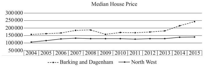
11 The pre-release material contains information concerning median house prices over the period 2004 – 2015. A spreadsheet has been used to generate a time series graph for two areas: the London borough of “Barking and Dagenham” and “North West”. This is shown together with the raw data in Fig. 11.1.
Year
Barking and Dagenham
North West
2004
160 000
107 000
2005
163 000
118 000
2006
168 000
127 000
2007
185 000
134 750
2008
190 000
129 950
2009
160 000
130 000
2010
171 000
130 000
2011
170 000
127 000
2012
174 995
130 000
2013
180 995
131 000
2014
215 000
138 500
2015
243 500
140 000
Fig. 11.1
Dr Procter suggests that it is unusual for median house prices in a London borough to be consistently higher than those in other parts of the country.
(a) Use your knowledge of the large data set to comment on Dr Procter’s suggestion. [1]
Dr Procter wishes to predict the median house price in Barking and Dagenham in 2016. She uses the spreadsheet function LINEST to find the equation of the line of best fit for the given data. She obtains the equation
\(P = 4897Y - 9\,657\,847\), where \(P\) is the median house price in pounds and \(Y\) is the calendar year, for example 2015.
(b) Use Dr Procter’s equation to predict the median house price in Barking and Dagenham in
2016
2017.
[2]
Professor Jackson uses a simpler model by using the data from 2014 and 2015 only to form a straight-line model.
(c) Find the equation Professor Jackson uses in her model. [2]
(d) Use Professor Jackson’s equation to predict the median house price in Barking and Dagenham in
2016
2017.
[2]
Professor Jackson carries out some research online. She finds some information about median house prices in Barking and Dagenham, which is shown in Fig. 11.2.
2016
2017
£290 000
£300 000
Fig. 11.2
(e) Comment on how well
Dr Procter’s model fits the data,
Professor Jackson’s model fits the data.
[2]
(f) Explain which, if any, of the models is likely to be more reliable for predicting median house prices in Barking and Dagenham in 2020. [1]
Mark scheme (a)
Scheme
Marks
AO
house prices are generally higher in London boroughs (than elsewhere in the country), so Dr Procter’s suggestion is probably wrong
B1
2.2a
[1]
Mark scheme (b)
Scheme
Marks
AO
214 505
B1
3.4
219 402
B1
1.1
[2]
Mark scheme (c)
Scheme
Marks
AO
\(P = 28\,500Y - 57\,184\,000\) (where \(Y\) is the calendar year)
B1
3.3
or \(P = 28\,500y + 215\,000\) (where \(y\) is the number of years after 2014)
B1
1.1
[2]
Notes
B1: gradient
B1: intercept
allow both marks for correct equation in any form isw allow eg \(y = 28\,500x - 57\,184\,000\)
Mark scheme (d)
Scheme
Marks
AO
2016 272 000
B1
3.4
2017 300 500
B1
1.1
[2]
Notes
FTtheir straight line model provided this gives values > 250 000
Mark scheme (e)
Scheme
Marks
AO
Dr Procter’s model is a (very) poor fit
B1
2.2a
Prof Jackson’s is a good fit, or works well for 2017, but not 2016
B1
2.2a
[2]
Notes
B1: dependent on correct values in (b)
B1:FT comment for their values > 250 000 this mark is dependent on having calculated values in part (d)