
June 2023 Paper 2 Q13
13 The scatter diagram uses information about all the Local Authorities (LAs) in the UK, taken from the 2011 census.
For each LA it shows the percentage (\(x\)) of employees who used public transport to travel to work and the percentage (\(y\)) who used motorised private transport.
“Public transport” includes train, bus, minibus, coach, underground, metro and light rail.
“Motorised private transport” includes car, van, motorcycle, scooter, moped, taxi and passenger in a car or van.
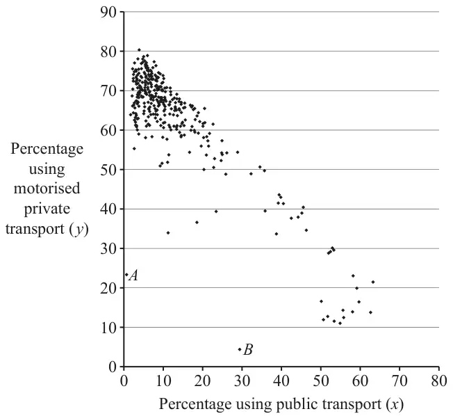
Consider the two groups of LAs where the percentages using motorised private transport are highest and lowest.
A student says that it is not possible to give a reliable answer to part (b)(i) without some further information.
Describe, with a justification, this characteristic. [2]
Describe, with a justification, this difference. [2]
Explain whether you agree with this criticism. [1]
| Scheme | Marks | AO |
|---|---|---|
| (i) \(k = 70\) to 80 inclusive | B1 | 1.2 |
| [1] | ||
| (ii) \(100 -\) their \(k\) | B1FT | 2.2a |
| [1] |
Notes
(a)(ii)
B1FT: Strictly FT their \(k\) (i.e. this must be \(100 -\) their \(k\) only)
| Scheme | Marks | AO |
|---|---|---|
| (i) The group with highest usage of private (motorised) transport (top left), because private transport uses more fuel than public transport (for the same travel distance, per person). | B1 | 2.2b |
| [1] | ||
| (ii) e.g. Lengths of journeys (or distance travelled) and | B1 | 2.4 |
| e.g. how many people travel in each vehicle used (or ‘occupancy’ of each mode) | B1 | 2.4 |
| [2] |
Notes
(b)(i)
B1: For a clear explanation that must both identify the group unambiguously (e.g. ‘top left’, ‘least public transport use’) and give a reason.
Accept equivalent justifications e.g. ‘each individual uses more fuel’
(b)(ii)
B1 B1: For two sensible distinct suggestions. Acceptable answers include:
- The type or amount of fuel used (by different modes of transport)
- Proportion or usage of Electric Vehicles
- Types of vehicle used (or available)
- Proportion of the different modes of transport within each category
- The occupancy of each mode (or e.g. car sharing)
- Proportion of full-time vs part-time working patterns
Do not accept:
- Population size (because \(F\) is per person)
- Number of those not in work (because \(F\) is for employees)
- References to emissions e.g. ‘given off’ (because \(F\) is the amount of fuel used)
| Scheme | Marks | AO |
|---|---|---|
| (i) Large percentage walk/cycle/work from home | B1 | 2.2b |
| Small area | B1 | 2.4 |
| [2] | ||
| (ii) \(A\) is rural, \(B\) is urban | B1 | 2.2b |
| Public transport is absent in \(A\) but used in \(B\) or, eg, Those in \(B\) who don’t walk, don’t use cars, so there is probably a lot of traffic, so \(B\) is urban. No public transport in \(A\) so \(A\) is rural | B1 | 2.4 |
| [2] |
Notes
(c)(i)
B1: For the shared characteristic (any of walk/cycle/work from home). Condone ‘these have the lowest total proportion using public or motorised private transport combined’ but do not accept only ‘lower percentage using motorised private transport’ or ‘lower percentage using public transport’ – need both
B1: For a justification (must be related to the LA). Acceptable answers include:
- ‘less need to travel to work’
- ‘shorter journeys’
- ‘better walking/cycling infrastructure’
But not just ‘more work from home’ (this is the characteristic)
(\(A\) is Scilly Isles, \(B\) is City of London)
(c)(ii)
B1: B1 for identifying the difference in environment (must make a comparison e.g. ‘\(A\) is more rural than \(B\)’). Accept clearly equivalent statements e.g. ‘city’ or ‘countryside’
B1: B1 for justification.
Cannot just restate the data so do not accept e.g. ‘\(A\) has low public transport use’ – must give a justification as to why this might be.
Accept e.g. ‘less availability of public transport’
Other sensible answers may be seen e.g. ‘motorised private transport is almost absent in \(B\) but more widely used in \(A\)’
| Scheme | Marks | AO |
|---|---|---|
| Some points are too close together to read | B1 | 2.3 |
| [1] |
Notes
B1: Must make a specific criticism of the graph related to reading values. Acceptable answers include:
- ‘the scale is not precise enough to read detailed values’
- ‘closely clustered points mean it is hard to read’
- ‘there are no gridlines so cannot read exact values’
Do not accept generic statements such as ‘the data may not be accurate’ or references to information not included on the graph.