
October 2021 Paper 2 Q13
13 The four pie charts illustrate the numbers of employees using different methods of travel in four Local Authorities in 2011.
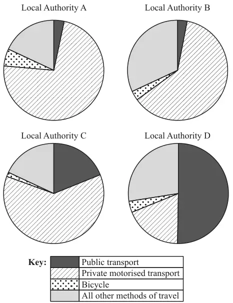
(a) State, with reasons, which of the four Local Authorities is most likely to be a rural area with many hills. [2]
(b) Explain why pie charts are more suitable for answering part (a) than bar charts showing the same data. [1]
(c) Two of the Local Authorities represent urban areas.
(i) State with a reason which two Local Authorities are likely to be urban. [2]
(ii) One urban Local Authority introduced a Park-and-Ride service in 2006. Users of this service drive to the edge of the urban area and then use buses to take them into the centre of the area. A student claims that a comparison of the corresponding pie charts for 2001 (not shown) and 2011 would enable them to identify which Local Authority this was.
State with a reason whether you agree with the student. [2]
State with a reason whether you agree with the student. [2]
| Scheme | Marks |
|---|---|
| A: High private and low public OR B: Low bicycle and low public OR B: Low bicycle and high private OR C: Low bicycle and high private | B2 |
| [2] |
Notes
Allow B1 for A or B or C with one correct factor only. Ignore else
All answers can be implied
Ignore all else
| Scheme | Marks |
|---|---|
| Pie charts allow comparison of proportions Pie charts show proportions oe Ignore all else | B1 |
| [1] |
Notes
NOT: Bar charts don’t show proportions unless also state pies do.
Assume “They” means pie charts.
NOT: It’s easier to compare data
Pie charts don’t easily show which is greatest
Allow percentages instead of proportions
| Scheme | Marks |
|---|---|
| (i) C and D | B1 |
| Larger (or high or most) proportion public transport Can be implied. Ignore all else | B1 |
| [2] | |
| (ii) LDS says “The method of travel used is for the longest part, by distance, of the usual journey to work” Correct answers therefore should assume users of P&R will report only private, not public | |
| Method of travel is the type used for the longest part of the journey | B1 |
| Most people using Park-and-Ride would still say they were using private transport. | B1 |
| [2] |
Notes
(c)(i)
B1: Both, no others
B1: Dep applied to at least one of C and D, even if other LA mentioned
B-marks are independent
(c)(ii)
B1: "Disagree" may be implied
B1: independent Ignore all else
| Scheme | Marks |
|---|---|
| People will still have to travel by car, so the results won’t be very different | B2 |
Alternatives, assuming (incorrectly) users of P&R will report both methods or just public:
| Scheme | Marks |
|---|---|
| Public transport increase or private decrease “Agree” may be implied. Ignore all else | B1 B0 |
| P&R will result in more people using private transport, so this will show an increase Not just “Increase in private” without justification | B1 B0 |
| Users of P&R will use both public and private, so not clear | B1 B0 |
| No, because other changes might have been made that affect the proportions. | B2 |
| If P&R users report both, or just public, then yes, public will show increase | B2 |
| Recognition of issue as to whether P&R users should report private or public Hence unclear whether change will show | B1 B1 |
Other sensible answers may be seen not covered in this MS