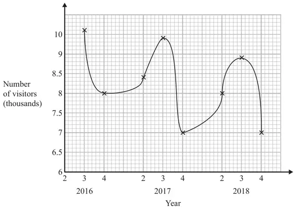
27 Sean has drawn a time series graph to show the numbers, in thousands, of visitors to a fun park.
Write down two things that are wrong or could be misleading with this graph. (2)
Mark scheme
Answer
Mark
Mark scheme
statement
B2
Two different statements Acceptable eg should be joined with straight lines (not curve)/should use a ruler 1st (quarter) not shown/plotted/labelled/not all quarters labelled does not show all 4 seasons 9.5 missing from vertical axes/not linear vertical (number) axis does not start at 0/the \(y\) axis starts at 6 the graph does not begin at 0, it starts at 6 it is not clear what 2, 3, 4 on the \(x\)-axis mean the scale of years doesn’t make sense there is lack of clarity about what the numbers on the \(x\) axis represent graph is curved line Not acceptable eg no value plotted for 2 in 2016 it does not start at 0 (no reference to vertical axis)/missing 0 they should not have connected the dots like that the numbers on the \(x\) axis are repeated the numbers along the \(x\) axis 2, 3, 4 the years on the \(x\) axis have not been written properly does not follow a sequence it needs a discontinuity wiggle on the axis no title
(B1
One statement eg from those above.)
Additional guidance
Ignore additional statements provided no contradiction
20 Youssuf posted an advert on his social media channel.
The table shows the number of views of the advert during its first 6 days.
Day
1
2
3
4
5
6
Number of views
49 000
95 000
87 000
77 000
64 000
48 000
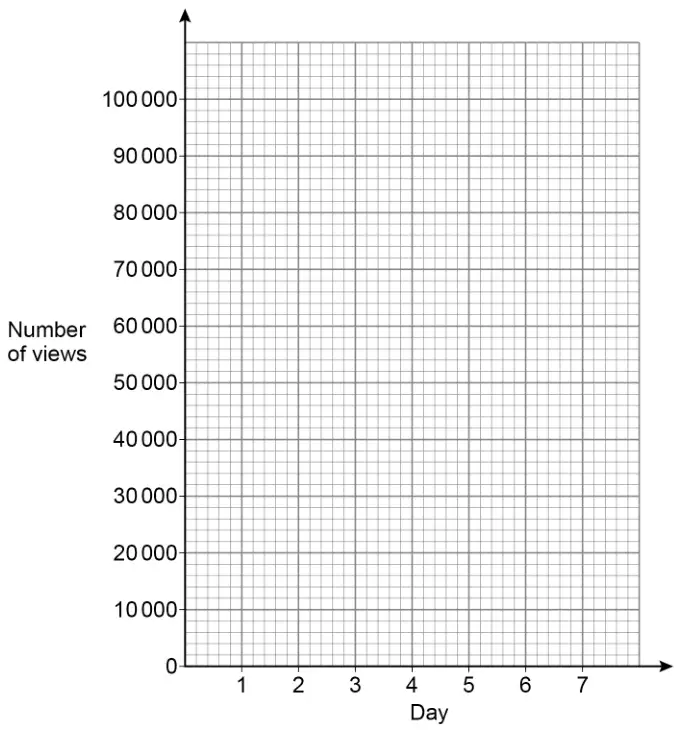
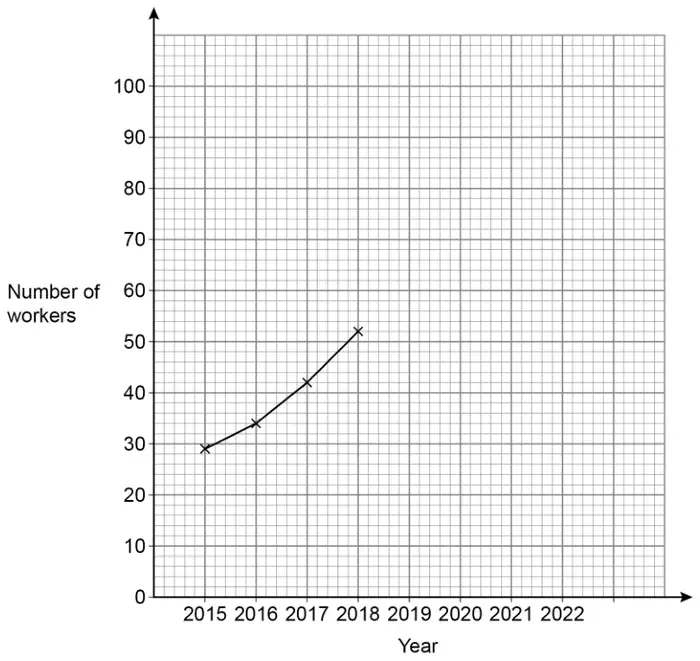
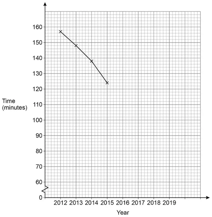
(a) On the grid, draw a time series graph to represent the data. [2 marks]
(b) Youssuf receives 0.018p for each view of the advert.
Estimate how much he receives from views of the advert on day 7[3 marks]
Mark scheme (a)
Answer
Mark
Comments
All six given points plotted correctly and joined with straight lines
B2
\(\pm\) half square B1 at least four of the given points plotted correctly
Additional guidance
Mark intention for straight lines
Lines can be dashed (do not regard as short lines if intention clear) or continuous
Ignore lines drawn to the left of day 1 and to the right of day 6
The top of the lines in a vertical line graph can imply points plotted correctly (other vertical lines can be ignored)
Ignore horizontal lines
Ignore extra points
Ignore a line of best fit and/or a histogram and/or a bar chart
Mark scheme (b)
Answer
Mark
Comments
[20 000, 40 000]
B1
may be implied
their [20 000, 40 000] \(\times\) 0.018 (\(\div\) 100) or [360, 720] (\(\div\) 100)
M1
oe eg their [20 000, 40 000] \(\times\) 0.000 18 1000 \(\lt\) their [20 000, 40 000] \(\lt\) 48 000 condone 0.02 for 0.018
[3.60, 7.20]
A1ft
ft B0M1 answer must be an amount of money
Additional guidance
Accept an answer in pence only if £ has been crossed out and p(ence) is given
For A1 or A1ft accept answers rounded or truncated to the nearest penny eg \(28\,700 \times 0.018 \div 100\) Answer 5.17 (or 5.16)
B1M1A1
Using 0.02 can score a maximum of B1M1A0 eg1 \(30\,000 \times 0.02 = 600\) Answer 6 eg2 \(46\,000 \times 0.02 = 920\) Answer 9.20
B1M1A0 B0M1A0
Estimating their final answer can score a maximum of B1M1A0 unless correct answer also seen eg1 \(32\,000 \times 0.018 \div 100\) Answer 5.80 eg2 \(32\,000 \times 0.018 \div 100 = 5.76\) Answer 5.80
B1M1A0 B1M1A1
\(30\,000 \times 0.018\) Answer 5.4
B1M1A0
If part (b) is blank, B1 may be awarded for [20 000, 40 000] unambiguously stated for day 7 in part (a)
3 Youssuf posted an advert on his social media channel.
The table shows the number of views of the advert during its first 6 days.
Day
1
2
3
4
5
6
Number of views
49 000
95 000
87 000
77 000
64 000
48 000
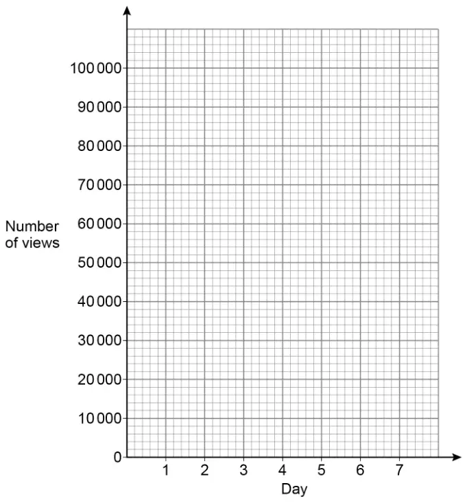
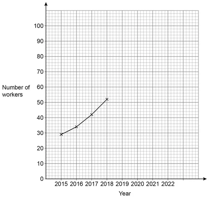
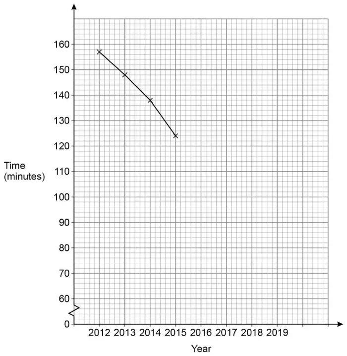
(a) On the grid, draw a time series graph to represent the data. [2 marks]
(b) Youssuf receives 0.018p for each view of the advert.
Estimate how much he receives from views of the advert on day 7[3 marks]
Mark scheme (a)
Answer
Mark
Comments
All six given points plotted correctly and joined with straight lines
B2
\(\pm\) half square B1 at least four of the given points plotted correctly
Additional guidance
Mark intention for straight lines
Lines can be dashed (do not regard as short lines if intention clear) or continuous
Ignore lines drawn to the left of day 1 and to the right of day 6
The top of the lines in a vertical line graph can imply points plotted correctly (other vertical lines can be ignored)
Ignore horizontal lines
Ignore extra points
Ignore a line of best fit and/or a histogram and/or a bar chart
Mark scheme (b)
Answer
Mark
Comments
[20 000, 40 000]
B1
may be implied
their [20 000, 40 000] \(\times\) 0.018 (\(\div\) 100) or [360, 720] (\(\div\) 100)
M1
oe eg their [20 000, 40 000] \(\times\) 0.000 18 1000 \(\lt\) their [20 000, 40 000] \(\lt\) 48 000 condone 0.02 for 0.018
[3.60, 7.20]
A1ft
ft B0M1 answer must be an amount of money
Additional guidance
Accept an answer in pence only if £ has been crossed out and p(ence) is given
For A1 or A1ft accept answers rounded or truncated to the nearest penny eg \(28\,700 \times 0.018 \div 100\) Answer 5.17 (or 5.16)
B1M1A1
Using 0.02 can score a maximum of B1M1A0 eg1 \(30\,000 \times 0.02 = 600\) Answer 6 eg2 \(46\,000 \times 0.02 = 920\) Answer 9.20
B1M1A0 B0M1A0
Estimating their final answer can score a maximum of B1M1A0 unless correct answer also seen eg1 \(32\,000 \times 0.018 \div 100\) Answer 5.80 eg2 \(32\,000 \times 0.018 \div 100 = 5.76\) Answer 5.80
B1M1A0 B1M1A1
\(30\,000 \times 0.018\) Answer 5.4
B1M1A0
If part (b) is blank, B1 may be awarded for [20 000, 40 000] unambiguously stated for day 7 in part (a)
The table shows the number he sold each quarter for three years.
Quarter 1
Quarter 2
Quarter 3
Quarter 4
2016
17
64
50
5
2015
9
72
61
1
2014
19
58
53
2
(a) In which year did he sell the most lawnmowers?
You must show your working. [2 marks]
(b) He uses the table to decide the number of lawnmowers to stock each quarter.
At the start of which quarter should Chris stock the most lawnmowers?
Circle your answer. [1 mark]
Quarter 1
Quarter 2
Quarter 3
Quarter 4
Mark scheme (a)
Answer
Mark
Comments
Alternative method 1
Two of the three totals correct (2016 =) 136 (2015 =) 143 (2014 =) 132 or 17 + 64 + 50 + 5 and 9 + 72 + 61 + 1 and 19 + 58 + 53 + 2
M1
Totals may be seen by table Correct totals may be implied by means (2016 \(\rightarrow\) 34, 2015 \(\rightarrow\) 35.75, 2014 \(\rightarrow\) 33) Addition signs must be shown for horizontal addition but may be implied by a column of numbers in their working
136 and 143 and 132 and 2015 or 34 and 35.75 and 33 and 2015
A1
Totals may be seen by table
Alternative method 2
8 and –8 and –11 and 4 or –7 and –10 and 14 and 8 and –1 or 11
M1
Difference between 2016 and 2015 Difference between 2015 and 2014 Differences may be seen in table
–7 and 11 and 2015
A1
Differences may be seen in table
Additional guidance
Differences may have consistently opposite signs for either comparison