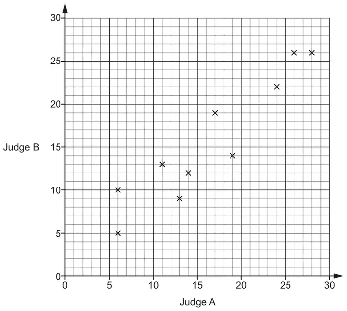
1 In a dance competition, two judges each award scores out of 30. The scatter diagram shows the scores awarded to the first 10 dancers.
(a) Here are the scores for the next two dancers.
Judge A
21
7
Judge B
18
8
Plot their scores on the scatter diagram. [1]
(b) Dancers who are awarded a score of more than 20 by both judges receive a medal.
For the 12 dancers, express the ratio of medal winners to non-medal winners in its simplest form. [3]
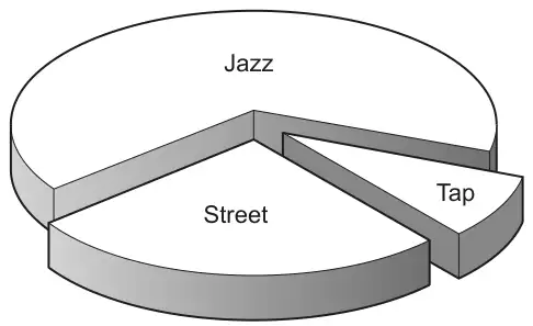
(c) This chart shows the types of dance performed by the 12 dancers. 3 performed a street dance, 8 performed a jazz dance and 1 performed a tap dance.
Why is this diagram misleading? [1]
Mark scheme (a)
Answer
Marks
Part marks and guidance
Points plotted at (21, 18) and (7, 8)
1
Tolerance ±1 mm
Mark scheme (b)
Answer
Marks
Part marks and guidance
1 : 3
3
B2 for 3 : 9 oe or answer 3 : 1 or B1 for 3 [dancers] or 9 [dancers] identified
If 0 scored then SC1 for 4 : 8 seen and simplified to 1 : 2
NOT from 4 : 12 May be on graph 4 : 12 simplified to 1 : 3 scores 0
Mark scheme (c)
Answer
Marks
Part marks and guidance
The wedges at the front look bigger than those at the back oe
1
Comments should refer to the 3D nature of the pie chart e.g. It’s tilted, slanted, seen from an angle etc. Ignore all references to missing angles, not being joined, etc. Mark the best bit unless contradicted