1 Two pupils are given data that shows the estimated number of computer tablet users worldwide from 2014 to 2018.
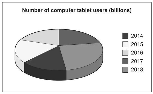
(a) Li creates this pie chart to show the data.
Write down two reasons why Li’s pie chart is not suitable to represent the data. [2]
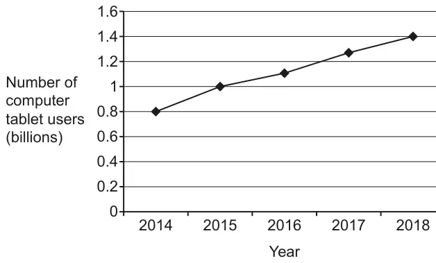
(b) Amaya creates this line graph to show the same data.
Work out the percentage increase in the number of computer tablet users from 2014 to 2018. [4]
Mark scheme (a)
Answer
Marks
Part marks and guidance
Two correct different observations from these three categories No values shown e.g. Pie chart only shows proportions not totals
3D aspect e.g. 3D distorts perspective oe
Colours/key unclear e.g. The colour/key are too similar oe
2
B1 for one correct observation
e.g. We have no total/numbers/figures/frequency
e.g. It’s tilted, slanted, seen from an angle etc
Where more than two reasons are given, mark the best unless contradicted e.g. ignore all references to missing angles Do not allow 2 marks for two reasons that refer to the same category Two reasons may appear in the same statement e.g. Its slanted and it does not show the total number [gets 2 marks] See Appendix
Appendix: additional guidance for Q1(a)
Mark
Comments about no numbers
1
There are no numbers/figures/scale [to indicate total or numbers in sector]
1
2
You don’t know what its out of. You need to total [frequency]
1
3
Its difficult to tell the size of each fraction of the pie chart and we need the total(we need the total gets the mark)
1
4
We need to know the angle sizes and what its out of(and what its out of gets the mark provided they don’t say its out of 360)
1
5
Pie charts show proportions/fractions/%’s but do not show quantities
1
Comments about 3D aspect
6
She is viewing the chart from the side not the front
1
7
Its 3D
1
8
It is hard to see the fractions/proportions
1
9
The sections at the front look larger than those at the back
1
10
Its slanted so its hard to measure the angles (Its slanted gets the mark)
1
11
Not able to measure angles owing to the positioning of the pie chart(gets it for the underlined part)
1
Comments about key/colours
12
Segments are not clearly labelled (ref to colour reason)
1
13
The colours look the same. Some of the years are the same colour.
1
14
The parts need to be clearly labelled BOD related to colour
1
15
The colours are confusing
16
It does not tell us the size of each sector (size does not imply number – could be angles)
0
17
Pie charts are for discrete data only
0
18
It might not be accurate
0
19
We need to know the angle sizes
0
20
There are better ways to present the data
0
21
It doesn’t have any labels (Not true – there are labels but not very clear)
0
22
It is an estimated number of users
0
23
The data is not in percentages.
0
24
The sectors have no angles/percentages/fractions
0
25
The sections are similar in size making it unclear
0
26
Not exact figures/data lost
0
Mark scheme (b)
Answer
Marks
Part marks and guidance
75
4
B1 for 0.8 and 1.4 or 3 [rows] and 4 [rows] oe
Accept work in billions for B and M marks i.e 800 000 000 and 1 400 000 000
AND M2 for \(\dfrac{\textit{their } 1.4 - \textit{their } 0.8}{\textit{their } 0.8}\) or \(\dfrac{\textit{their } 1.4 - \textit{their } 0.8}{\textit{their } 0.8} \times 100\)
or for \(\dfrac{\textit{their } 1.4}{\textit{their } 0.8} \times 100\) [ –100] oe
M2 soi by 0.75 or 175
or M1 for \(\dfrac{\textit{their } 1.4}{\textit{their } 0.8}\)