
Higher June 2019 Paper 5 Q5
5 The table shows the ages and values of 11 cars of the same model.
| Age (years) | 4 | 7 | 11 | 1 | 9 | 10 | 4 | 3 | 7 | 8 | 12 |
|---|---|---|---|---|---|---|---|---|---|---|---|
| Value (thousands of pounds) | 9.2 | 6.0 | 1.2 | 11.4 | 2.3 | 4.2 | 3.4 | 8.0 | 5.6 | 5.0 | 0.4 |
The points for the first 7 cars are plotted on the scatter diagram.
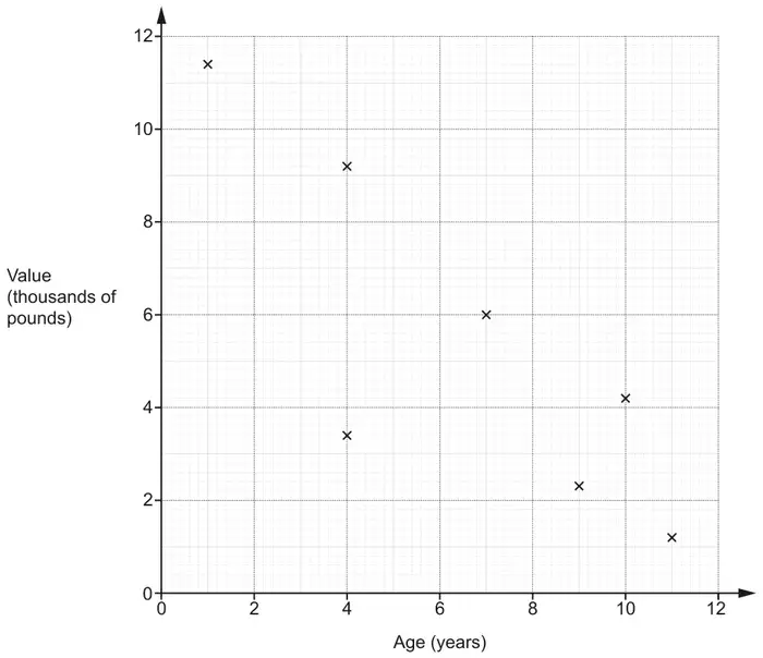
(a) Plot the points for the remaining 4 cars. [2]
(b) Describe the type and strength of the correlation shown in the completed scatter diagram. [2]
(c) One car lost its value more quickly than the other cars.
On the scatter diagram, draw a circle around the point representing this car. [1]
(d) By drawing a line of best fit, estimate the value of a car that is 6 years old. [2]
(e) Explain the limitations of using the equation of the line of best fit to estimate the value of a car that is 16 years old. [1]
| Answer | Marks | Part marks and guidance | |
|---|---|---|---|
| Four points correctly plotted | 2 | B1 for 2 or 3 correct plots | Mark in 70% zoom, use overlay, points inside or touching circles |
| Answer | Marks | Part marks and guidance | |
|---|---|---|---|
| Negative Strong | 1 1 | Do not accept description of relationship Accept moderate, medium etc, but not weak | |
| Answer | Marks | Part marks and guidance | |
|---|---|---|---|
| Point at (4, 3.4) indicated only | 1 | ||
| Answer | Marks | Part marks and guidance | |
|---|---|---|---|
| Ruled line of best fit and answer FT their line ± 100 | 2 | B1 for ruled line of best fit or for answer FT their line with negative gradient | Use overlay for LOBF, ruled line should be as long as the zone and should not cross the longer sides of the zone Not for e.g. 6.4 thousand |
| Answer | Marks | Part marks and guidance | |
|---|---|---|---|
| Only have data on cars up to 12 years old oe or Equation of line of best fit would give a negative value or zero oe | 1 | e.g. the trend may not continue It would give a negative cost Outside range of data provided oe The price would be below zero The price would be zero oe See AG Do not accept 16 is not on the graph The graph does not go to 16 Ignore incorrect statements | |
Appendix: exemplar responses for Q5(e)
| Response | Mark | |
|---|---|---|
| 1 | The line of best fit would hit zero before 16 years old and a car is always worth something | 1 |
| 2 | 16 years is off the scale so the estimate would be inaccurate as the correlation may change (Ignore insufficient first part – this gets it for the final part underlined) | 1 |
| 3 | No data for a car 16 years old | 1 |
| 4 | The equation will give a negative value | 1 |
| 5 | Data is only provided for cars up to 12 years old, so we don’t know beyond that | 1 |
| 6 | Should not extrapolate beyond 12 years | 1 |
| 7 | Car prices will never be zero BOD | 1 |
| 8 | Rate of value loss may not be constant (BOD trend does not continue) | 1 |
| 9 | 16 years is not on the graph | 0 |
| 10 | Worth is not decreasing at a standard rate, it is fluctuating | 0 |
| 11 | Graph only goes to 12 years and it is less likely cars will be 16 years old | 0 |
| 12 | Starts to curve off which is not shown on the graph | 0 |
| 13 | Just an average, depends on the condition, mileage etc | 0 |
| 14 | Extrapolated | 0 |
| 15 | Line of best fit won’t reach | 0 |