
June 2024 Paper 2 Q11
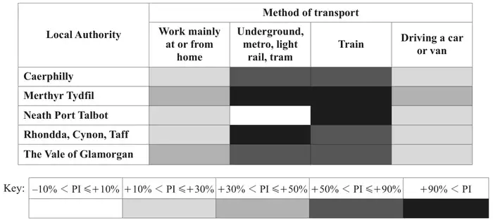
11 The chart below represents the percentage increases (PI) in the numbers of employees using four different methods of travel to work from 2001 and 2011, in five different Local Authorities (LAs) in Wales.
Give two reasons why the student is likely to be wrong. [2]
Explain why this means that the chart does not provide very helpful information for the student. [1]
Between 2001 and 2011 the increase in \(D\) was approximately 3.5 times the increase in \(H\).
Use this fact and the information in the chart to estimate the ratio \(D : H\) in 2001. [3]
| Scheme | Marks | AO |
|---|---|---|
| (i) Train, because all increases over 50% | B1 | 2.2b |
| [1] | ||
| (ii) The chart does not show where in the range each value is Or We do not know the (relative) sizes of each LA | B1 | 2.3 |
| [1] |
Notes
(a)(i) B1: Must specify Train and give a reason. Any sensible reason related to chart, e.g.:
- “Train has two of highest category and three of the 2nd highest”
- May refer to colours (e.g. dark, darker, darkest)
(a)(ii) B1: Any sensible reason relating to either ‘exact values’ or ‘actual/relative sizes of each LA’. Examples:
- “we do not know exact values because the data is grouped” B1
- “grouped” (without reference to exact values) B0
- “increases could be much higher than 90%” B1
- “low % of high number may be greater than high % of low number” B1
- “not all workers accounted for” B0
- “may be errors in data” B0
NB throughout this question, do not credit reasons that don’t relate to the question or that attempt to criticise the data set (rather than the chart/presentation and reasoning from it).
| Scheme | Marks | AO |
|---|---|---|
| Do not know the initial proportions of each mode of transport | B1 | 2.3 |
| Do not know the exact % increases | B1 | 2.4 |
| [2] |
Notes
B1 B1: Any 2 distinct correct reasons. Examples:
- “% ranges are wide” B1
- “Do not know the upper limit for +90% PI” B1
- “Do not know values within -10 to +10%” B1
- “Do not know baseline values for each mode” B1
- “size of the LAs” (not relevant here) B0
Do not credit criticism of underlying data or grouping of modes of transport (e.g. walking/working from home) B0
| Scheme | Marks | AO |
|---|---|---|
| (Small) changes in these small numbers will lead to large % increases (which may give a misleading impression of the overall trend). | B1 | 2.4 |
| [1] |
Notes
B1: Must refer to numbers or absolute values, not just %, e.g.:
- “actual increases small (so hard to see trend)” B1
- Do not credit references to grouped data / exact values here (not relevant) B0
| Scheme | Marks | AO |
|---|---|---|
| Increase in \(D\) is 20% and in \(H\) is 40% | M1 | 3.1a |
| \(0.2D_{01} \approx 3.5 \times 0.4H_{01}\) | M1 | 1.1 |
| \(D : H\) is \(7 : 1\) | A1 | 2.2b |
| [3] |
Notes
M1: M1 for sight of midpoints: 20% and 40%
- Allow 0.2 and 0.4
- Condone 1.2 and 1.4
Alternatively may see comparison of corresponding lower and upper bounds e.g. 10% -> 30% and 30% -> 50% (this leads to an estimate of 8.15) – M1
M1: For setting up two expressions and correctly using 3.5 (must be on the correct side). Do not accept 1.2, 1.4 here (NB \(3.5 \times 0.4 = 1.4\))
Allow = instead of \(\approx\)
Must be using two estimates for midpoints or considering both sets of lower/upper bounds
A1: Accept 3.5:0.5. If lower and upper bounds used, accept 8(.15):1
Need not be given as a ratio: accept \(\frac{D_{01}}{H_{01}} \approx 7\) oe but not \(D = 7H\)
Note that 7:2 often comes from not using any information from the chart (M0M0A0)