
Higher June 2024 Paper 5 Q4
4 The scatter diagram shows the test scores for 20 pupils in Science and Mathematics.
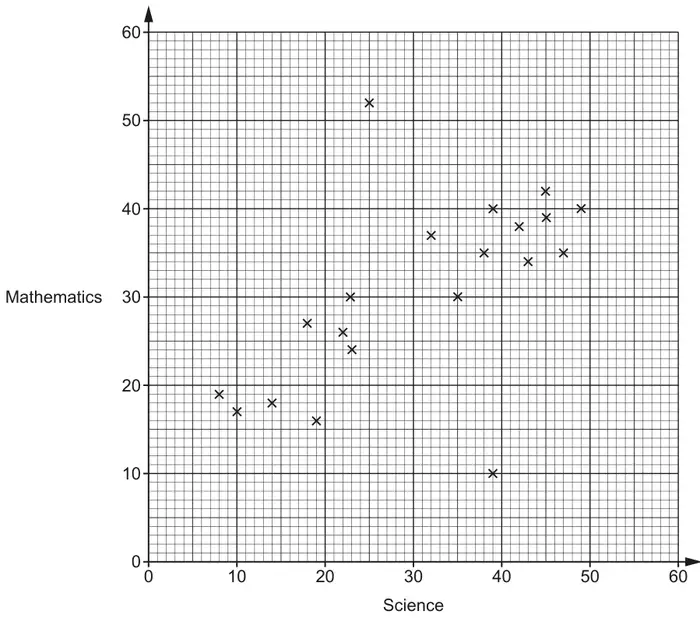
(a) Describe the type of correlation shown in the scatter diagram. [1]
(b) One pupil took the Science test but was then ill during the Mathematics test and had to leave early.
On the scatter diagram, circle the point that is most likely to represent this pupil. [1]
(c) By drawing a line of best fit, estimate the test score in Mathematics for a pupil who scored 28 in the Science test. [2]
(d) Explain why using the scatter diagram to estimate the test score in Mathematics for a pupil who scored 60 in Science may be unreliable. [1]
(e) Find the percentage of the 20 pupils who scored less than 30 marks in both Science and Mathematics. [3]
| Answer | Marks | Part marks and guidance | |
|---|---|---|---|
| Positive | 1 | Ignore embellishments | |
| Answer | Marks | Part marks and guidance | |
|---|---|---|---|
| Indicates the point (39, 10) | 1 | Ignore circles around the points \(\leqslant 30\) for both Science and Maths as this is working for part (e) | |
| Answer | Marks | Part marks and guidance | |
|---|---|---|---|
| Ruled line of best fit and answer FT ± 0.5 their straight ruled line at 28 Science marks | 2 | B1 for ruled line of best fit or answer FT ± 0.5 their straight ruled line with positive gradient | Use overlay for LOBF, ruled line needs to reach both gates set at: (8,11) and (8,22) (49,35) and (49,46) Gates include circles on overlay Ignore LOBF beyond gates |
| Answer | Marks | Part marks and guidance | |
|---|---|---|---|
| Correct explanation e.g. It is beyond the range of the data provided on the scatter diagram. The pupil may not follow the trend/pattern of the data | 1 | Accept The line of best fit should not extend beyond the data provided Outside range of data provided oe Small sample Data only goes up to 49 No one scores 60 Do not Accept You cannot extend past the LOBF otherwise it is inaccurate Ignore incorrect statements See Appendix 2 | |
Appendix 2: Question 4(d)
| Response | Mark | |
|---|---|---|
| 1 | It is extrapolated and not in the data provided | 1 |
| 2 | The diagram has no data above 49 (underlined part gets the mark) (accept range 49 to 59 for this type of statement) | 1 |
| 3 | The graph does not go up to 60 as there is no data above 49 (underlined part gets the mark) | 1 |
| 4 | We do not know that the pattern will continue above 49 (implies trend may not continue) | 1 |
| 5 | The graph does not cover that data range (allow for the underlined part) | 1 |
| 6 | There are no pupils on the graph with scores above 49 (accept pupils oe for data) (accept range 49 to 59 for this type of statement) | 1 |
| 7 | There are no plots/points/results on the graph above 49 (accept plots/points/results for data) (accept range 49 to 59) | 1 |
| 8 | Most pupils scored between 20 and 50 in Science – we cannot predict accurately for 60 marks | 1 |
| 9 | They may be much better at one subject than the other and do not follow the correlation (allow for the underlined part with ‘may’) | 1 |
| 10 | There is no data above 50 [for Science] (accept range 49 to 59 for this type of statement) | 1 |
| 11 | It may be an outlier (Implies it may not follow the pattern) | 1 |
| 12 | It is too far away from the last piece of data | 1 |
| 13 | There is insufficient data (implies small sample) | 1 |
| 14 | The graph reaches up to 49 (not referring to data) | 0 |
| 15 | The scattergraph does not go beyond 50 (not referring to data) | 0 |
| 16 | Extrapolated (needs explanation) | 0 |
| 17 | The graph only goes up to 49 (not referring to data) | 0 |
| 18 | The graph does not show information for a score of 60 | 0 |
| 19 | There is no data | 0 |
| 20 | They might be better at Maths than Science | 0 |
| 21 | It is an outlier (It is not an outlier – we do not know – needs to be phrased like example 11) | 0 |
| 22 | The highest Maths score was 49 and the highest Science score was 52 (Science is 49 and Maths 52 so incorrect) | 0 |
| 23 | Because there is no results | 0 |
| Answer | Marks | Part marks and guidance | |
|---|---|---|---|
| 35[%] | 3 | M2 for \(\frac{7}{20} \times 100\) oe or B1 for 7 [pupils] If 0 scored, SC1 for \(\frac{\textit{their}7}{20}\) correctly converted to a percentage. | B1 implied by \(\frac{7}{20}\) oe or \(\frac{7}{k}\) (\(k \gt 7\)) |