
Higher November 2024 Paper 4 Q4
4 Each week the manager of a petrol station records the average daily sales, in litres, and the average price, in pounds, of a litre of petrol for that week.
The table shows their results for ten weeks.
| Week | 1 | 2 | 3 | 4 | 5 | 6 | 7 | 8 | 9 | 10 |
|---|---|---|---|---|---|---|---|---|---|---|
| Price per litre (£) | 1.42 | 1.45 | 1.47 | 1.50 | 1.54 | 1.60 | 1.57 | 1.52 | 1.61 | 1.46 |
| Litres sold per day | 740 | 725 | 620 | 705 | 685 | 660 | 675 | 695 | 655 | 715 |
The results for the first nine weeks are plotted on the scatter diagram.
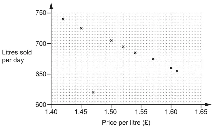
(a) Plot the result for week 10. [1]
(b) Describe the type of correlation shown in the scatter diagram. [1]
(c) In one week, there was a delay with petrol deliveries.
Circle the most likely point on the scatter diagram for that week. [1]
(d)
(i) On the scatter diagram, draw a line of best fit. [1]
(ii) Use the line of best fit to estimate the average daily sales when the price per litre of petrol is £1.48. [1]
(e) The manager says,
As the sales go down, the total amount of money we take stays roughly the same.
Find evidence to support this statement. [3]
| Answer | Marks | Part marks and guidance | |
|---|---|---|---|
| (1.46, 715) accurately plotted | 1 | Tolerance : no daylight between their point and correct point | |
| Answer | Marks | Part marks and guidance | |
|---|---|---|---|
| Negative | 1 | Ignore embellishments | |
| Answer | Marks | Part marks and guidance | |
|---|---|---|---|
| (1.47, 620) ringed | 1 | allow any indication | |
| Answer | Marks | Part marks and guidance | |
|---|---|---|---|
| (i) Accurate line of best fit | 1 | see overlay between (1.44, 720) and (1.44, 740) and between (1.60, 650) and (1.60, 670) and must reach vertical lines at each end, ignore beyond overlay | |
| (ii) FT their line | 1FT | FT their line with negative gradient only | tolerance : our reading ± 3 |
| Answer | Marks | Part marks and guidance | |
|---|---|---|---|
| Two different products correctly calculated, one product in the range 1.40 ≤ price ≤ 1.52 and one product in the range 1.52 < price ≤ 1.65 | 3 | B2 for one product correctly calculated or B1 for one product calculated with the incorrect result | see appendix for the products, the points used must be either the given points or on their lobf not the outlier, if there are more than two products then select the best two |
Appendix: Question 4(e)
| 1.42 | 740 | 1050[.80] |
| 1.45 | 725 | 1051[.25] |
| 1.46 | 715 | 1043[.90] |
| 1.5 | 705 | 1057[.50] |
| 1.52 | 695 | 1056[.40] |
| 1.54 | 685 | 1054[.90] |
| 1.57 | 675 | 1059[.75] |
| 1.6 | 660 | 1056[.00] |
| 1.61 | 655 | 1054[.55] |
allow rounded up as well